Neutral Sans Workhorse

Olt + Memoir Slang
Lets Olt own the focal silhouette while handling secondary copy, sizing and subheads cleanly.
Inspect Memoir Slang specimenDisclosure: MakerFileHub may earn a commission from qualifying purchases via paid links on this page. How our links work.
Chevron-cut tribal display
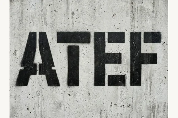
Olt is a tribal-inspired decorative face in bone white on slate: three narrow capitals built from mirrored chevrons and X marks, with forked ends, a small asterisk detail and pointed terminals, set with a plain line above and three plain lines beneath that name the formats and the style.
Paid link
Get this fontProject & layout blueprintsAt-a-glance maker compatibility
Sturdy stroke walls and open counters weed cleanly on adhesive vinyl, HTV apparel film, and cut cardstock.
Visual anatomy & craft review
The word is short and the plate gives it a great deal of slate, which is the right way to show a face this angular, because each letter is assembled from repeated chevrons and the repetition has to be judged at size. The drawing is a narrow capital with forked ends and X marks, so the letterforms read as carved marks rather than as typography, and the small asterisk detail sits inside the counters. That construction sets a large size floor, because the chevrons close when the letters shrink. The slate and the scattered bone fragments are staging that names the register, and the plain lines beneath are product copy. Because the face is built from repeated parts, it suits a logo, a poster and a shirt rather than a heading in a document.
Decorative, geometric, tribal, sharp
Two-font hierarchy recipes
Tested contrast partners — pairing Olt with grounded secondary typography.
Olt + Memoir Slang
Lets Olt own the focal silhouette while handling secondary copy, sizing and subheads cleanly.
Inspect Memoir Slang specimen
Olt + Evoire
Grounds bold display lettering with classic typographic authority on posters, badges and apparel.
Inspect Evoire specimenPractical applications
Concrete hierarchy, scale and production guidance tailored to Olt’s stroke geometry.
A chevron-cut face reads as carved, and the repeated marks hold on a dark poster where a plain sans would look ordinary.
Hierarchy & layout recipe
A2 poster: the event at 100 mm cap height, the details in a 20 mm sans, and the venue at 11 mm. Keep 30 mm margins and print one colour on a dark stock.
Pre-production check
Check the A2 at five metres, where a chevron can merge into the next letter; keep 6 mm between letters. Confirm the 11 mm venue reads at two metres and that the forked ends stay sharp.
A carved display gives an outdoor brand a mark that reads as a tool, and the strong shapes hold on a small tag. A tool brand reads as carved, not drawn.
Hierarchy & layout recipe
Set the mark at 18 pt on a tag, 90 mm on a panel and 13 pt on a card, keeping the chevrons only above 20 pt. Keep one colour and clear space equal to half the mark height.
Pre-production check
Check the 13 pt card mark, where a chevron can close; keep the size above 15 pt. Confirm the tag mark reads at arm's length and that the panel survives a wet season.
A carved display prints in one screen and reads as a symbol, which suits a themed party shirt. A themed shirt needs a symbol, not a sentence.
Hierarchy & layout recipe
Print a 240 mm chest graphic: the slogan at 60 mm cap height, the year at 26 mm, and one ink on a dark shirt. Keep the narrowest gap at 4 mm and place the graphic 80 mm below the collar.
Pre-production check
Check the screen at actual mesh, where a 4 mm gap can fill; open the spacing. Wash-test one shirt and confirm the forked ends stay sharp after five cycles.
Technical & licence verification
Confirm included OTF/TTF/WOFF formats, full glyph tables and licence coverage on the live store page before batch production.
Closest visual alternatives
Matched across letterform anatomy, stroke behaviour and craft applications.
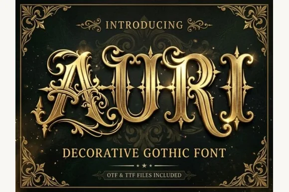
Filigree-swashed Victorian gothic capitals
Auri crowns bold Victorian gothic capitals with mid-stem spurs and scrolling filigree tendrils, built for dark-fantasy covers, emblems and luxury labels, where broad main stems anchor delicate curling side flourishes and turn three to six letter titles or single initials into ornate crests.
Ideas for this font
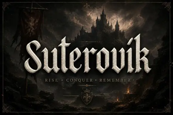
Narrow gothic display with sweep
Suterovik is a narrow gothic display in silver on a dark landscape: mixed case with a sweeping S, a hooked tall k, angular shoulders and a scaled texture, set as one word with a tracked line beneath and a small crest at the foot, framed against a castle and a banner.
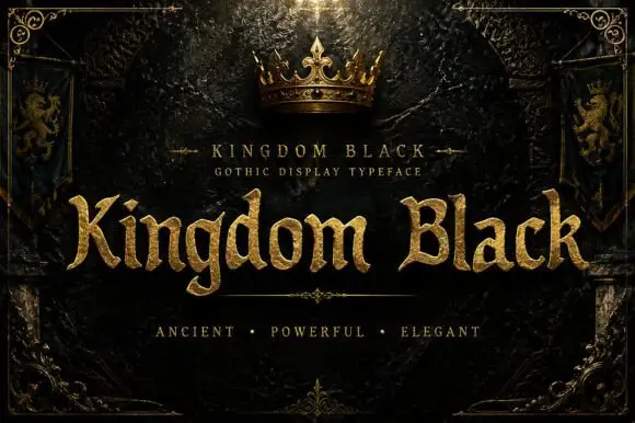
Weighty serif-like Gothic with rounded bowls and tapered sharp tips
Kingdom Black is a gothic display face filled with a textured gold, presented as a royal title plate with a crown above, lion banners at the sides and an ornamental frame.
Ideas for this font
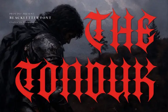
Concave-sided gothic display
The Tonduk is a solid red gothic display over a dark painted landscape: capitals with concave sides, sharp flared ends, narrow bowls and open counters, set in two lines of different sizes with a small presenting note and a credit at the upper left.
Ideas for this font
Same independent foundry
Allow optional Google Analytics to measure visits and catalogue actions. Your search words and notes are not included. Privacy & storage