High-Contrast Display Serif

Old Pines + Medvilea Editorial
Pairs sculptural editorial warmth with Old Pines's clean modern geometry.
Inspect Medvilea Editorial specimenDisclosure: MakerFileHub may earn a commission from qualifying purchases via paid links on this page. How our links work.
Speckled handcrafted capital sans
Old Pines is a handcrafted capital sans in cream on a dark forest photograph: rounded capitals with softly uneven edges, speckled interiors and slight variations in width, set as one line inside an arced line above and a second arced line beneath.
Paid link
Get this fontProject & layout blueprintsAt-a-glance maker compatibility
Fine grain and micro-texture excel in 300 DPI print, sublimation, and screen print rather than small vinyl weeding.
Visual anatomy & craft review
The two arced lines frame the word and give the plate a badge-like structure, which suits a face sold as handcrafted, because the frame echoes the uneven edge. The drawing is a rounded capital with a speckled fill and a wobbling contour, so the word reads as drawn with a marker rather than as a system sans, and the arced lines show that the same treatment holds at a smaller size. That construction sets a moderate size floor, since the speckle closes first. The forest photograph behind it is staging that names an outdoor register, and the arced lines carry the style and the count of three weights. Because the letters are rounded and even, the face suits a sign, a label and a shirt, and the speckle means it should be printed at a size where the texture reads as grain.
Sans serif, handcrafted, speckled, organic
Two-font hierarchy recipes
Tested contrast partners — pairing Old Pines with grounded secondary typography.
Old Pines + Medvilea Editorial
Pairs sculptural editorial warmth with Old Pines's clean modern geometry.
Inspect Medvilea Editorial specimen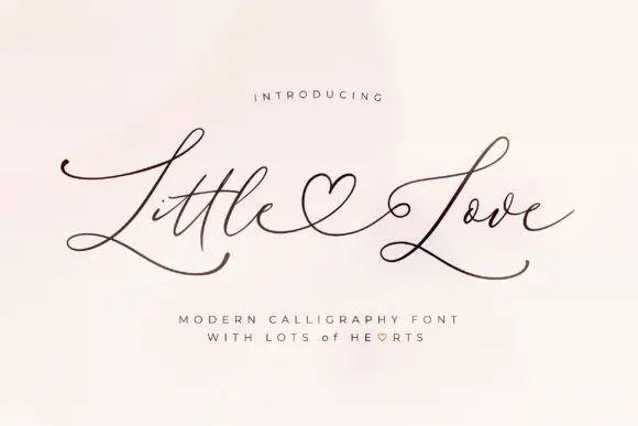
Old Pines + Little Love
Introduces organic movement on pull-quotes, signatures and gift tags.
Inspect Little Love specimenPractical applications
Concrete hierarchy, scale and production guidance tailored to Old Pines’s stroke geometry.
A handcrafted sans reads as a local shop rather than a chain, and the speckled fill survives a painted board. Local beats corporate on a high street.
Hierarchy & layout recipe
Paint a 1,000 by 380 mm board: the shop at 110 mm cap height, the hours in a 22 mm sans, and a 5 mm rule. Keep 25 mm margins and paint two colours on a primed board.
Pre-production check
Check the board at 110 mm, where the speckle can look like a bad mix; keep it even. Confirm the 22 mm hours read at two metres and that the rule survives a wet season.
A handcrafted face prints as a camp shirt, and the speckle reads as fabric texture rather than as damage. A camp shirt should look screen printed.
Hierarchy & layout recipe
Print a 250 mm chest graphic: the camp at 60 mm cap height, the year at 26 mm, and one ink on a light shirt. Keep the speckle above 1 mm and place the graphic 80 mm below the collar.
Pre-production check
Check the screen at actual mesh, where a 1 mm speckle can fill; keep it at 2 mm. Wash-test one shirt and confirm the edges stay uneven rather than ragged after five cycles.
A handcrafted label reads as a small roastery, and the rounded letters stay legible at a small die. A small roastery sells on texture.
Hierarchy & layout recipe
Print a 60 by 90 mm label: the roaster at 14 pt, the blend at 8.5 pt, and the roast at 7 pt. Keep 5 mm inside the die and keep the uneven edge above 0.4 mm.
Pre-production check
Check the 14 pt name on a bag, where the edge can clot; keep it fine. Confirm the 7 pt roast reads at arm's length and that the label takes a fold.
Technical & licence verification
Confirm included OTF/TTF/WOFF formats, full glyph tables and licence coverage on the live store page before batch production.
Closest visual alternatives
Matched across letterform anatomy, stroke behaviour and craft applications.
Wide rounded western sans
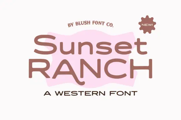
Sunset Ranch is a wide rounded sans in clay brown on white: mixed case with heavy rounded strokes, an unusually long curved leg on the capital A and open bowls, set in two lines over a torn pink shape, with a small arced line above, a sun badge at the corner and a tracked line beneath.

Tall distressed vintage capitals with speckled edges and tight fit
Modern Vintage is a tall capital alphabet with a distressed print texture, tight letterfit and vertical proportions, so a word reads as letterpress that has been used a hundred times.
Ideas for this font
Tall condensed sans with chipped, distressed texture
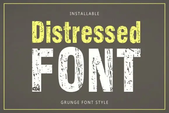
Distressed is a tall condensed sans whose strokes are eaten away by irregular chips, so the letters look printed, worn and flaked rather than cleanly drawn.
Ideas for this font

Heavy soft capitals with compact counters and slightly uneven edges
District Supply shows mustard uppercase words across a pale concrete-like field. Broad nearly even strokes form compact round counters, the T arms run flat, the Y angles sharply, and small irregularities soften the outer edges of a dense rectangular heading.
Ideas for this font
Allow optional Google Analytics to measure visits and catalogue actions. Your search words and notes are not included. Privacy & storage