Editorial Serif Anchor

Notes Schedule + Evoire
Anchors Notes Schedule's fluid strokes with crisp Roman proportions on wedding suites, headers and packaging.
Inspect Evoire specimenDisclosure: MakerFileHub may earn a commission from qualifying purchases via paid links on this page. How our links work.
Light rounded handwriting
Notes Schedule is a light handwritten face in charcoal on a ruled sheet: rounded mixed case with gently uneven stems, open circular bowls, a tall ascender and a loose baseline, set in two lines above a tracked line and a plain line that name the style and the cuts.
Paid link
Get this fontProject & layout blueprintsAt-a-glance maker compatibility
Weld or Unite overlapping script joins into one continuous vector path before sending to the blade.
Visual anatomy & craft review
The plate is staged on a ruled sheet, and that is the correct setting for a handwriting face, because the faint rules show how the letters sit relative to a line and how much they drift. The drawing is light and rounded, with gently uneven stems and open bowls, so the face reads as quick but tidy handwriting rather than as a script with a nib, and the light weight means the face is at home at note size rather than only at display size. The tracked lines beneath are product copy that name the style and the included weights. It suits a planner, a label and a letter, and it is a rare case where a handwriting face can set a short paragraph without becoming unreadable.
Handwritten, light, rounded, informal
Two-font hierarchy recipes
Tested contrast partners — pairing Notes Schedule with grounded secondary typography.
Notes Schedule + Evoire
Anchors Notes Schedule's fluid strokes with crisp Roman proportions on wedding suites, headers and packaging.
Inspect Evoire specimen
Notes Schedule + Headline
Keeps small-scale dates, URLs, nutrition facts and care instructions crisp and legible below script titles.
Inspect Headline specimenPractical applications
Concrete hierarchy, scale and production guidance tailored to Notes Schedule’s stroke geometry.
A light handwriting face suits a planner, and the open bowls stay readable at note size where a script would not. The light forms suit note taking.
Hierarchy & layout recipe
A5 planner: the headings at 18 pt, the notes at 10 pt with 1.5 leading, and the dates at 9 pt. Keep 15 mm margins and print one ink on a cream sheet with faint rules.
Pre-production check
Check the 10 pt notes at actual size, where a light stem can break in a home printer; keep the weight at regular or above. Confirm the headings read at arm's length and that the rules align with the baseline.
A handwriting label reads as a personal note, and the light forms suit a small shop better than a brand sans. It reads as a handwritten note.
Hierarchy & layout recipe
Print a 55 by 80 mm label: the shop at 13 pt, the product at 9 pt, and the price at 8 pt. Keep 5 mm inside the die and keep the light strokes above 0.3 mm.
Pre-production check
Check the 9 pt product on a small die, where a light stroke can break; keep it above 0.3 mm. Confirm the price reads at arm's length and that the label takes a fold.
A handwritten face makes a thank you card feel personal, and the ruled setting helps the lines sit evenly. It feels personal at note size.
Hierarchy & layout recipe
A6 card: the greeting at 20 pt, the message at 10 pt with 1.5 leading, and the signature at 14 pt. Keep 15 mm margins and print one ink on a cream card.
Pre-production check
Check the 10 pt message at home-print resolution, where a rounded bowl can fill; keep the weight at regular. Confirm the message reads at arm's length and that the card folds flat.
Technical & licence verification
Confirm included OTF/TTF/WOFF formats, full glyph tables and licence coverage on the live store page before batch production.
Closest visual alternatives
Matched across letterform anatomy, stroke behaviour and craft applications.
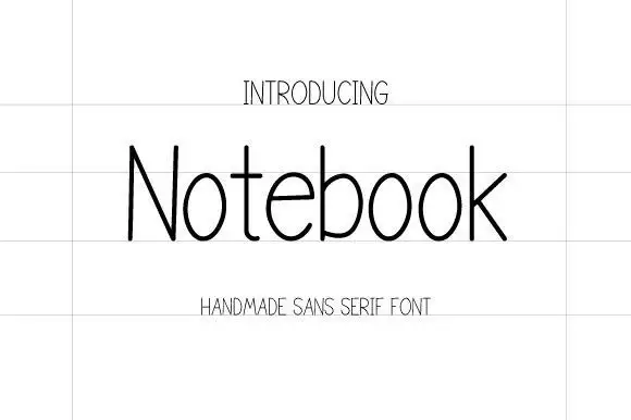
Thin handmade sans
Notebook is a thin handmade sans in near-black on a lined sheet: tall narrow letters with hairline strokes, a very large x-height, open counters and a slight irregularity in the stems, set as one word with a tracked label above and below in the same weight.
Ideas for this font
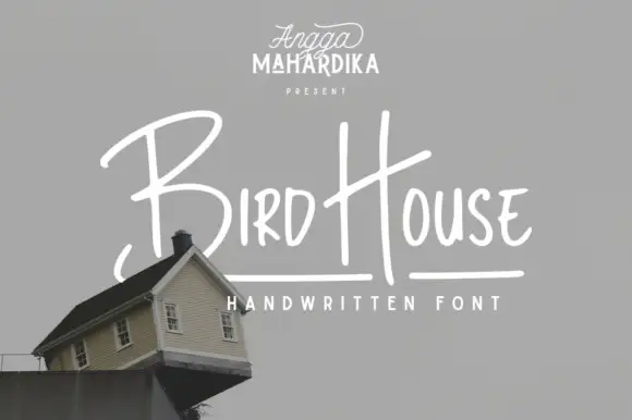
Thin informal marker mixed case with towering capitals and long cross-strokes
Bird House is a thin informal marker hand in which the first capital towers over a narrow lowercase body, the H rises especially high and a long cross-stroke travels across the second word, so a name reads as a quick marker sketch.
Ideas for this font
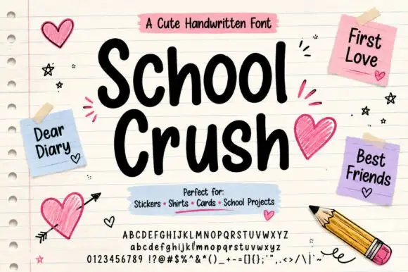
Heavy rounded marker print on a notebook page
School Crush is a heavy rounded marker print in black on a lined notebook page, with drawn hearts, sticky notes and a pencil turning the specimen into a school desk.
Ideas for this font
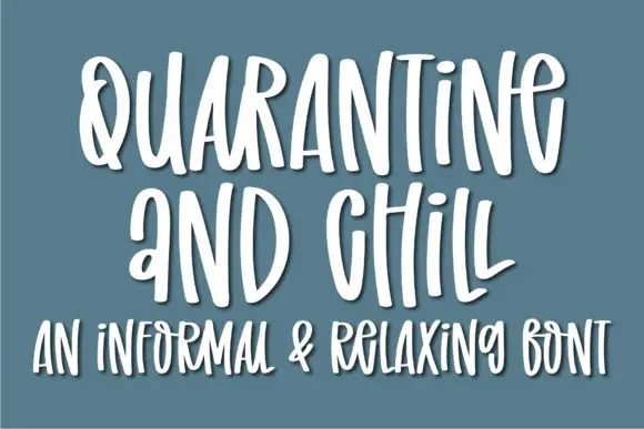
Informal tall hand with soft shadow
Quarantine and Chill is an informal handwritten display in white on slate blue: tall narrow letters, uneven spacing and a soft shadow that lifts the strokes off the ground, with a second line in the same hand.
Same independent foundry
Allow optional Google Analytics to measure visits and catalogue actions. Your search words and notes are not included. Privacy & storage