Editorial Serif Anchor

Nighters Club + Orvelia
Anchors Nighters Club's fluid strokes with crisp Roman proportions on wedding suites, headers and packaging.
Inspect Orvelia specimenDisclosure: MakerFileHub may earn a commission from qualifying purchases via paid links on this page. How our links work.
Bold vintage baseball script
Nighters Club is a bold vintage script in cream on deep red: connected lowercase strokes with heavy swells, an oversized capital that lifts off the baseline, a long underline swash, and a small gold sub-line, so the pair reads as a mid-century sports team mark.
Paid link
Get this fontProject & layout blueprintsAt-a-glance maker compatibility
Weld or Unite overlapping script joins into one continuous vector path before sending to the blade.
Visual anatomy & craft review
The word is set in one line with the second line tucked beneath and to the right, and the drawing is the American sports script: the lowercase masses are heavy, the joins are thick, and the capital N rises well above the x-height with a curl on its top. The descender of the final letter extends into a long underscore, which is the classic team-mark device, and the gold sub-line sits inside the space that the swash creates. Spacing is tight enough that the word reads as a single badge, and the counters are open enough that the heavy strokes stay distinct at small sizes. The specimen prints cream on a red ground with hand-drawn horizontal stripes across the upper half, which sets the face against a period texture rather than a flat colour.
Retro, baseball, script, bold
Two-font hierarchy recipes
Tested contrast partners — pairing Nighters Club with grounded secondary typography.
Nighters Club + Orvelia
Anchors Nighters Club's fluid strokes with crisp Roman proportions on wedding suites, headers and packaging.
Inspect Orvelia specimen
Nighters Club + Helina
Keeps small-scale dates, URLs, nutrition facts and care instructions crisp and legible below script titles.
Inspect Helina specimenPractical applications
Concrete hierarchy, scale and production guidance tailored to Nighters Club’s stroke geometry.
A vintage baseball script is the honest reference for a club mark, and the heavy connected strokes read as an embroidered badge on a cap where a modern sans would look borrowed.
Hierarchy & layout recipe
Embroider a 90 mm cap badge: the name at 22 mm cap height, the club line in a 5 mm sans, and a 2 mm outline to hold the thread. Keep the swash underline inside the badge and reduce the smallest gaps to 1.5 mm for stitching.
Pre-production check
Check the embroidery file, where a thick join under 1.5 mm closes into a lump; redraw the joins. Confirm the 5 mm club line reads at two metres and that the swash does not run outside the badge on a curved crown.
A team script gives a sports-themed birthday the look of real merchandise, and the single-colour version prints on a shirt without registration problems.
Hierarchy & layout recipe
Print a 250 mm chest graphic: the name at 60 mm cap height, the age in a 25 mm sans inside the swash, and one ink on a light shirt. Keep the thinnest swash at 3 mm so the screen holds it after washing.
Pre-production check
Check the screen at actual mesh, where the swash tail under 2 mm breaks; thicken the tail. Confirm the age reads inside the swash at three metres and that the print survives a wash without cracking at the joins.
A period sports script frames a history book as a document of its era, and the underline swash gives the cover a built-in rule for the subtitle.
Hierarchy & layout recipe
Set the title at 100 mm wide on a 240 mm cover, the subtitle in a 9 pt sans beneath the swash, and the author in 8 pt caps. Print two colours on a matte stock so the cream holds against the red without glare.
Pre-production check
Check the title at thumbnail size, where the swash can read as a stray line; keep it attached to the last letter. Confirm the 9 pt subtitle sits clear of the swash tail and that the 8 pt author survives the lamination.
Technical & licence verification
Confirm included OTF/TTF/WOFF formats, full glyph tables and licence coverage on the live store page before batch production.
Closest visual alternatives
Matched across letterform anatomy, stroke behaviour and craft applications.
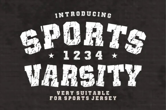
Arched distressed varsity & jersey-number slab serif
Sports Varsity is a bold, grunge-textured collegiate slab serif with matching athletic numerals ('1 2 3 4') built for vintage arched team shirts.
Ideas for this font
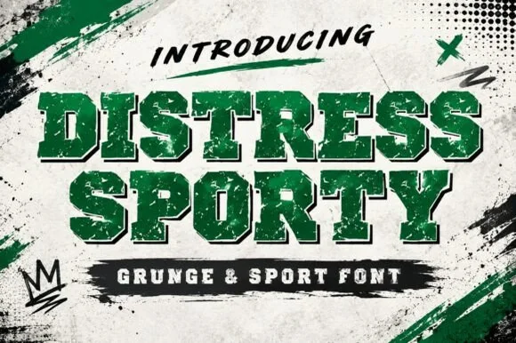
Heavy cracked-plastisol grunge varsity slab serif
Distress Sporty is a rugged collegiate varsity slab serif pre-weathered with cracked plastisol-ink splits and rough turf grit.
Ideas for this font
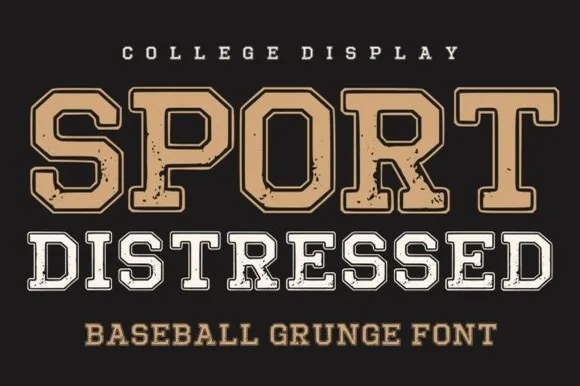
College slab block in layered grunge cuts
Sport Distressed is a college slab block shown in two treatments on one page: a tan filled cap with a thin keyline, and a white outline cap with a worn, speckled fill, both built on the same squared athletic skeleton.
Ideas for this font
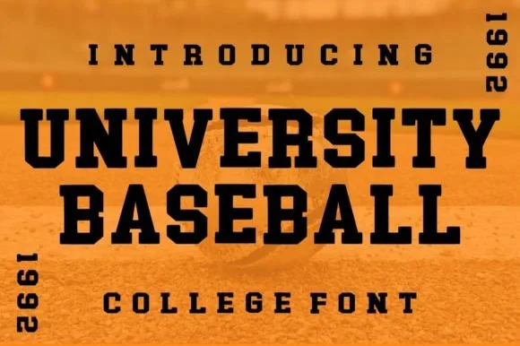
Wide heavy collegiate championship slab serif
University Baseball is a wide, ultra-sturdy collegiate slab serif with thick bracketed blocks and zero-nonsense varsity punch.
Ideas for this font
Same independent foundry
Allow optional Google Analytics to measure visits and catalogue actions. Your search words and notes are not included. Privacy & storage