Modern Grotesque Body

Buttermilk Biscuits + Base Edge
Creates crisp high-hierarchy contrast beneath Buttermilk Biscuits headlines across menus, websites and labels.
Inspect Base Edge specimenDisclosure: MakerFileHub may earn a commission from qualifying purchases via paid links on this page. How our links work.
Irregular flared serif with a handwritten rhythm and uneven letter widths
Buttermilk Biscuits is a serif with a handwritten rhythm: the serifs flare unevenly, the letter widths vary, and the capitals mix proportions so a word reads as something lettered by hand with a broad nib.
Paid link
Get this fontProject & layout blueprintsAt-a-glance maker compatibility
Sturdy stroke walls and open counters weed cleanly on adhesive vinyl, HTV apparel film, and cut cardstock.
Visual anatomy & craft review
The capital B is drawn wide with a flared stem and an open lower bowl, while the following capitals turn narrow, and that variation is deliberate — it is what keeps the word from looking like a manufactured roman. The lowercase mixes forms too: the t crosses with a slanted bar, the i carries a wedge dot, the s keeps an open spine and the c closes with a flared terminal. Weight sits in the stems with a moderate contrast, and the serifs flare outward rather than bracketing in, which gives the face its farmhouse character. Because the widths vary, the fit is uneven and wants manual spacing at display sizes. The blush ground, the taupe ink and the three caption lines are presentation; the typeface is the two words.
Irregular · Flared · Warm
Two-font hierarchy recipes
Tested contrast partners — pairing Buttermilk Biscuits with grounded secondary typography.
Buttermilk Biscuits + Base Edge
Creates crisp high-hierarchy contrast beneath Buttermilk Biscuits headlines across menus, websites and labels.
Inspect Base Edge specimen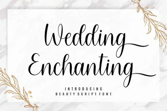
Buttermilk Biscuits + Wedding Enchanting
Adds a warm human signature touch for 1-to-3-word callouts without competing against structured serif capitals.
Inspect Wedding Enchanting specimenPractical applications
Concrete hierarchy, scale and production guidance tailored to Buttermilk Biscuits’s stroke geometry.
The uneven serifs make a printed label read as hand-lettered, which suits a small bakery selling at a market where every label sits at 11 pt.
Hierarchy & layout recipe
Print on a 55 by 75 mm label: set the bakery name at 11 pt, set the product in a 6 pt caps sans beneath, and leave 5 mm of margin so the flared serifs are not cut by the rounded corner.
Pre-production check
Uneven widths shift when a long word is set; check the artwork with the longest product name and space the flared letters by hand.
The flared serif gives a menu cover a broad-nib character without a script, and the mixed widths fill a wide format at 48 pt.
Hierarchy & layout recipe
Print an A5 cover: set the title at 48 pt across the upper half, set the date in a 9 pt caps sans beneath, and keep 16 mm of margin so the flared terminals stay inside the trim.
Pre-production check
A flared serif at 48 pt uncoated looks softer than on screen; check the proof on the chosen paper and keep the stems at least 3 mm wide.
The handwritten rhythm reads as painted lettering on glass, and the uneven widths keep a shop name from looking like a supermarket sign at 12 cm.
Hierarchy & layout recipe
Cut a 500 by 250 mm vinyl decal: set the shop name at 12 cm, set the opening hours in a 4 cm sans beneath, and hold 6 cm from the glass edge so the flared serifs are not trimmed by the frame.
Pre-production check
Vinyl cutters need a minimum stroke and weeding gap; check the vector at full size and widen the flared thin points before cutting.
Technical & licence verification
Confirm included OTF/TTF/WOFF formats, full glyph tables and licence coverage on the live store page before batch production.
Closest visual alternatives
Matched across letterform anatomy, stroke behaviour and craft applications.
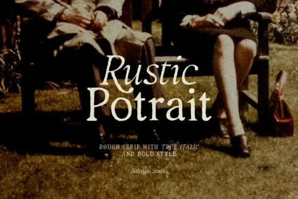
Rough serif with italic
Rustic Portrait is a rough serif in warm cream over a sepia photograph of two people on a garden bench: moderate contrast, soft worn serifs and a slight tilt, with the first word in the roman and the second in the same cut, and a tracked line beneath naming the italic and bold.
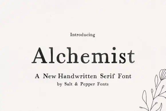
Soft handwritten serif with irregular small details
Alchemist shows black mixed-case letters with modest contrast and softly uneven edges, where a wide A and rounded lowercase bowls sit beside a tall h and a lightly curved t terminal, and the title rests on cream next to a small botanical line drawing and handwritten-serif wording.
Ideas for this font
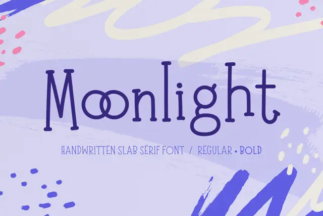
Tall irregular handwritten slab serif
Moonlight is a handwritten slab serif in deep purple on lavender: tall narrow letters with blunt serifs, an uneven baseline and a second bold cut, shown over soft painted shapes.
Ideas for this font
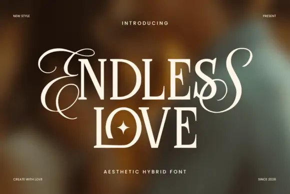
Upright contrasting capitals framed by looping endpoint letters
Endless Love is a contrasting upright capital face in which the first and last letters carry long loops that leave the cap line above and below, so a two-line title reads as a framed romantic lockup.
Ideas for this font
Same independent foundry
Allow optional Google Analytics to measure visits and catalogue actions. Your search words and notes are not included. Privacy & storage