Editorial Serif Anchor

Daily Calm + Kernova
Anchors Daily Calm's fluid strokes with crisp Roman proportions on wedding suites, headers and packaging.
Inspect Kernova specimenDisclosure: MakerFileHub may earn a commission from qualifying purchases via paid links on this page. How our links work.
Tall rounded script with heavy entries and a stacked two-line rhythm
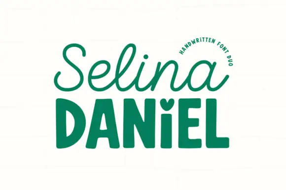
Daily Calm is a tall rounded script with heavy entries and light exits, drawn so two stacked words share the same width and read as a single column of movement.
Paid link
Get this fontProject & layout blueprintsAt-a-glance maker compatibility
Weld or Unite overlapping script joins into one continuous vector path before sending to the blade.
Visual anatomy & craft review
The capital D begins with a tall loop that starts above the cap line, then a stem that thickens as it descends and ends in a rounded foot before joining forward. The lowercase letters keep that tall narrow proportion: the a closes into a small bowl, the i and the l rise to ascender height with light stems, and the y drops into a long loop that returns under the word. Weight shifts across each letter from heavy at the top of the entry stroke to light at the exit, which gives the line a gentle pulse without any abrupt contrast. The second word repeats the same width and the same pulse, set slightly larger and offset left, so the pair reads as one block rather than two lines. Ends are rounded. The cream ground, the small sparkle marks and the label strip are presentation; the script is the two words.
Tall · Rounded · Stacked
Two-font hierarchy recipes
Tested contrast partners — pairing Daily Calm with grounded secondary typography.
Daily Calm + Kernova
Anchors Daily Calm's fluid strokes with crisp Roman proportions on wedding suites, headers and packaging.
Inspect Kernova specimen
Daily Calm + Prime Nordic
Keeps small-scale dates, URLs, nutrition facts and care instructions crisp and legible below script titles.
Inspect Prime Nordic specimenPractical applications
Concrete hierarchy, scale and production guidance tailored to Daily Calm’s stroke geometry.
The tall narrow proportions fit a small label where a wide script would have to shrink, and the gentle weight pulse keeps the mark quiet rather than promotional.
Hierarchy & layout recipe
Set the studio name at 13 pt on a 40 by 70 mm label, keep the class list in a 5 pt sans, and leave 6 mm at the top so the capital loop is not crowded by the border.
Pre-production check
Small labels printed on a roll can drift in registration; check the second impression and hold the fine exits at 0.3 mm minimum before approving the run.
Two stacked words in the same width give a menu header a column of its own, and the light exits keep the lettering from dominating the dish names beneath.
Hierarchy & layout recipe
Set the heading at 26 pt on an A5 menu, keep the dishes in a 9 pt serif at 12 pt leading, and hold 10 mm between the heading's y loop and the first course line.
Pre-production check
A long descender loop can cross the first course on a tight A5 menu; check the proof at final size and raise the block if the loop touches the text.
The quiet weight and the tall forms read as a written note, which suits a printed card that sits beside a handwritten message rather than replacing it.
Hierarchy & layout recipe
Set the greeting at 18 pt at the head of a 105 by 148 mm card, keep the house name in a 6 pt sans at the foot, and leave the middle 70 mm of the card clear for handwriting.
Pre-production check
A light exit at 18 pt on a textured card can break; print one card on the actual stock and raise the size to 20 pt if the joins start to look furry.
Technical & licence verification
Confirm included OTF/TTF/WOFF formats, full glyph tables and licence coverage on the live store page before batch production.
Closest visual alternatives
Matched across letterform anatomy, stroke behaviour and craft applications.
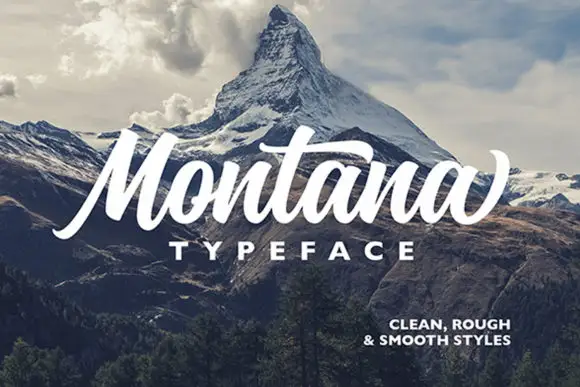
Heavy slanted brush script with a broad t bar and a rising final terminal
Montana is a heavy slanted brush script in which the stems carry dark weight, the M rises tall and angular, the t bar runs broad and the closing letter lifts into a high terminal, so a short headline reads as painted signage.
Ideas for this font
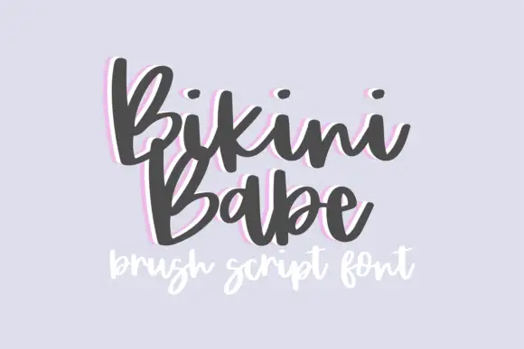
Bouncy brush script with a heavy soft stroke and tilted letter bodies
Bikini Babe is a bouncy brush script in which the letters tilt at slightly different angles, the stroke stays heavy and soft and the baseline rises and falls through the phrase.
Ideas for this font
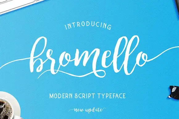
Loose brush script with a light even stroke and long flat entry tails
Bromello is a loose brush script in which the strokes stay light and even, the letters lean forward gently and the entry and exit run out as long flat tails on both sides.
Ideas for this font
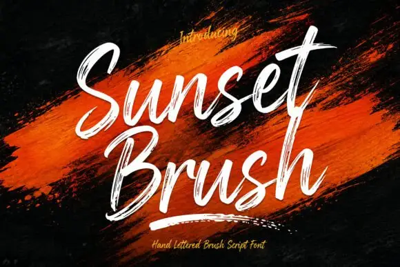
Rough brush script with a dry edge
Sunset Brush is a rough brush script in white over an orange paint smear: heavy strokes with dry, split ends, tall narrow loops and a forward slant that keeps a twelve-letter phrase moving.
Ideas for this font
Same independent foundry
Allow optional Google Analytics to measure visits and catalogue actions. Your search words and notes are not included. Privacy & storage