High-Contrast Display Serif

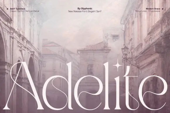
Mono Vensca Space + Mewah
Pairs sculptural editorial warmth with Mono Vensca Space's clean modern geometry.
Inspect Mewah specimenDisclosure: MakerFileHub may earn a commission from qualifying purchases via paid links on this page. How our links work.
Squared monospace sans with slashed zero
Mono Vensca Space is a squared monospace sans shown in black, white and amber on black: mixed case with uniform widths, a slashed zero, an angular greater-than sign, small data blocks at the corners and a paragraph of description beside the name.
Paid link
Get this fontProject & layout blueprintsAt-a-glance maker compatibility
Sturdy stroke walls and open counters weed cleanly on adhesive vinyl, HTV apparel film, and cut cardstock.
Visual anatomy & craft review
The plate is laid out like a specification sheet, which is right for a monospace: a block of description at the top, the name at two sizes, a sample of the greater-than sign and a zero with a slash, and a row of weights along the foot. The drawing is a squared monospace with uniform character widths, which is the functional requirement, and the slashed zero is the detail that makes it usable for code. That construction sets a modest size floor and makes the face usable at small sizes on screen, which is its purpose. The amber accents and the data blocks are staging that name the register, and the weight list is genuine product information.
Sans serif, mono, technical, coded
Two-font hierarchy recipes
Tested contrast partners — pairing Mono Vensca Space with grounded secondary typography.
Mono Vensca Space + Mewah
Pairs sculptural editorial warmth with Mono Vensca Space's clean modern geometry.
Inspect Mewah specimen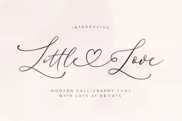
Mono Vensca Space + Little Love
Introduces organic movement on pull-quotes, signatures and gift tags.
Inspect Little Love specimenPractical applications
Concrete hierarchy, scale and production guidance tailored to Mono Vensca Space’s stroke geometry.
A monospace reads as engineering, and the slashed zero and uniform widths keep code samples and a wordmark consistent from one licence.
Hierarchy & layout recipe
Set the name at 14 pt on a card, 90 mm on a wall and 9.5 pt in a code sample, keeping the mono fit for the sample only. Keep one colour and clear space equal to the cap height.
Pre-production check
Check the 9.5 pt code sample on screen, where a squared bowl can fill; keep the size at 9.5 pt or above. Confirm the wall name reads at eight metres and that the slashed zero is unambiguous.
A monospace sets commands and values in a manual, and the uniform width keeps tables aligned without manual spacing. Fixed width keeps the columns true.
Hierarchy & layout recipe
Set the body at 9.5 pt on a 130 mm measure with 1.4 leading, the commands at 9.5 pt, and the captions at 8.5 pt. Print one ink on an uncoated stock and keep 18 mm margins.
Pre-production check
Check the 9.5 pt body in a proof, where a squared bowl can close; keep the size at 9.5 pt or above. Confirm the 8.5 pt captions keep a 4.5:1 contrast and that the command block aligns.
A monospace signals a technical club, and the squared letters read on a corridor board seen at an angle. The squares read at an angle.
Hierarchy & layout recipe
A3 poster: the club at 60 mm cap height, the times in a 20 mm sans, and the room at 12 mm. Keep 25 mm margins and print two colours on a dark stock. Print on a matte sheet so the corridor lights do not glare off it.
Pre-production check
Check the A3 at three metres, where a squared bowl can merge; keep 3 mm between letters. Confirm the 12 mm room reads at two metres and that the poster sits at eye height.
Technical & licence verification
Confirm included OTF/TTF/WOFF formats, full glyph tables and licence coverage on the live store page before batch production.
Closest visual alternatives
Matched across letterform anatomy, stroke behaviour and craft applications.

Light geometric capitals with circular O and broad angular diagonals
Modern Heritage shows black capitals in two closely stacked lines on white, where thin nearly even strokes form a circular O, a broad M and N and a large triangular A, while the G keeps an open right side with a short inner bar.
Ideas for this font
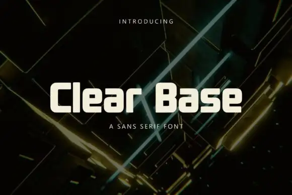
Squarish compact mixed case with flat bowls and softly rounded corners
Clear Base sets cream mixed case over a dark angular light pattern. The C and B have flat sides and shallow corner curves, while the lowercase a and e repeat small rectangular counters, and the tall l makes a clear upright interruption in the row.
Ideas for this font
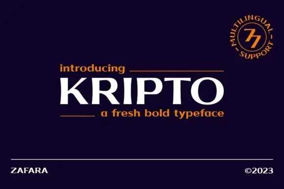
Broad contrast capitals with sharp top cuts and curved tapering joins
Kripto centres white uppercase lettering on deep purple, where thick upright strokes meet finer curved O and P joins, the R leg sweeps diagonally outward and the K arms meet in a sharp central junction.
Ideas for this font
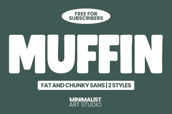
Fat chunky sans display
Muffin is a fat chunky sans in white on dark green: extremely heavy caps with squared corners, narrow counters, and a slightly condensed width, presented as a two-style family with a tracked label beneath and a badge above.
Ideas for this font
Same independent foundry
Allow optional Google Analytics to measure visits and catalogue actions. Your search words and notes are not included. Privacy & storage