High-Contrast Display Serif

Clear Base + Things
Pairs sculptural editorial warmth with Clear Base's clean modern geometry.
Inspect Things specimenDisclosure: MakerFileHub may earn a commission from qualifying purchases via paid links on this page. How our links work.
Squarish compact mixed case with flat bowls and softly rounded corners
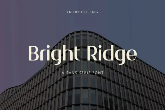
Clear Base sets cream mixed case over a dark angular light pattern. The C and B have flat sides and shallow corner curves, while the lowercase a and e repeat small rectangular counters, and the tall l makes a clear upright interruption in the row.
Paid link
Get this fontProject & layout blueprintsAt-a-glance maker compatibility
Sturdy stroke walls and open counters weed cleanly on adhesive vinyl, HTV apparel film, and cut cardstock.
Visual anatomy & craft review
The bowls flatten on the sides, the corners round only slightly, the counters turn rectangular and the x-height stays compact. That squared construction is the character: the word reads as a modern interface mark rather than a neutral grotesque, which is why the diagonal light streaks behind it make the geometry easy to see. Those streaks are artwork, and the short title never shows small labels or numerals, so test your own caption sizes, keep 16 pt as the floor and check the figures separately.
Squarish compact mixed case with flat bowls and softly rounded corners
Two-font hierarchy recipes
Tested contrast partners — pairing Clear Base with grounded secondary typography.
Clear Base + Things
Pairs sculptural editorial warmth with Clear Base's clean modern geometry.
Inspect Things specimen
Clear Base + Abigail
Introduces organic movement on pull-quotes, signatures and gift tags.
Inspect Abigail specimenPractical applications
Concrete hierarchy, scale and production guidance tailored to Clear Base’s stroke geometry.
The squared bowls suit a digital mark, and the compact mixed case holds a two-word name at 26 pt on a card, where the flat sides keep the row aligned to a grid.
Hierarchy & layout recipe
Print an 85 by 55 mm card: set the wordmark at 26 pt on one row, keep 16 mm of clear ground beneath before the address at 7 pt, and align the flat sides of the bowls to the card edge.
Pre-production check
A short specimen shows no numerals; check the file before setting a version number or date in this face.
The compact forms make tidy labels, and the rectangular counters hold a three-word heading at 20 pt on a printed page, where the flat bowls echo the column grid.
Hierarchy & layout recipe
Print a 210 mm page: set the label at 20 pt on one row, keep 12 mm of clear ground beneath before the body at 9 pt, and keep the label in small caps so the squared shapes stay even.
Pre-production check
Labels set under 12 pt lose their flat sides; check the page proof and hold the label at 16 pt or above.
The squared letters suit a wayfinding sign, and the tall l interrupts the row clearly at 40 pt on an acrylic panel, where the soft corners survive cutting.
Hierarchy & layout recipe
Cut a 300 by 150 mm acrylic panel: set the room name at 40 pt on one row, keep 18 mm of clear ground beneath before the opening times at 13 pt, and keep 18 mm of margin for the fixing holes.
Pre-production check
Corner radii under 2 mm chip in acrylic; check the cut file and keep the radius at 3 mm or above.
Technical & licence verification
Confirm included OTF/TTF/WOFF formats, full glyph tables and licence coverage on the live store page before batch production.
Closest visual alternatives
Matched across letterform anatomy, stroke behaviour and craft applications.
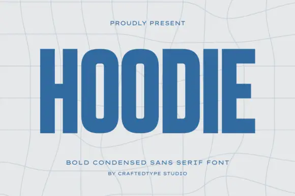
Condensed block capitals with rounded rectangular O counters
Hoodie shows a large blue uppercase word on a pale warped-grid field, where heavy straight uprights and flat horizontal endings form a dense block, the O and D hold rounded rectangular counters, the H crossbar sits near the middle and the E keeps three squared arms.
Ideas for this font
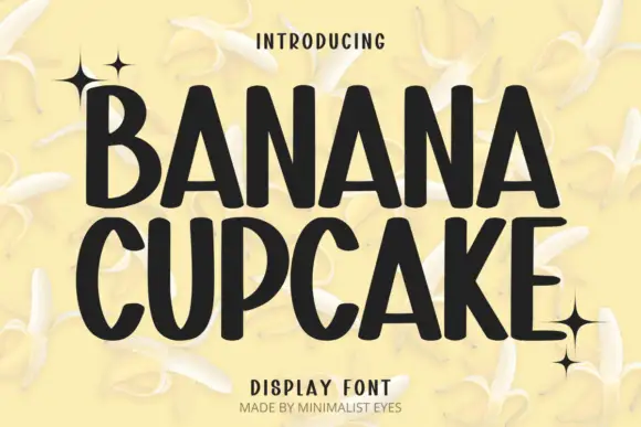
Tall playful display sans
Banana Cupcake stacks two large words in dark letters on a pale banana photograph, where tall narrow capitals fill the width, the counters squeeze into thin slots, the corners soften slightly and the letter widths shift row by row so the second word runs wider than the first.
Ideas for this font

Open rounded mixed case with a tall t and broad circular bowls
Cultivo shows a large black title-case name across the lower part of a pale beige cover, where light to moderate nearly even strokes form an open C, a broad u and near-circular bowls, the t finishes with a rounded lower turn and the v opens a clean diagonal.
Ideas for this font
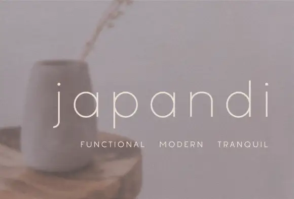
Widely spaced thin lowercase with circular bowls and a hooked j descender
Japandi draws its lowercase in a hairline geometric line, keeps the bowls almost circular and sets the words far apart on a soft photographic ground so the type feels like a room rather than a label.
Ideas for this font
Same independent foundry
Allow optional Google Analytics to measure visits and catalogue actions. Your search words and notes are not included. Privacy & storage