Editorial Serif Anchor

Million Smiles + Marquis - Elegant Modern Serif
Anchors Million Smiles's fluid strokes with crisp Roman proportions on wedding suites, headers and packaging.
Inspect Marquis - Elegant Modern Serif specimenDisclosure: MakerFileHub may earn a commission from qualifying purchases via paid links on this page. How our links work.
Bold retro brush script with a slant
Million Smiles is a bold retro brush script in deep teal on cream paper: thick connected letters with a pronounced slant, angular joins and a full stop, with a two-line capital caption in orange beneath the words.
Paid link
Get this fontProject & layout blueprintsAt-a-glance maker compatibility
Weld or Unite overlapping script joins into one continuous vector path before sending to the blade.
Visual anatomy & craft review
Two words are stacked and lean together, and the face is a bold brush script from the sign-painting tradition: the stroke is thick and slightly tapering, the joins are angular where the brush turned, the M opens with a pointed entry, the l and the k rise into narrow hooks, the s closes with a heavy curve and the full stop at the end is a fat teardrop. The contrast is low, so the words read as solid shapes at a distance, and the slant is consistent across both lines, which is what keeps the block looking painted rather than tilted. The palette is a single ink on a warm cream sheet with visible paper texture, and a small capital caption in a contrasting rust sits at an angle beneath the block. Million Smiles is a script for packaging, signage, apparel and retro branding, and it wants a short phrase at a large size, since the angular joins close up when the face is set small.
Bold, brushed, retro
Two-font hierarchy recipes
Tested contrast partners — pairing Million Smiles with grounded secondary typography.
Million Smiles + Marquis - Elegant Modern Serif
Anchors Million Smiles's fluid strokes with crisp Roman proportions on wedding suites, headers and packaging.
Inspect Marquis - Elegant Modern Serif specimen
Million Smiles + Helina
Keeps small-scale dates, URLs, nutrition facts and care instructions crisp and legible below script titles.
Inspect Helina specimenPractical applications
Concrete hierarchy, scale and production guidance tailored to Million Smiles’s stroke geometry.
A retro brush script gives a bottle a painted look that a digital script cannot, and the thick stroke survives a small label and a curved surface.
Hierarchy & layout recipe
Print a 60 by 95 mm label: set the brand at 22 pt on one line, keep 7 mm of clear ground beneath before the flavour at 6 pt, and hold 5 mm of margin on all four sides.
Pre-production check
Angular joins fill in at twenty-two points; print one label on the real bottle and check the joins before the run.
A bold script sets a warm, retro tone for a food issue, and the heavy letters hold their shape over a photograph at cover size.
Hierarchy & layout recipe
Print a 230 by 300 mm cover: set the title at 90 pt on one line, keep 26 mm of clear ground beneath before the coverlines at 10 pt, and hold 18 mm of margin on all four sides.
Pre-production check
A slanted block over a graphic cover needs a clear area; proof the cover with the image in place and check the overlap.
A painted script reads as a seasonal sign rather than a sticker, and the thick letters stay visible from a few metres in bright light.
Hierarchy & layout recipe
Print a 600 by 400 mm board: set the name at 110 pt over two lines, keep 28 mm of clear ground beneath before the flavours at 20 pt, and hold 24 mm of margin on all four sides.
Pre-production check
Dark ink on a sunlit board can look faded after one season; print one board and keep it varnished or shaded before the summer.
Technical & licence verification
Confirm included OTF/TTF/WOFF formats, full glyph tables and licence coverage on the live store page before batch production.
Closest visual alternatives
Matched across letterform anatomy, stroke behaviour and craft applications.

Ornate flourished calligraphy with oversized loops
Handmade Calligraphy is an ornate script whose flourishes leave the letters entirely, curling above and below the line so the two words read as a drawn flourish with letters inside it.
Ideas for this font

Fine extended signature script
Lovely sets a fine signature script in a single dark weight over a pale city photograph, where a wide entry curve opens low at the left, the letters rise into tall slender loops through the middle and a large descending y plus an extended closing sweep make the lower right part of the footprint.
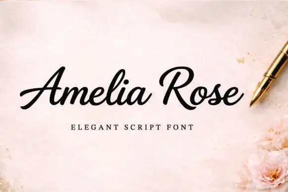
Slanted weighty script with a sweeping capital R and connected joins
Amelia Rose is a slanted script in which the strokes stay weighty through the joins, the capital R sweeps wide and the letters lean together, so a name reads as a confident handwritten signature.
Ideas for this font

Bold slanted script with a curled capital and heavy connected stems
Esmeralda is a bold slanted script in which the capital curls back over itself and the body runs in connected heavy stems with a steady forward lean.
Ideas for this font
Same independent foundry
Allow optional Google Analytics to measure visits and catalogue actions. Your search words and notes are not included. Privacy & storage