High-Contrast Display Serif

Mechacore + The Lumina Awesome
Pairs sculptural editorial warmth with Mechacore's clean modern geometry.
Inspect The Lumina Awesome specimenDisclosure: MakerFileHub may earn a commission from qualifying purchases via paid links on this page. How our links work.
Antique art nouveau display
Lombard is an antique art nouveau display in white over a period portrait: thin strokes, wide rounded forms, an S with a swelling waist, a D closed into a teardrop and an R with a sweeping leg, with a small block of red copy beneath, so the plate reads as a nineteen-thirties title card.
Paid link
Get this fontProject & layout blueprintsAt-a-glance maker compatibility
Open counter bridges hold interior islands intact on laser-cut wood, acrylic, and mylar stencils.
Visual anatomy & craft review
The word is set once across the frame, and the drawing is an antique display of the nouveau school: the strokes swell and taper, the bowls are wide and round, and the joints meet at sharp points, which gives the letters their period flourish. The weight is light enough that the face needs a large size and a contrasty ground, and the specimen places it over a monochrome photograph where the white reads as a projected title. Spacing is generous so each letter's drawing is visible, and the block of red copy beneath is set in the same construction at a fraction of the size, with an attribution line under it. The composition is asymmetric, with the portrait at the left, and the whole plate stays within two colours plus the photograph.
Art nouveau, antique, ornate, elegant
Two-font hierarchy recipes
Tested contrast partners — pairing Mechacore with grounded secondary typography.
Mechacore + The Lumina Awesome
Pairs sculptural editorial warmth with Mechacore's clean modern geometry.
Inspect The Lumina Awesome specimen
Mechacore + Welcome
Introduces organic movement on pull-quotes, signatures and gift tags.
Inspect Welcome specimenPractical applications
Concrete hierarchy, scale and production guidance tailored to Mechacore’s stroke geometry.
An art nouveau display reads as period elegance, and the thin strokes work in cut vinyl or neon where a heavier face would lose its character.
Hierarchy & layout recipe
Fabricate a 1,000 by 320 mm sign: the name at 120 mm cap height, a 6 mm minimum stroke, and the hours in a 20 mm deco sans. Keep 30 mm margins and specify a matte finish so the thin strokes do not glare.
Pre-production check
Check the 120 mm sign, where a 6 mm stroke can flex in fabrication; keep it above 5 mm. Confirm the 20 mm hours read at four metres and that the thin joints survive the cutting file.
An ornate display gives a period wedding its tone, and the light strokes keep the card airy where a heavy ornamented face would fill it.
Hierarchy & layout recipe
A5 invitation: the names at 24 pt, the request in a 10 pt serif, and the date at 8 pt caps. Keep 22 mm margins, leave 10 mm clear around the swelling strokes, and letterpress one ink on a heavy card.
Pre-production check
Check the 24 pt names on cotton, where thin strokes can sink; proof the plate. Confirm the 10 pt request reads at arm's length and that the names clear the frame.
An art nouveau title signals period setting before a word is read, and the thin letterforms let the cover photograph show through the title.
Hierarchy & layout recipe
Set the title at 90 mm cap height across 230 mm, the author in a 10 pt serif, and the imprint at 7 pt. Print white over a monochrome photograph and keep the red accent for the subtitle only.
Pre-production check
Check the title at thumbnail size, where the thin strokes can disappear; keep the contrast high. Confirm the 7 pt imprint survives lamination and that the title clears the trim by 10 mm.
Technical & licence verification
Confirm included OTF/TTF/WOFF formats, full glyph tables and licence coverage on the live store page before batch production.
Closest visual alternatives
Matched across letterform anatomy, stroke behaviour and craft applications.
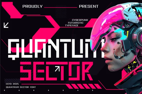
Modular stencil-cut cyberpunk & HUD techno display
Quantum Sector is a square-jawed cyberpunk techno sans featuring futuristic stencil cuts, directional arrow accents, and HUD geometry.
Ideas for this font
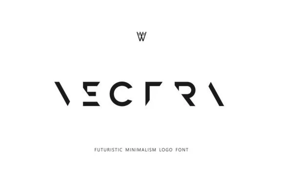
Deconstructed minimalist stencil & puzzle logo font
Vectra is an experimental futuristic logo font that strips each capital down to minimalist geometric strokes and negative-space angles.
Ideas for this font
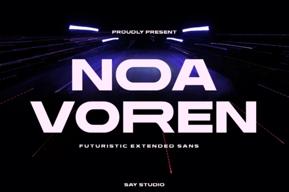
Wide extended futuristic & aerospace display grotesk
Noa Voren is a bold, wide-stance extended sans serif featuring stretched horizontal proportions and subtle speed-sliced diagonal cuts.
Ideas for this font
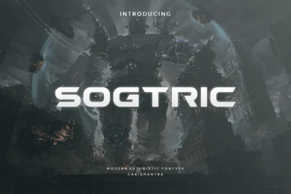
Wide geometric sans for futuristic display
Sogtric is a wide geometric sans in white caps over dark science-fiction city art: even stroke weight throughout, near-square counters and a flat-sided O that make it read as signage projected onto a night skyline rather than a text face.
Ideas for this font
Allow optional Google Analytics to measure visits and catalogue actions. Your search words and notes are not included. Privacy & storage