Editorial Serif Anchor

Lonely + Glofi
Anchors Lonely's fluid strokes with crisp Roman proportions on wedding suites, headers and packaging.
Inspect Glofi specimenDisclosure: MakerFileHub may earn a commission from qualifying purchases via paid links on this page. How our links work.
Monoline script for valentines
Lonely is a monoline script in black on cream: a light even stroke, tall open loops, a long level connector and a single tail that flicks out at the end, set as one word over a soft brush swash, with a wide-tracked label above and beneath.
Paid link
Get this fontProject & layout blueprintsAt-a-glance maker compatibility
Weld or Unite overlapping script joins into one continuous vector path before sending to the blade.
Visual anatomy & craft review
The word is set once and the drawing is a monoline script: the stroke is even, the loops are open, and the connectors run level between letters, which keeps a short word readable at almost any size. The tail at the end flicks outward, which gives the word its signature feel without a long flourish that would need extra space. Behind the word is a soft brush swash in a warm tone, which shows how the script behaves over a textured ground, and the wide-tracked labels above and beneath are set in a light serif. The palette is two tones on cream, and the small hearts and stars at the corners are line drawings rather than part of the face.
Script, monoline, romantic, simple
Two-font hierarchy recipes
Tested contrast partners — pairing Lonely with grounded secondary typography.
Lonely + Glofi
Anchors Lonely's fluid strokes with crisp Roman proportions on wedding suites, headers and packaging.
Inspect Glofi specimen
Lonely + Furion
Keeps small-scale dates, URLs, nutrition facts and care instructions crisp and legible below script titles.
Inspect Furion specimenPractical applications
Concrete hierarchy, scale and production guidance tailored to Lonely’s stroke geometry.
A monoline script reads as a written note, and the even stroke keeps the word legible on an A6 where a modulated script would thin out.
Hierarchy & layout recipe
A6 card: the phrase at 28 pt, the details in a 9 pt sans, and two small hearts. Keep 12 mm margins and print one ink on a pale card so the swash reads as a wash.
Pre-production check
Check the 28 pt phrase at home-print resolution, where a thin join can break; keep it above 0.5 mm. Confirm the 9 pt details keep a 4.5:1 contrast and that the hearts clear the trim.
A monoline script holds up in paint at sign scale because the stroke is even, and the single tail gives a board a drawn finish.
Hierarchy & layout recipe
A1 board: the greeting at 80 mm x-height, the names in a 34 mm serif, and the date at 22 mm. Keep 40 mm margins so the tail has room, and paint one colour on a light board.
Pre-production check
Check the board at four metres, where an even monoline can look flat; keep the stroke consistent. Confirm the 22 mm date reads from the door and that the tail stays inside the frame.
A monoline label reads as a personal product, and the even stroke prints cleanly on an uncoated sticker where a modulated script fills with fibre.
Hierarchy & layout recipe
Print a 55 by 80 mm label: the scent at 14 pt, the weight in a 6 pt sans, and the maker at 7 pt. Keep 4 mm inside the die and print one ink on a kraft stock.
Pre-production check
Check the 14 pt scent on kraft, where the even stroke can look flat; keep the ink dark. Confirm the 6 pt weight reads on the shelf and that the die clears the tail.
Technical & licence verification
Confirm included OTF/TTF/WOFF formats, full glyph tables and licence coverage on the live store page before batch production.
Closest visual alternatives
Matched across letterform anatomy, stroke behaviour and craft applications.
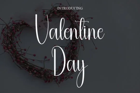
Tall hairline calligraphic script
Valentine Day is a tall hairline script in white on a dark page: very thin monoline letters with tall looping ascenders, small round bowls, a long descending tail on the y, and a heart-shaped wreath of wire and berries behind the words.
Ideas for this font
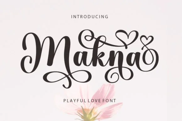
Bold playful script with heart flourishes
Makna is a playful love script in dark brown on white: bold rounded letters with curled terminals, a swash that turns into a heart above the word and loops that rise from the baseline, with a tracked caption below.
Ideas for this font
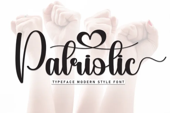
Fat monoline script with heart detail
Patriotic is a fat monoline script in black over a soft photograph of raised fists: a thick even stroke, a heart cut into the bowl of one letter, and a long connecting swash that runs under and over the word before curling away, with a tracked caption on a strip beneath.
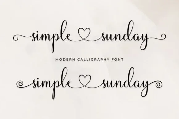
Fine monoline calligraphy script with connecting center heart & end curls!
Simple Sunday is a sweet monoline calligraphy script featuring built-in center heart connectors ('simple ♡ sunday') plus straight and spiral end tails!
Ideas for this font
Same independent foundry
Allow optional Google Analytics to measure visits and catalogue actions. Your search words and notes are not included. Privacy & storage