Modern Grotesque Body

Laghino + Memoir Slang
Creates crisp high-hierarchy contrast beneath Laghino headlines across menus, websites and labels.
Inspect Memoir Slang specimenDisclosure: MakerFileHub may earn a commission from qualifying purchases via paid links on this page. How our links work.
Heavy round mixed case with a long looping h descender
Laghino shows a heavy rounded serif mixed case in which the capital curls its entry, the bowls stay broad and a long extension from the h area drops into a low loop that returns with a ball end, while the g keeps a second enclosed descending bowl.
Paid link
Get this fontProject & layout blueprintsAt-a-glance maker compatibility
Sturdy stroke walls and open counters weed cleanly on adhesive vinyl, HTV apparel film, and cut cardstock.
Visual anatomy & craft review
The capital L curls at its entry, the bowls round out on a substantial weight, the h sends a long extension below the baseline and the loop returns with a rounded ball, and the g closes its own descending bowl beside it. The low loop is the character: it makes a short word feel handwritten without becoming a script, which is why the sample sets a name over an archival scene. Because the loop travels, keep 24 mm beneath and 18 mm at each end from 28 pt, and the ball terminal needs its own space.
Heavy · Rounded · Looped
Two-font hierarchy recipes
Tested contrast partners — pairing Laghino with grounded secondary typography.
Laghino + Memoir Slang
Creates crisp high-hierarchy contrast beneath Laghino headlines across menus, websites and labels.
Inspect Memoir Slang specimen
Laghino + Stylish
Adds a warm human signature touch for 1-to-3-word callouts without competing against structured serif capitals.
Inspect Stylish specimenPractical applications
Concrete hierarchy, scale and production guidance tailored to Laghino’s stroke geometry.
The heavy rounded serif suits a pantry label, and the low loop gives the name a warm finish at 20 pt on a 55 mm panel. The heavy weight also keeps the loop solid on a small label.
Hierarchy & layout recipe
Print a 55 by 45 mm label: set the name at 20 pt, keep 10 mm beneath for the loop, and set the weight in a 6 pt caps at the foot with 5 mm of clear ground. Keep the jar label square.
Pre-production check
A ball terminal printed under 2 mm looks like a smudge; check the plate proof and keep the name at 20 pt or above.
The looped serif softens a rustic suite, and the heavy bowls keep two names readable at 24 pt on heavy card stock in one ink. The loop gives the two names a single soft gesture.
Hierarchy & layout recipe
Print a 130 by 180 mm card: set the names at 24 pt, keep 20 mm beneath for the h loop, and set the venue at 9 pt in a light serif with 14 mm of clear space below the loop. Keep the loop clear of any rule.
Pre-production check
A loop printed into the venue line collides with it; check the card and keep 18 mm of clear ground. Test the names on one card first.
The curled entry gives a craft feature a warm opening, and the broad bowls hold a one-word title at 56 pt across a spread. The entry curl also brightens a plain editorial title.
Hierarchy & layout recipe
Print a 210 mm spread: set the title at 56 pt, keep 26 mm beneath the loop before the standfirst at 10 pt, and keep the block on the outer margin of the page. Keep the title inside the column.
Pre-production check
A loop reaching into the image area loses its ball end; check the page and keep the title on the plain column.
Technical & licence verification
Confirm included OTF/TTF/WOFF formats, full glyph tables and licence coverage on the live store page before batch production.
Closest visual alternatives
Matched across letterform anatomy, stroke behaviour and craft applications.
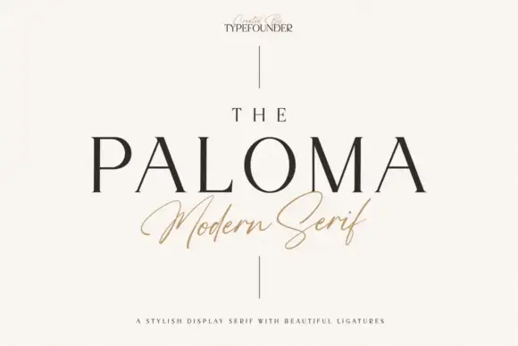
Display serif with ligatures
The Paloma is a display serif in near-black on warm white: high contrast, fine hairline serifs, a wide bowl and a tall ascender, with one word in a light italic script beneath and a tracked line under that, both flanked by a thin vertical rule.
Ideas for this font

Display serif with slanted accent
The Lumina Awesome is a display serif in cream over a close portrait: a light slanted line in mixed case above, and a substantial upright caps line beneath at a larger size, with a tracked note at the top left and a bracketed line at the foot naming the count of cuts.
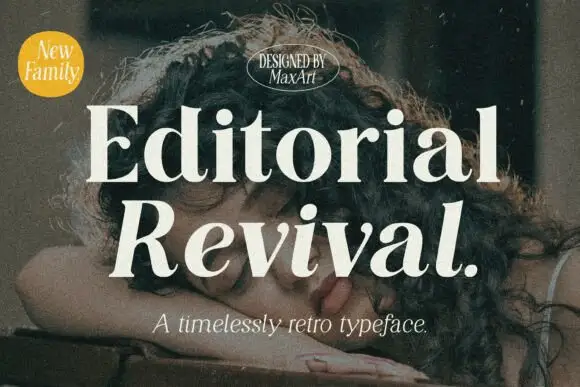
Substantial upright serif title paired with a bold slanted lower word
Editorial Revival shows pale two-line lettering over a dark portrait, where Editorial stands upright with broad bowls and sharp serif tips while Revival below leans strongly right and ends in a large full stop, and smaller slanted supporting text repeats the same direction beneath.

Open serif with softly irregular edges and flaring diagonals
Kernova Serif is a modern serif in which the bowls stay open, the contrast sits at a middle range and the edges of the stems and feet carry a soft irregularity, so a line reads as a quietly weathered classic rather than a crisp didone.
Ideas for this font
Same independent foundry
Allow optional Google Analytics to measure visits and catalogue actions. Your search words and notes are not included. Privacy & storage