Editorial Serif Anchor

La Rambla + Auretha
Anchors La Rambla's fluid strokes with crisp Roman proportions on wedding suites, headers and packaging.
Inspect Auretha specimenDisclosure: MakerFileHub may earn a commission from qualifying purchases via paid links on this page. How our links work.
Fine tall separate lettering with a hairline geometric skeleton
La Rambla is fine separate lettering built on a geometric skeleton, with tall narrow letters, hairline strokes of even weight and generous gaps, so a word reads as light construction lines rather than handwriting.
Paid link
Get this fontProject & layout blueprintsAt-a-glance maker compatibility
Set Cricut or Silhouette operation to Pen, Foil Quill, or Laser Score — not Basic Blade Cut.
Visual anatomy & craft review
Nothing connects. Each letter is drawn as a thin even line: the capital L is a plain vertical with a short foot, the a is a circle plus a straight stem, and the R repeats that circle with a short leg, so the word reads as if it were drafted with a ruler. The ascenders on the b and the l run well above the x-height and keep a hairline square top, and the counters stay wide and open. Spacing is wider than a text face would use, which is what gives the phrase its airy, architectural quality, and the baseline is perfectly level. The ends are cut square and never taper. The pale wood background, the coffee cup and the two tracked caps labels are presentation; the lettering is the two words.
Fine · Tall · Geometric
Two-font hierarchy recipes
Tested contrast partners — pairing La Rambla with grounded secondary typography.
La Rambla + Auretha
Anchors La Rambla's fluid strokes with crisp Roman proportions on wedding suites, headers and packaging.
Inspect Auretha specimen
La Rambla + Hermano
Keeps small-scale dates, URLs, nutrition facts and care instructions crisp and legible below script titles.
Inspect Hermano specimenPractical applications
Concrete hierarchy, scale and production guidance tailored to La Rambla’s stroke geometry.
A hairline geometric skeleton reads as a drawing rather than a logo, which is exactly the register a small architecture practice wants, and the generous spacing keeps the mark light on a drawing sheet.
Hierarchy & layout recipe
Set the studio name at 16 pt at the foot of an A1 sheet, keep the drawing number in a 6 pt mono at the top right, and hold 20 mm of clear space so the hairlines are not lost against the drawing.
Pre-production check
A 0.1 mm hairline will not reproduce on a plotter at A1; test a plot at final size and take the lettering up to 18 pt if the strokes break.
Thin geometric lettering opens a section without shouting, and the wide spacing lets a long title act as a rule across the top of the page, which no dense script can do.
Hierarchy & layout recipe
Set the section title at 36 pt across a 170 mm measure, keep the page folio in a 8 pt grotesque, and align the lettering's square ends with the column edges so the spacing reads as deliberate.
Pre-production check
Hairlines on coated stock can disappear under a varnish; proof one page with the intended finishing and confirm the lettering still reads on the press sheet.
A fine geometric hand looks contemporary against a plain menu, and the wide spacing keeps a long venue name readable without a second typeface or a rule system.
Hierarchy & layout recipe
Set the venue name at 20 pt across the head of an A5 menu, keep the courses in a light serif at 9 pt, and leave 12 mm between the header and the first course so the open counters have room.
Pre-production check
Thin lettering over a printed photograph loses definition; check the proof against the actual image and place the header on a plain band if the strokes start to vanish.
Technical & licence verification
Confirm included OTF/TTF/WOFF formats, full glyph tables and licence coverage on the live store page before batch production.
Closest visual alternatives
Matched across letterform anatomy, stroke behaviour and craft applications.
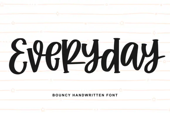
Heavy bouncing marker lettering
Everyday is a heavy monoline marker alphabet with a bouncing baseline, mixed case and rounded joins that keep the word feeling quickly written.
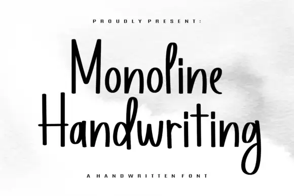
Tall narrow monoline hand
Monoline Handwriting is a tall narrow hand in black on white: fine even strokes, high ascenders, a small x-height and a quick forward rhythm that keeps an eleven-letter word inside a card.
Ideas for this font
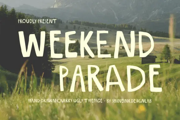
Narrow hand-drawn upright capitals
Weekend Parade is a set of tall narrow hand-drawn capitals with uneven stems, open counters and a baseline that drifts across the length of the line.
Ideas for this font
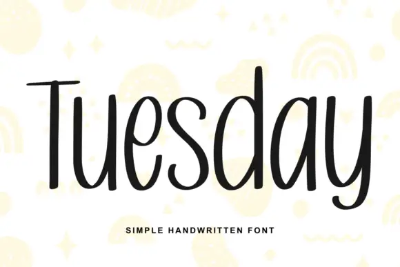
Simple unjoined handwriting with a light bounce
Tuesday is a simple handwritten face in black on white: a monoline, unjoined hand with tall ascenders, circular bowls and a slight bounce along the line, shown over pale yellow doodles of rainbows, stars and squiggles.
Ideas for this font
Allow optional Google Analytics to measure visits and catalogue actions. Your search words and notes are not included. Privacy & storage