Editorial Serif Anchor

Everyday + Kernova
Anchors Everyday's fluid strokes with crisp Roman proportions on wedding suites, headers and packaging.
Inspect Kernova specimenDisclosure: MakerFileHub may earn a commission from qualifying purchases via paid links on this page. How our links work.
Heavy bouncing marker lettering
Everyday is a heavy monoline marker alphabet with a bouncing baseline, mixed case and rounded joins that keep the word feeling quickly written.
Paid link
Get this fontProject & layout blueprintsAt-a-glance maker compatibility
Weld or Unite overlapping script joins into one continuous vector path before sending to the blade.
Visual anatomy & craft review
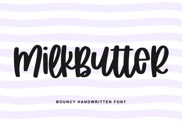
The specimen is one word set large on lined notepaper, which flatters the hand-drawn rhythm: letters rise and dip by roughly a tenth of the x-height, the E is drawn as a capital despite the mixed-case word, and the joins between letters stay open rather than touching. Stroke width is even and thick, with blunt rounded terminals, so the face reads as marker rather than as brush. Counters are wide in e, a and y, which is what keeps it legible at small sizes despite the bounce. The ruled paper and the tracked caption under the word are context and a label line respectively, not part of the alphabet.
Bouncy · Marker · Friendly
Two-font hierarchy recipes
Tested contrast partners — pairing Everyday with grounded secondary typography.
Everyday + Kernova
Anchors Everyday's fluid strokes with crisp Roman proportions on wedding suites, headers and packaging.
Inspect Kernova specimen
Everyday + Saltriver Grotesk
Keeps small-scale dates, URLs, nutrition facts and care instructions crisp and legible below script titles.
Inspect Saltriver Grotesk specimenPractical applications
Concrete hierarchy, scale and production guidance tailored to Everyday’s stroke geometry.
The bouncing baseline reads as friendly handwriting rather than as signage, which suits a primary classroom door where the tone matters as much as the words.
Hierarchy & layout recipe
Set the phrase at 1.5-inch height on an A4 sheet, keep it to two words, and let the bounce show only across the second word so the first stays easy to read from the corridor.
Pre-production check
At door size the even stroke is fine, but check the y descender against the frame; it drops lower than the other letters.
Even marker weight survives chalk and wipe-down boards better than a high-contrast script, and the bounce suits a hand-written board.
Hierarchy & layout recipe
Write the header at 3-inch height across the top third of the board, keep the price list in a small plain face beneath, and leave 5 cm between the two zones.
Pre-production check
Chalk thickens every stroke, so a monoline face can close its counters; test the a and e first.
The quickly written feel sets a relaxed tone that a formal script would overstate for a casual celebration with friends in a garden.
Hierarchy & layout recipe
Print the sign at 2-inch height on A3 card, keep the phrase to three words, and centre it slightly high so the lower descenders have room above the stand.
Pre-production check
Mixed case with a capital E in the middle of a word is a stylistic decision; keep your own wording consistent or the bounce will read as a typo.
Technical & licence verification
Confirm included OTF/TTF/WOFF formats, full glyph tables and licence coverage on the live store page before batch production.
Closest visual alternatives
Matched across letterform anatomy, stroke behaviour and craft applications.
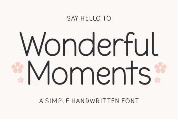
Thin rounded handwritten sans
Wonderful Moments is a thin rounded handwritten sans set in mixed caps: wide open letterforms, a light even stroke with rounded terminals and a small bounce that keeps the line from feeling ruled.
Ideas for this font
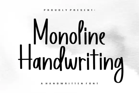
Tall narrow monoline hand
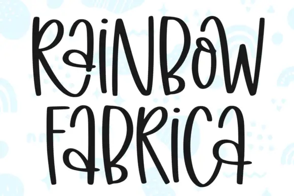
Monoline Handwriting is a tall narrow hand in black on white: fine even strokes, high ascenders, a small x-height and a quick forward rhythm that keeps an eleven-letter word inside a card.
Ideas for this font
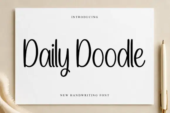
Narrow upright handwriting with tall ascenders and a soft even stroke
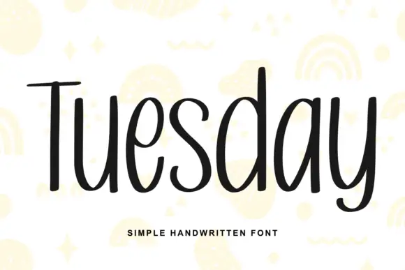
Daily Doodle is narrow upright handwriting in which the ascenders run tall, the stroke stays soft and even, and the letters stand apart at a gentle rhythm.
Ideas for this font
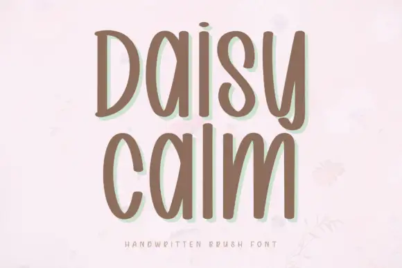
Soft brush capitals with a gentle bounce
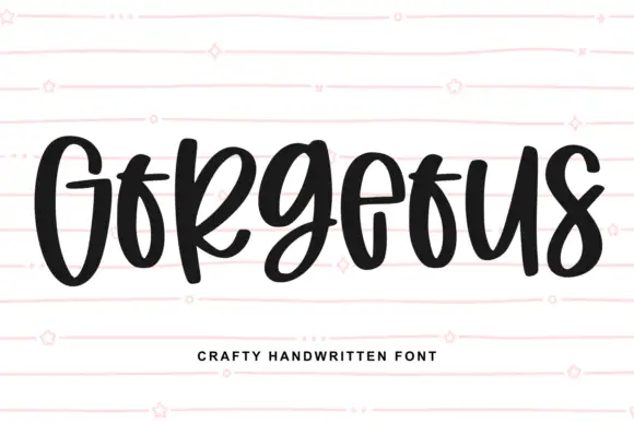
Daisy Calm is a soft brush alphabet drawn with thick rounded strokes and a gentle bounce, set here in two lines of capitals that keep an even, unhurried rhythm.
Ideas for this font
Same independent foundry
Allow optional Google Analytics to measure visits and catalogue actions. Your search words and notes are not included. Privacy & storage