Neutral Sans Workhorse

Kingching + Inkora
Lets Kingching own the focal silhouette while handling secondary copy, sizing and subheads cleanly.
Inspect Inkora specimenDisclosure: MakerFileHub may earn a commission from qualifying purchases via paid links on this page. How our links work.
Ornate royal manuscript blackletter (Uppercase + Lowercase)
Kingching ('Aaksaraan KINGCHING') is a regal Old-English blackletter pairing lushly flourished uppercase capitals with tall cathedral lowercase!
Paid link
Get this fontProject & layout blueprintsAt-a-glance maker compatibility
Weld or Unite overlapping script joins into one continuous vector path before sending to the blade.
Visual anatomy & craft review
Kingching is a regal Old-English blackletter in upper and lower case, with lushly flourished capitals, tall cathedral lowercase and a heavy even weight that keeps a word solid at 25 mm. The capitals are ornamental set-pieces while the lowercase is the working part, tightly knit but open enough to read at 14 pt in print. It is a title and label face rather than a text face, and it is at its best in one antique gold or bone ink on a dark ground, or as a deboss on leather and card.
Royal-cathedral · Ornate-capitals · Heraldic-gold
Two-font hierarchy recipes
Tested contrast partners — pairing Kingching with grounded secondary typography.
Kingching + Inkora
Lets Kingching own the focal silhouette while handling secondary copy, sizing and subheads cleanly.
Inspect Inkora specimen
Kingching + Raffined
Grounds bold display lettering with classic typographic authority on posters, badges and apparel.
Inspect Raffined specimenPractical applications
Concrete hierarchy, scale and production guidance tailored to Kingching’s stroke geometry.
Old-English capitals read as a mark stamped into leather or printed on an old label, which is what a heritage brand is imitating. The even weight holds a short product name at 12 mm on a tin.
Hierarchy & layout recipe
Label 70 x 100 mm, name 16 mm, data 5/7 pt, 5 mm top arc. Tin 75 x 100 mm, name 14 mm, brewing 5.5 pt. Patch 70 x 40 mm, word 8 mm, 4 mm deboss border.
Pre-production check
Leather patches are debossed and a flourished capital under 1.5 mm fills in the press. Request a 1:1 emboss proof, and use the plain lowercase for patches if the flourish closes.
Cathedral lowercase gives a historical edition the right period density, and the flourished capitals can carry an initial at display size. Heavy weight survives uncoated text stock.
Hierarchy & layout recipe
Jacket 152 x 229 mm, title 54 pt, author 16 pt, 18 mm margins, spine 9 pt. Title page 170 x 240 mm, initial 120 pt, body 11/16 pt. Poster 500 x 700 mm, title 220 mm, imprint 16/22 pt.
Pre-production check
A spine at 9 pt closes a tight blackletter into a grey bar. Check the spine at shelf distance, and substitute a plain condensed for the spine while keeping the display face on the cover.
Manuscript letterforms suit a ceremony in an old building, and the flourished capitals give a couple an ornamental mark without a monogram. The lowercase keeps a long name readable.
Hierarchy & layout recipe
Invitation 120 x 180 mm, names 24 pt, details 9/13 pt, 15 mm margins. Service card A5, headings 15 pt, hymns 8.5/12 pt. Seal 40 mm round, initials 24 pt.
Pre-production check
A wax seal stamp needs 1.5 mm of relief and a tight blackletter under 2 mm closes in the wax. Cut one stamp and press three seals before approving the design.
Technical & licence verification
Confirm included OTF/TTF/WOFF formats, full glyph tables and licence coverage on the live store page before batch production.
Closest visual alternatives
Matched across letterform anatomy, stroke behaviour and craft applications.
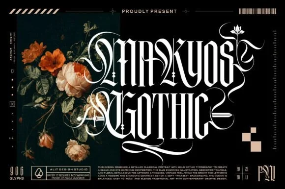
Ornate blackletter with filigree swashes
Makyos Gothic is an ornate blackletter in white on black: heavy spiked stems, hairline filigree woven through the counters, and long swashes that curl out of the first and last letters, shown beside dark blooms and studio marks.
Ideas for this font
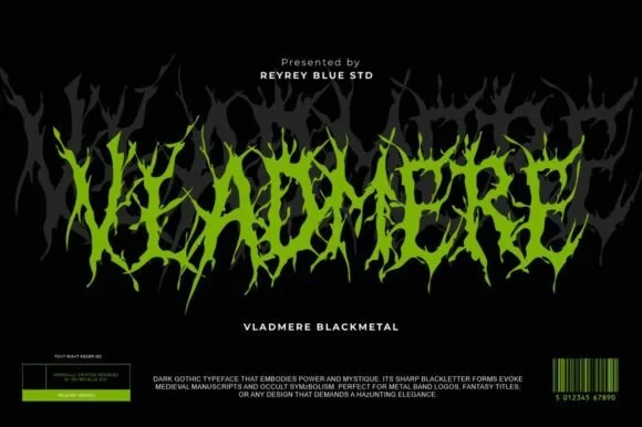
Black-metal jagged logo display
Vladmere is a black-metal logo face in lime green on black: letters built from thin jagged blades that lean and intersect, a mirrored grey copy behind the word, and a barcode-style badge at the foot that gives the specimen the look of a record sleeve.
Ideas for this font
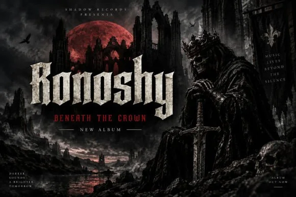
Sharp blackletter with stone texture
Ronoshy is a blackletter display in bone white on a dark gothic scene: tall spiked capitals with hairline joins and sharp terminals, textured like carved stone, set above a red subtitle in a small rounded capital face.
Ideas for this font
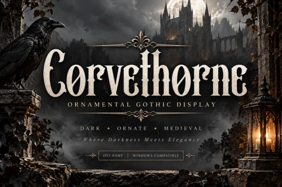
Raven-gothic ornamental blackletter with diamond counter flourishes
Corvethorne is a tall, condensed ornamental gothic display font accented with interior diamond crosshairs and curled medieval spurs.
Ideas for this font
Same independent foundry
Allow optional Google Analytics to measure visits and catalogue actions. Your search words and notes are not included. Privacy & storage