Modern Grotesque Body

Kicela + Headline
Creates crisp high-hierarchy contrast beneath Kicela headlines across menus, websites and labels.
Inspect Headline specimenDisclosure: MakerFileHub may earn a commission from qualifying purchases via paid links on this page. How our links work.
Heavy contrasting capitals with a low K sweep and joined-looking CE
Kicela shows dark capitals with thick upright stems, fine joins and sharp flared ends, where the K leg sweeps beneath the I and a thin curved stroke runs from the C area into the E crossbar.
Paid link
Get this fontProject & layout blueprintsAt-a-glance maker compatibility
Sturdy stroke walls and open counters weed cleanly on adhesive vinyl, HTV apparel film, and cut cardstock.
Visual anatomy & craft review
The stems stay heavy, the joins thin to a hairline, the ends flare and two strokes travel across letters to suggest a link. That simulated interlace is the character: the word reads as a joined monogram without any automated ligature, which is why the sample keeps one short name over a plain field. The composition demonstrates a look rather than an alternate inventory, so check whether the linking strokes exist as characters and keep 30 pt before the hairlines thin out.
Heavy caps · Interlaced · Flared ends
Two-font hierarchy recipes
Tested contrast partners — pairing Kicela with grounded secondary typography.
Kicela + Headline
Creates crisp high-hierarchy contrast beneath Kicela headlines across menus, websites and labels.
Inspect Headline specimen
Kicela + Farmhouse
Adds a warm human signature touch for 1-to-3-word callouts without competing against structured serif capitals.
Inspect Farmhouse specimenPractical applications
Concrete hierarchy, scale and production guidance tailored to Kicela’s stroke geometry.
The interlaced caps give a label a monogram feel, and the heavy stems hold a short name at 26 pt on a card, where the hairline joins still survive a single-colour print.
Hierarchy & layout recipe
Print an 85 by 55 mm card: set the wordmark at 26 pt on one row, keep 16 mm of clear ground beneath for the sweeping leg, and set the address at 7 pt in a plain sans at the foot.
Pre-production check
A hairline join printed at 20 pt breaks into dots; check the proof and keep the wordmark at 24 pt or above.
The interlaced caps set a typography title, and the flared ends hold a one-word heading at 64 pt on a spread, with the fine joins kept on the palest part of the page.
Hierarchy & layout recipe
Print a 210 mm spread: set the title at 64 pt on one row, keep 22 mm beneath before the standfirst at 10 pt, and keep the hairlines on the palest part of the page.
Pre-production check
Fine joins over a tinted ground vanish; check the printed spread at full size and keep the title on a white or very pale field.
The joined look suits a monogram invitation, and the heavy caps hold two initials at 34 pt on heavy card, where the crossing stroke needs room to read as a link.
Hierarchy & layout recipe
Print a 105 by 148 mm card: set the initials at 34 pt as the only display element, keep 24 mm of clear ground beneath before the date at 9 pt, and centre the block optically.
Pre-production check
Two interlaced letters at 24 pt turn into one shape; check the card and keep the pair at 30 pt or above.
Technical & licence verification
Confirm included OTF/TTF/WOFF formats, full glyph tables and licence coverage on the live store page before batch production.
Closest visual alternatives
Matched across letterform anatomy, stroke behaviour and craft applications.
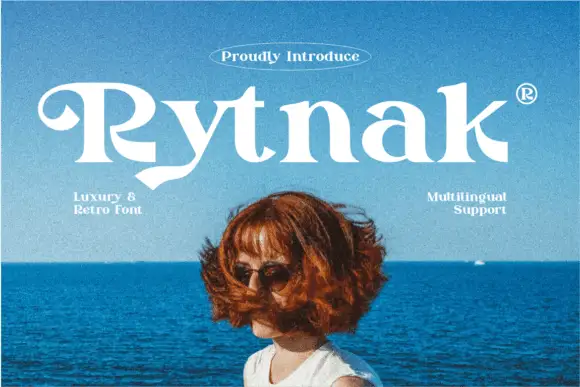
Heavy retro serif
Rytnak is a heavy retro serif in white over a photograph of a figure against a blue sea: fat stems, a hooked R, a pointed y tail and wide bowls, set as one word with a tracked line above in an oval rule and two small notes at the sides.
Ideas for this font

Fine mixed case with crossing e strokes and overlapping round bowls
Creatoon sets pale high-contrast mixed case over a warm portrait, where the C opens a broad bowl, a long diagonal crosses the first e and the two o shapes overlap near the end of the word.
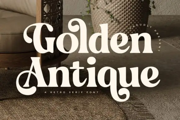
Retro serif with bulbous ball terminals and a swash tail
Golden Antique is a retro serif in which the stems swell, the terminals turn into balls and the final letter drops a swash, so a two-word title reads as a 1970s record sleeve rather than as a classical serif.
Ideas for this font
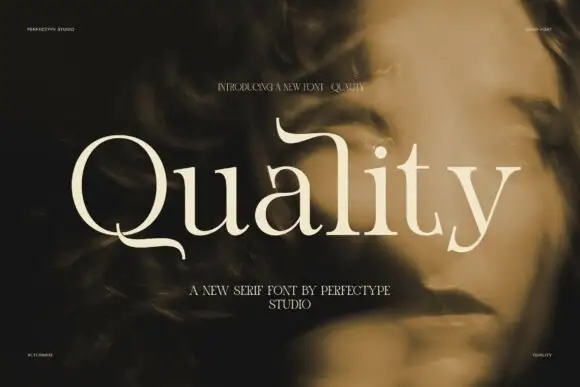
Light display serif with drawn terminals
Quality is a light display serif in cream over a shadowed portrait: mixed case with a bent Q tail that curls beneath the following letter, an extended upper stroke on the l, high contrast and fine joins, set as one large word with a small line above and two lines beneath.
Ideas for this font
Same independent foundry
Allow optional Google Analytics to measure visits and catalogue actions. Your search words and notes are not included. Privacy & storage