Neutral Sans Workhorse

Kawaii Spooky + Clyne Sans
Lets Kawaii Spooky own the focal silhouette while handling secondary copy, sizing and subheads cleanly.
Inspect Clyne Sans specimenDisclosure: MakerFileHub may earn a commission from qualifying purchases via paid links on this page. How our links work.
Soft irregular mixed case with varied Halloween faces, skulls, candle and stitched details
Kawaii Spooky shows two bright mixed-case rows on black, where rounded swollen letters carry different seasonal details, from ghost-like faces and small skulls to a candle shape and stitched marks, with the colour changing from letter to letter across the word.
Paid link
Get this fontProject & layout blueprintsAt-a-glance maker compatibility
Weld or Unite overlapping script joins into one continuous vector path before sending to the blade.
Visual anatomy & craft review
The bodies stay soft and round, each letter wears its own detail, the colours shift and the faces sit inside the strokes. That per-letter detail is the character: the word reads as a row of friendly characters rather than a themed texture, which is why the sample needs a black ground. The colour changes and the surrounding web and bat are cover elements, so check the actual decorated glyphs before writing a phrase and keep 44 pt so the small faces stay readable.
Soft irregular mixed case with varied Halloween faces, skulls, candle and stitched details
Two-font hierarchy recipes
Tested contrast partners — pairing Kawaii Spooky with grounded secondary typography.
Kawaii Spooky + Clyne Sans
Lets Kawaii Spooky own the focal silhouette while handling secondary copy, sizing and subheads cleanly.
Inspect Clyne Sans specimen
Kawaii Spooky + Bulgary
Grounds bold display lettering with classic typographic authority on posters, badges and apparel.
Inspect Bulgary specimenPractical applications
Concrete hierarchy, scale and production guidance tailored to Kawaii Spooky’s stroke geometry.
The soft seasonal caps suit a light-hearted card, and the rounded bodies hold a short greeting at 32 pt on an A6 sheet, where the small faces read at arm's length.
Hierarchy & layout recipe
Print an A6 card: set the greeting at 32 pt on one row, keep 18 mm of clear ground beneath before the details at 11 pt, and keep the card black so the bright letters stay vivid.
Pre-production check
Face details under 3 mm close up on a small card; check the proof and hold the greeting at 28 pt or above.
The rounded caps give a favour tag charm, and the soft forms hold a name at 24 pt on a 45 by 70 mm tag, where the stitched marks survive a die cut.
Hierarchy & layout recipe
Print a 45 by 70 mm tag: set the name at 24 pt on one row, keep 10 mm of clear ground beneath for the detail, and keep 7 mm to the punch hole so the tag holds.
Pre-production check
Check which letters carry a face; two decorated letters in a short name are enough at this size.
The friendly letters read across a room, and the rounded mass holds a two-word sign at 50 mm on a printed board, where the seasonal details are visible from a distance.
Hierarchy & layout recipe
Print a 600 by 300 mm board: set the sign at 50 mm on one row, keep 22 mm of clear ground beneath before the times at 14 pt, and keep 24 mm of border so the round flanks are not trimmed.
Pre-production check
The colour changes may be applied per glyph; check the file before quoting a multi-colour print.
Technical & licence verification
Confirm included OTF/TTF/WOFF formats, full glyph tables and licence coverage on the live store page before batch production.
Closest visual alternatives
Matched across letterform anatomy, stroke behaviour and craft applications.
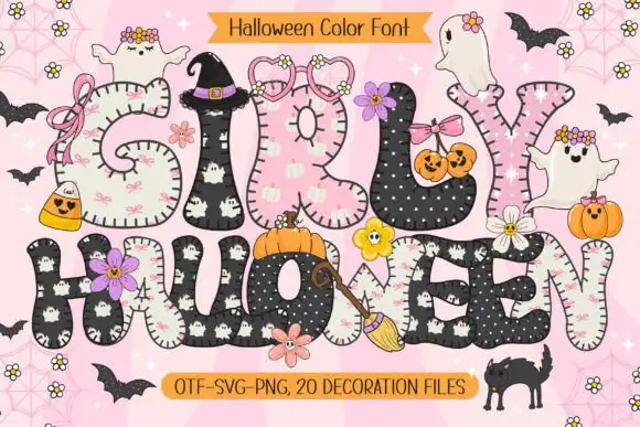
Rounded patchwork letters with pink motifs and small Halloween figures
Girly Halloween sets fat colour capitals in two treatments — cream with tiny black ghosts, and black with white dots — and dresses every letter with a bow, a flower, a pumpkin or a friendly ghost.
Ideas for this font
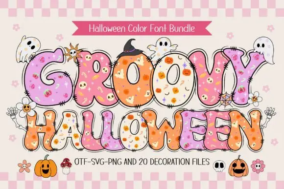
Bulging pastel capitals patterned with tiny playful Halloween symbols
Groovy Halloween is a colour font bundle in which fat rounded letters carry a cross-stitched edge, a pastel fill dotted with small Halloween drawings, and a whole sheet of matching decorations.
Ideas for this font
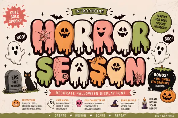
Bubble horror letters with faces and webs
Horror Season mixes puffy capitals with melting lower edges and face-shaped counters, where webs, cracks and small creature details appear inside selected letter bodies and the title is multicoloured with a heavy outline.
Ideas for this font
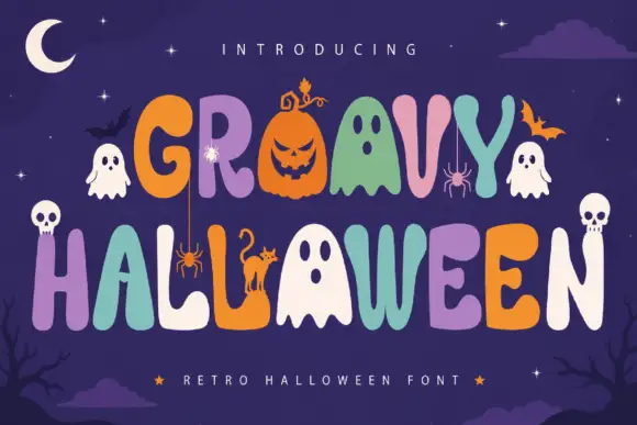
Playful multicolour caps with picture substitutions for letters
Groovy Halloween is a playful capital alphabet in which rounded letters sit in a bouncing row and several characters are replaced by drawn pumpkins, ghosts and skulls, so a two-word greeting reads as a decorated banner.
Same independent foundry
Allow optional Google Analytics to measure visits and catalogue actions. Your search words and notes are not included. Privacy & storage