High-Contrast Display Serif

Introvert + Evoire
Pairs sculptural editorial warmth with Introvert's clean modern geometry.
Inspect Evoire specimenDisclosure: MakerFileHub may earn a commission from qualifying purchases via paid links on this page. How our links work.
Bouncy rounded script with a separate tall print companion
Introvert is a duo: a bouncy rounded script and a separate print file drawn to the same height, so capitals and lowercase can be swapped across the two without a change of tone.
Paid link
Get this fontProject & layout blueprintsAt-a-glance maker compatibility
Weld or Unite overlapping script joins into one continuous vector path before sending to the blade.
Visual anatomy & craft review
The cover stacks three voices from one family on a cream ground: introvert in a dark grey lowercase script that drops and lifts letter by letter, INTROVERT in the same script but in capitals at an even height, and a third lighter line reading playful font duo with a small teal doodle at the end. Below that a tracked line explains the system, MIX SCRIPT & SANS, CAPS & LOWERCASE, which is the practical point: because the sans is a second file rather than an OpenType alternate, a designer without feature access can still reach every variant by switching fonts. The rainbow outline and the round badge at the top are cover decoration, and the bounce in the script is deliberate rather than a defect of the baseline.
Cozy · Bouncy · Paired
Two-font hierarchy recipes
Tested contrast partners — pairing Introvert with grounded secondary typography.
Introvert + Evoire
Pairs sculptural editorial warmth with Introvert's clean modern geometry.
Inspect Evoire specimen
Introvert + I Heart You
Introduces organic movement on pull-quotes, signatures and gift tags.
Inspect I Heart You specimenPractical applications
Concrete hierarchy, scale and production guidance tailored to Introvert’s stroke geometry.
Two files at the same height let a stationery range put a bouncy title on a notebook and a plain note on the pages inside while keeping the range reading as one family.
Hierarchy & layout recipe
Set the notebook cover title at 30 pt in the script, keep the inside running head in the sans at 9 pt, and hold the bounce to one word per title so the cover still reads at a glance on a shelf.
Pre-production check
Because the sans is a separate file, check the two heights side by side: a mixed line drawn from both files can drift by a point if the sizes are set by eye.
A separate sans means every sticker can carry a legible word and a decorative one from the same family, which suits a sheet that has to look varied but coherent on a single die page.
Hierarchy & layout recipe
Set the short prompts in the sans at 7 pt and the decorative labels in the script at 12 pt, keep a 3 mm gap between stickers for the die cut, and repeat the same three-word vocabulary across the sheet.
Pre-production check
Small die-cut stickers lose fine hairlines; test the sheet once at the real size, since the script's joins are the first thing to break at 7 pt.
A cozy script for the day heading and a plain sans for the tasks gives a planner two clear roles, and the separate file means both come from the same drawing rather than two unrelated fonts.
Hierarchy & layout recipe
Set the day name in the script at 18 pt at the head of each column, keep the task lines in the sans at 9 pt on a 6 mm baseline grid, and leave the margins plain so the pencilled notes have a quiet ground.
Pre-production check
Check the sans numerals against the printed rules: figures drawn for display often sit slightly high on a text baseline and will look like they are floating.
Technical & licence verification
Confirm included OTF/TTF/WOFF formats, full glyph tables and licence coverage on the live store page before batch production.
Closest visual alternatives
Matched across letterform anatomy, stroke behaviour and craft applications.
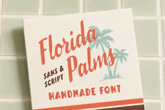
Hand-painted script paired with a sturdy all-caps sans
Florida Palms matches a relaxed hand-painted script with a sturdy all-caps sans, and ships textured versions of both so the pair can look screen-printed rather than digitally clean.
Ideas for this font
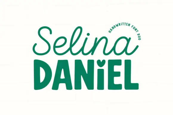
Handwritten script paired with a chunky sans
Selina Daniel is a handwritten duo in green on off-white: a monoline script with open loops on the first word, and a chunky rounded sans in caps for the second, with a small heart set into the counter of one letter, so the pair covers a name and a label in one voice.
Ideas for this font
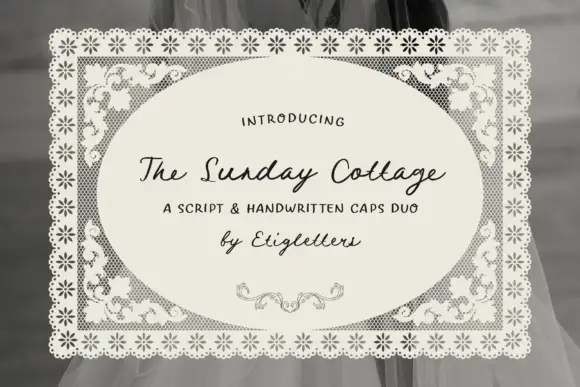
Script with handwritten caps
The Sunday Cottage is a duo on a lace-bordered label: a slanted connected script for the name and a loose handwritten capital set for the supporting line, with a small drawn flourish beneath.
Ideas for this font
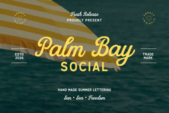
Summer script with an upright block companion
Palm Bay Social is a duo on a sunlit water photograph: a casual looped script in golden yellow for the place name and a plain uppercase block line beneath it, with small tracked proofs and stamps around the edges.
Same independent foundry
Allow optional Google Analytics to measure visits and catalogue actions. Your search words and notes are not included. Privacy & storage