High-Contrast Display Serif

The Sunday Cottage + Mewah
Pairs sculptural editorial warmth with The Sunday Cottage's clean modern geometry.
Inspect Mewah specimenDisclosure: MakerFileHub may earn a commission from qualifying purchases via paid links on this page. How our links work.
Script with handwritten caps
The Sunday Cottage is a duo on a lace-bordered label: a slanted connected script for the name and a loose handwritten capital set for the supporting line, with a small drawn flourish beneath.
Paid link
Get this fontProject & layout blueprintsAt-a-glance maker compatibility
Sturdy stroke walls and open counters weed cleanly on adhesive vinyl, HTV apparel film, and cut cardstock.
Visual anatomy & craft review
The script line is the headline: connected lower case with a light forward slant, a tall T at the start and a final e that turns out into a short tail, all in near-black on a cream ground. The second line is the partner face, an upright handwritten capital set with uneven spacing between the letters, which is what makes the pair look hand-lettered rather than typeset. A third line in the script at half the size shows how the face behaves as a caption, and a drawn flourish closes the block. The whole thing sits inside an oval label with a scalloped lace border over a monochrome photograph, so the specimen reads as a printed card rather than a font sheet. The duo is built for stationery and small brands: the script carries the name, the caps carry the explanation, and both share one ink.
A slanted script paired with loose capitals
Two-font hierarchy recipes
Tested contrast partners — pairing The Sunday Cottage with grounded secondary typography.
The Sunday Cottage + Mewah
Pairs sculptural editorial warmth with The Sunday Cottage's clean modern geometry.
Inspect Mewah specimen
The Sunday Cottage + Wishful Women
Introduces organic movement on pull-quotes, signatures and gift tags.
Inspect Wishful Women specimenPractical applications
Concrete hierarchy, scale and production guidance tailored to The Sunday Cottage’s stroke geometry.
The pair covers the names and the practical line in one purchase, and the cap set keeps the venue readable where a script alone would blur.
Hierarchy & layout recipe
Print a 120 by 170 mm invitation: set the names at 28 pt in the script, set the venue at 9 pt in the caps with 16 mm of clear ground between, and hold 15 mm of margin on all sides.
Pre-production check
Two faces at very different weights can fight on one card; print one invitation at the finished size and check the ratio before the suite.
A script over a loose capital line looks like a shop sign painted by hand, which is the impression a small country shop wants to give.
Hierarchy & layout recipe
Print a 90 by 60 mm label: set the shop name at 17 pt in the script, set the line at 6.5 pt in the caps with 6 mm of clear ground, and hold 5 mm of margin on all sides.
Pre-production check
Handwritten capitals can look like an error when small; print one label at the real size and check the spacing before the order.
A card with a script name and a capital line reads as printed stationery rather than a programme, and the pair does it without a third font.
Hierarchy & layout recipe
Print an A5 cover: set the heading at 30 pt in the script, set the date line at 10 pt in the caps with 18 mm of clear ground, and hold 14 mm of margin on all sides.
Pre-production check
The script tail can collide with the cap line below; print one cover at the finished size and check the gap before the run.
Technical & licence verification
Confirm included OTF/TTF/WOFF formats, full glyph tables and licence coverage on the live store page before batch production.
Closest visual alternatives
Matched across letterform anatomy, stroke behaviour and craft applications.
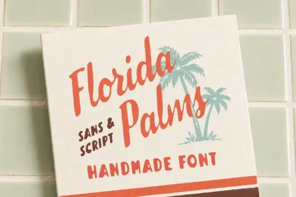
Hand-painted script paired with a sturdy all-caps sans
Florida Palms matches a relaxed hand-painted script with a sturdy all-caps sans, and ships textured versions of both so the pair can look screen-printed rather than digitally clean.
Ideas for this font
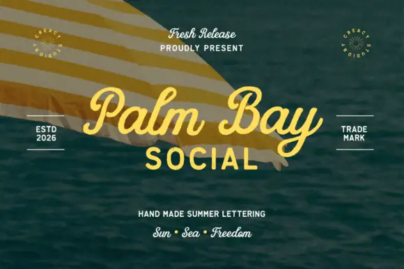
Summer script with an upright block companion
Palm Bay Social is a duo on a sunlit water photograph: a casual looped script in golden yellow for the place name and a plain uppercase block line beneath it, with small tracked proofs and stamps around the edges.
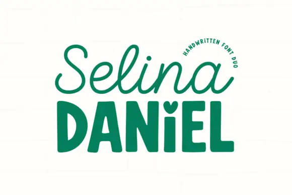
Handwritten script paired with a chunky sans
Selina Daniel is a handwritten duo in green on off-white: a monoline script with open loops on the first word, and a chunky rounded sans in caps for the second, with a small heart set into the counter of one letter, so the pair covers a name and a label in one voice.
Ideas for this font
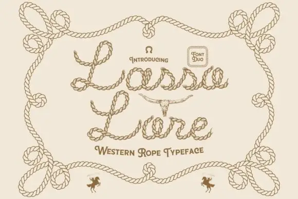
Rope-drawn western script
Lasso Lore is a western duo drawn entirely in rope: letters made of twisted cord with visible knots, a small capital set beneath for the style line, and a border of coiled rope around the sheet.
Same independent foundry
Allow optional Google Analytics to measure visits and catalogue actions. Your search words and notes are not included. Privacy & storage