High-Contrast Display Serif

Hippie + Aureline
Pairs sculptural editorial warmth with Hippie's clean modern geometry.
Inspect Aureline specimenDisclosure: MakerFileHub may earn a commission from qualifying purchases via paid links on this page. How our links work.
Heavy condensed capitals with softened rectangular ends and small squared P counters
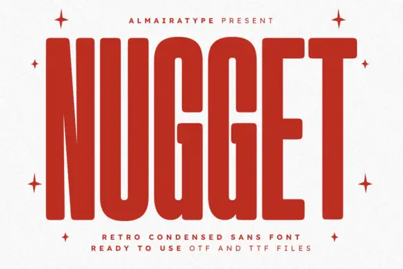
Hippie is a heavy condensed sans in the seventies poster tradition: tall stems, very narrow counters, flat terminals and spacing tight enough that a short word locks into a slab.
Paid link
Get this fontProject & layout blueprintsAt-a-glance maker compatibility
Sturdy stroke walls and open counters weed cleanly on adhesive vinyl, HTV apparel film, and cut cardstock.
Visual anatomy & craft review
HIPPIE runs across the middle of the card in solid black caps on a warm off-white ground, and every letter is drawn at the narrowest width the strokes allow: the H is two thick bars with a slot between them, the P counters are almost rectangles, and the E ends in three bars of equal length. Nothing is rounded and nothing is tapered, so the face looks cut rather than drawn, and the spacing is tight enough that the letters nearly share edges. A small tracked line at the top names the studio and a two-line caption at the foot explains the product in the same quiet tone, which is what makes the page work: the display word is loud and the information is soft. This is a sign painter's weighting applied to a modern skeleton, and it behaves like a poster face, best at 60 pt and above where the narrow counters stay open and the mass reads from a distance.
Heavy condensed capitals with softened rectangular ends and small squared P counters
Two-font hierarchy recipes
Tested contrast partners — pairing Hippie with grounded secondary typography.
Hippie + Aureline
Pairs sculptural editorial warmth with Hippie's clean modern geometry.
Inspect Aureline specimen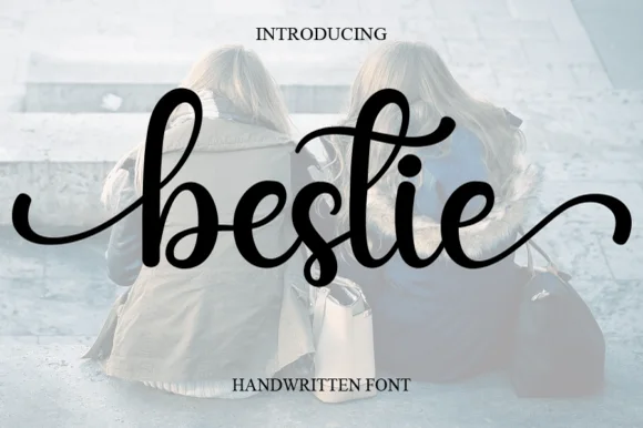
Hippie + Bestie
Introduces organic movement on pull-quotes, signatures and gift tags.
Inspect Bestie specimenPractical applications
Concrete hierarchy, scale and production guidance tailored to Hippie’s stroke geometry.
The condensed weight fits a long shop name on a narrow fascia, and the retro cut gives a small business a period look without a hand-painted sign budget.
Hierarchy & layout recipe
Print a 1500 by 350 mm fascia panel: set the shop name at 140 pt on one row, keep 36 mm of clear ground beneath before the opening hours at 20 pt, and hold 40 mm at the left and right ends of the panel.
Pre-production check
Condensed letters on a routed face lose their counters if the cutter is blunt; check one painted offcut before the sign goes into production.
The mass of the letters holds a cover at newsstand distance, and the retro tone says which decade the issue is about before the strapline is read.
Hierarchy & layout recipe
Print a 210 by 297 mm cover: set the cover line at 92 pt on one row, keep 24 mm of clear ground beneath before the price panel at 10 pt, and hold 18 mm from the last letter to the right edge of the page.
Pre-production check
Heavy black coverage on uncoated stock scuffs at the fold; print one cover and fold it before the run is approved.
The tight retro block reads over sand and shade where a lighter face disappears, and a single word carries the whole poster with no illustration beside it.
Hierarchy & layout recipe
Print a 420 by 594 mm poster: set the bar name at 200 pt on three rows, keep 40 mm of clear ground beneath before the address at 14 pt, and hold 34 mm of margin so the rows do not touch the poster edge.
Pre-production check
Sun-faded stock loses contrast within a season; print one poster and leave it in daylight for a week before ordering the set.
Technical & licence verification
Confirm included OTF/TTF/WOFF formats, full glyph tables and licence coverage on the live store page before batch production.
Closest visual alternatives
Matched across letterform anatomy, stroke behaviour and craft applications.
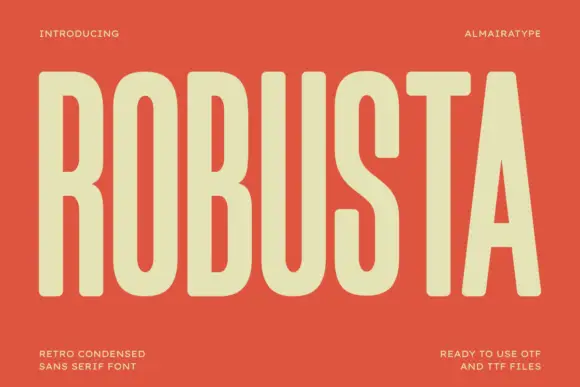
Tall condensed retro sans
Robusta is a tall condensed sans in cream on terracotta: very tall caps with softly squared curves, an even heavy stroke and a triangular counter in the A, set as one word across the plate with tracked notes in all four corners.
Ideas for this font
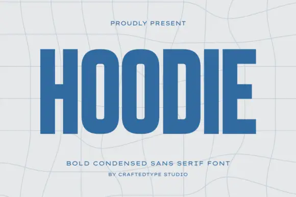
Condensed block capitals with rounded rectangular O counters
Hoodie shows a large blue uppercase word on a pale warped-grid field, where heavy straight uprights and flat horizontal endings form a dense block, the O and D hold rounded rectangular counters, the H crossbar sits near the middle and the E keeps three squared arms.
Ideas for this font
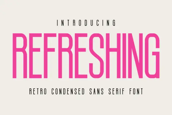
Light condensed retro sans
Refreshing is a light condensed sans in magenta on a warm off-white ground: capitals with long straight stems, a diagonal S middle, flat terminals and a narrow fit, set as one line between a tracked line above and a plain line beneath.
Ideas for this font
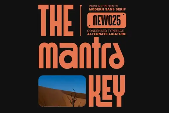
Condensed modern sans with alternates
The Mantra Key is a condensed mixed-case sans in orange on near-black: rounded arches on the m and n, an angled final a, a tall narrow fit and flat terminals, set in three stacked lines of different sizes with a small credit block at the upper right and a photograph inset in the third line.
Ideas for this font
Same independent foundry
Allow optional Google Analytics to measure visits and catalogue actions. Your search words and notes are not included. Privacy & storage