High-Contrast Display Serif

Hello Sister + Kernova
Pairs sculptural editorial warmth with Hello Sister's clean modern geometry.
Inspect Kernova specimenDisclosure: MakerFileHub may earn a commission from qualifying purchases via paid links on this page. How our links work.
Narrow high capitals with rounded ends and curved S and R terminals
Hello Sister is a condensed display sans with very tall letters, a low crossbar on the A and H, and rows set so close that the two lines lock together into one block.
Paid link
Get this fontProject & layout blueprintsAt-a-glance maker compatibility
Sturdy stroke walls and open counters weed cleanly on adhesive vinyl, HTV apparel film, and cut cardstock.
Visual anatomy & craft review
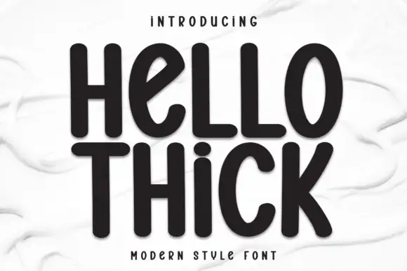
HELLO sits directly over SISTER in black, the rows overlapping by a few millimetres, and the letters are so narrow that the two words form a single rectangle on the page. Stems are straight and even, the E and the L share an almost identical width, and the S is the only shape that breaks the grid. The face has no serifs and no contrast, so its character comes from proportion: the caps are tall, the counters are narrow slots, and the spacing is tight enough that the O nearly touches the next letter. A blurred photograph of a group of women sits behind the type at very low contrast, which keeps the page from feeling like a specimen. Nothing else is on the card, and that is the argument: the two words are the design. Set large, it makes a strong poster; set in a paragraph, the narrow counters close and the lines run together, so keep it for headings, covers, tote prints and title cards.
Narrow high capitals with rounded ends and curved S and R terminals
Two-font hierarchy recipes
Tested contrast partners — pairing Hello Sister with grounded secondary typography.
Hello Sister + Kernova
Pairs sculptural editorial warmth with Hello Sister's clean modern geometry.
Inspect Kernova specimen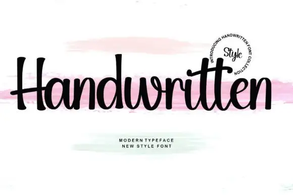
Hello Sister + Handwritten
Introduces organic movement on pull-quotes, signatures and gift tags.
Inspect Handwritten specimenPractical applications
Concrete hierarchy, scale and production guidance tailored to Hello Sister’s stroke geometry.
The stacked rows carry the whole cover without a photograph, and the tall letters hold a long title inside a narrow single column.
Hierarchy & layout recipe
Print a 135 by 216 mm book cover: set the title at 72 pt across two tight rows, keep 20 mm of clear ground beneath before the author name at 11 pt, and hold 16 mm from the widest row to the spine edge.
Pre-production check
Stacked rows print with ink bridging at the overlap; print one cover at the final size and separate the rows if they fill in.
The narrow letters fill a tall sign with two words alone, and the tight rows read as a designed object rather than as a printed greeting.
Hierarchy & layout recipe
Print a 300 by 500 mm board: set the greeting at 110 pt across two rows, keep 26 mm of clear ground beneath before the date at 14 pt, and hold 24 mm of border on all sides of the board.
Pre-production check
Tall narrow letters look thinner on a wall at distance; print one board and check from five metres before the order.
Two words sell the whole tone of a two-chair salon, and the condensed forms fit a tall narrow window that a wide face cannot use.
Hierarchy & layout recipe
Print a 280 by 900 mm decal: set the wording at 130 pt across two rows, keep 40 mm of clear ground beneath before the opening hours at 16 pt, and hold 30 mm from the letters to the frame edge.
Pre-production check
Window vinyl shrinks the counters when applied; print one decal and mount it on glass before the pair is cut.
Technical & licence verification
Confirm included OTF/TTF/WOFF formats, full glyph tables and licence coverage on the live store page before batch production.
Closest visual alternatives
Matched across letterform anatomy, stroke behaviour and craft applications.

Contrasting mixed case with broad e bowl and plain tall B stem
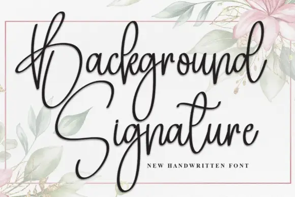
Bareum shows muted terracotta title-case lettering on a pale flat field, where more substantial vertical and curved sides meet fine joins, the B carries a broad bowl, the u opens widely and the m keeps two narrow curved shoulders without projecting feet.
Ideas for this font
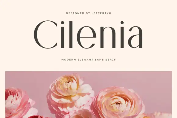
Contrasting mixed case with a broad C and fine e crossbar
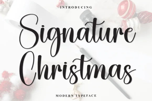
Cilenia shows dark title-case lettering above a separate pink flower photograph, where substantial upright and curved sections alternate with fine joins, the C opens broad, the e carries a fine crossbar and the a keeps a thin upper curve above a rounded lower bowl.
Ideas for this font
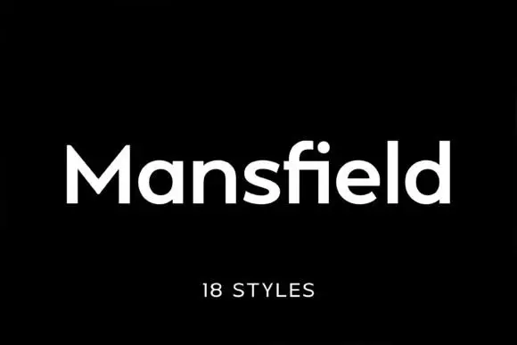
Substantial neutral sans
Mansfield is a substantial mixed case sans in white on black: plain forms with a deep M centre, an open e, straight terminals and a firm even stroke, set as one word with a small tracked count of styles beneath.
Ideas for this font
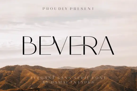
Fine high-contrast capitals with a sweeping E-R connection and a sharp narrow V
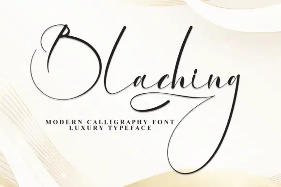
Bevera places thin black capitals over a pale landscape photograph, where fine horizontal arms meet stronger vertical strokes, the E near the middle extends into a long curved connection toward the R and the V narrows to a sharp point.
Same independent foundry
Allow optional Google Analytics to measure visits and catalogue actions. Your search words and notes are not included. Privacy & storage