Editorial Serif Anchor

Witches Halloween + Cervelique
Anchors Witches Halloween's fluid strokes with crisp Roman proportions on wedding suites, headers and packaging.
Inspect Cervelique specimenDisclosure: MakerFileHub may earn a commission from qualifying purchases via paid links on this page. How our links work.
Quirky hand-drawn mixed-width display
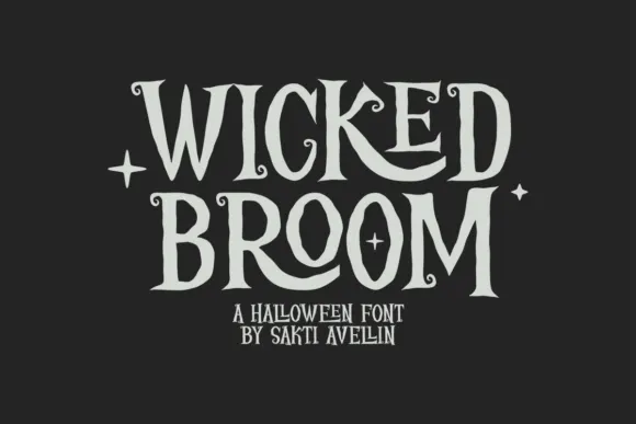
Witches Halloween is a quirky hand-drawn display in cream on charcoal: letters of wildly different widths, some built from stacked strokes, a flipped E, a heart-like O, and a bounce that moves each character on the line, so the pair reads as hand lettering by a confident amateur rather than as a drawn alphabet.
Paid link
Get this fontProject & layout blueprintsAt-a-glance maker compatibility
Weld or Unite overlapping script joins into one continuous vector path before sending to the blade.
Visual anatomy & craft review
The two words share a style but not a width: the W of the first line is drawn as three strokes, the E is set on its side, and the second line's O is a looping form that reads as a heart, which is the kind of inconsistency that makes hand lettering feel alive. Strokes end in blunt cuts rather than points, and the thickness varies slightly from letter to letter, so the eye registers a hand rather than a grid. The bounce keeps every character off the baseline by a different amount, and the spacing opens and closes, which is what gives the pair its rhythm. Because the face relies on irregularity, it works only for short phrases, and the specimen respects that with two words at large size and two tracked captions beneath in the same quirky style.
Quirky, hand-drawn, playful, irregular
Two-font hierarchy recipes
Tested contrast partners — pairing Witches Halloween with grounded secondary typography.
Witches Halloween + Cervelique
Anchors Witches Halloween's fluid strokes with crisp Roman proportions on wedding suites, headers and packaging.
Inspect Cervelique specimen
Witches Halloween + Furion
Keeps small-scale dates, URLs, nutrition facts and care instructions crisp and legible below script titles.
Inspect Furion specimenPractical applications
Concrete hierarchy, scale and production guidance tailored to Witches Halloween’s stroke geometry.
A quirky hand-drawn display suits a family pumpkin patch better than a horror face, and the irregular widths read as painted timber lettering at the gate.
Hierarchy & layout recipe
Paint a 900 by 400 mm board: the phrase at 130 mm cap height, the opening hours in a 28 mm casual sans, and a 5 mm border. Keep the letters at least 20 mm apart so the bounce does not merge them, and paint two colours on plywood.
Pre-production check
Check the board at 15 m, where the flipped letter can read as an error; swap to the upright cut for signage. Confirm the 28 mm hours read at three metres and that the bounce stays consistent across both lines.
A playful hand-drawn face is easy for children to read and looks made for the occasion, and the thick strokes survive a home printer where a fine script would disappear.
Hierarchy & layout recipe
A6 card: the phrase at 30 pt, the date and time in a 9 pt casual sans, and a small illustration at the foot. Keep 10 mm margins, print two colours, and leave the captions in a straight line so the details stay readable.
Pre-production check
Check the 30 pt phrase on a home printer, where the variable strokes can fill; use the cleanest cut. Confirm the 9 pt details keep a 4.5:1 contrast and that the invitation still reads at half size on a phone screen.
A hand-drawn display with thick strokes cuts cleanly in card and reads as a hand-lettered topper, which is what a craft buyer actually wants from a seasonal font.
Hierarchy & layout recipe
Cut a 150 mm topper: the name at 60 mm cap height, a 4 mm stroke minimum, and two 3 mm tabs at the base to seat it in the cake. Keep 6 mm between letters so the cutter can clear the gaps.
Pre-production check
Check the cut file at 150 mm, where a stroke under 3 mm tears in card; thicken the thinnest joins. Confirm the topper stands in a 200 mm cake and that the tabs do not show above the icing line.
Technical & licence verification
Confirm included OTF/TTF/WOFF formats, full glyph tables and licence coverage on the live store page before batch production.
Closest visual alternatives
Matched across letterform anatomy, stroke behaviour and craft applications.
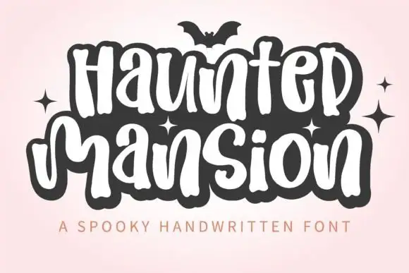
Tall rounded Halloween lettering
Haunted Mansion shows tall softly irregular letters built as narrow white strokes inside a heavy dark surrounding shape, with rounded humps, looped descenders and a bat and small sparkles sitting outside the lettering.
Ideas for this font
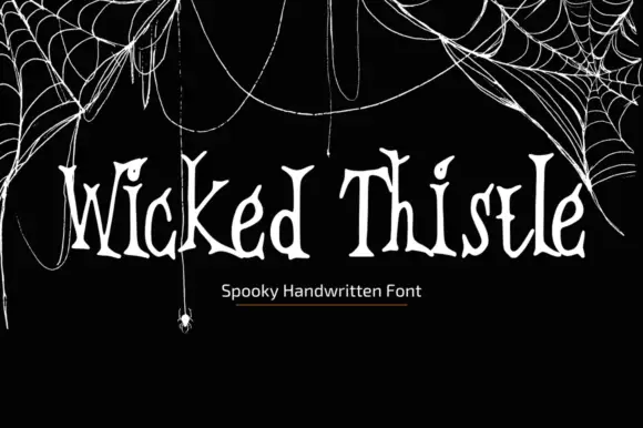
Thin uneven spooky hand
Wicked Thistle Font is a thin uneven handwritten face in bone on black: tall letters with forked and curled terminals, uneven stems and a spidery rhythm, set in one line above a small plain caption, with drawn cobwebs and a hanging spider framing the corners.
Ideas for this font
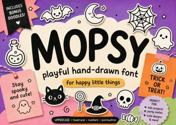
Heavy soft Halloween print
Mopsy is a heavy soft hand-drawn print in black on cream: fat rounded letters, small counters and a playful bounce, surrounded by drawn bats, ghosts, spiders and pumpkins.
Ideas for this font
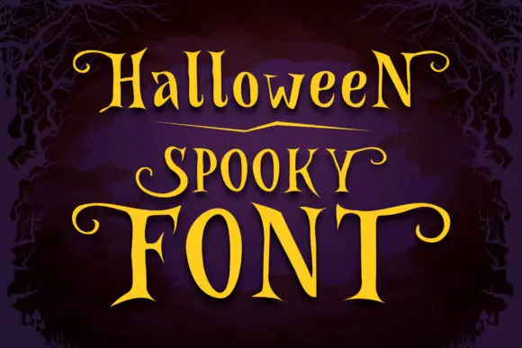
Narrow spooky serifs with curled ends
Halloween Spooky shows tall high-contrast letters with pointed serif tips and long curling terminals, and the enlarged F and T extend horizontally across the lowest word of the composition.
Ideas for this font
Same independent foundry
Allow optional Google Analytics to measure visits and catalogue actions. Your search words and notes are not included. Privacy & storage