Modern Grotesque Body

Harvellia + Memoir Slang
Creates crisp high-hierarchy contrast beneath Harvellia headlines across menus, websites and labels.
Inspect Memoir Slang specimenDisclosure: MakerFileHub may earn a commission from qualifying purchases via paid links on this page. How our links work.
Fine slanted mixed case with a tight spiral capital entry
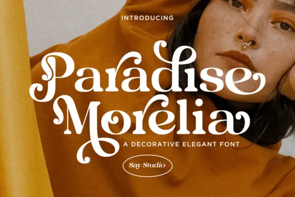
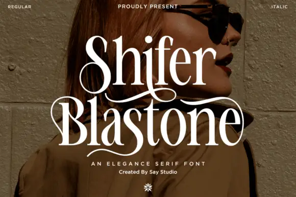
Harvellia shows white right-leaning serif letters over a dark portrait: a tight spiral enters the H at the upper left, the long stems lean consistently and the round bowls connect through fine tapered joins.
Paid link
Get this fontProject & layout blueprintsAt-a-glance maker compatibility
Crisp hairline serifs shine on stationery, foil stamping, and packaging; add slight offset for small decals.
Visual anatomy & craft review
The stems stay slender on a steady slant, the joins taper to hairlines, the bowls stay round and the capital opens with a small spiral instead of a flat serif. The spiral entry is the character: the word begins with a curl and then leans away, which is why the sample sets one name over a portrait. Because the slant and the spiral both need room, keep 18 mm at the left and 16 mm between rows from 26 pt. The captions advertise italic, alternates and language support, but the cover demonstrates only this slanted specimen.
Slanted · Spiral entry · Fine
Two-font hierarchy recipes
Tested contrast partners — pairing Harvellia with grounded secondary typography.
Harvellia + Memoir Slang
Creates crisp high-hierarchy contrast beneath Harvellia headlines across menus, websites and labels.
Inspect Memoir Slang specimen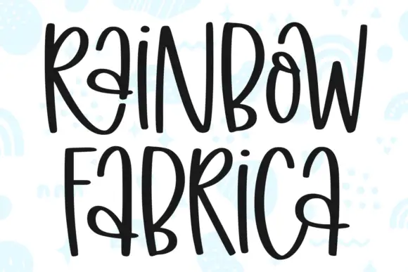
Harvellia + Rainbow Fabrica
Adds a warm human signature touch for 1-to-3-word callouts without competing against structured serif capitals.
Inspect Rainbow Fabrica specimenPractical applications
Concrete hierarchy, scale and production guidance tailored to Harvellia’s stroke geometry.
The slanted row gives a cover motion, and the fine contrast holds a two-word title at 60 pt on a coated page. The lean also keeps a long title from reading as a static band.
Hierarchy & layout recipe
Print an A4 cover: set the title at 60 pt, keep 20 mm of clear ground at the left for the spiral, and set the cover lines at 9 pt in a small caps along the foot of the page. Keep the foot band plain.
Pre-production check
A spiral entry printed under 2 mm closes into a dot; check the film and keep the title at 46 pt or above. Ask for a wet proof of the cover.
The lean gives a small mark movement, and the fine serifs stay readable at 22 pt on a coated card in one ink. The spiral also gives a small mark its entry point.
Hierarchy & layout recipe
Print an 85 by 55 mm card: set the wordmark at 22 pt, keep 12 mm of clear ground at the left for the spiral, and set the address in a 7 pt caps at the foot with 8 mm of space.
Pre-production check
Hairlines printed on an uncoated card spread at 18 pt; check the proof and keep the wordmark at 20 pt or above.
The steady slant keeps a contemporary suite lively, and the fine bowls hold two names at 24 pt on heavy card stock. The slant also keeps a formal row feeling current.
Hierarchy & layout recipe
Print a 130 by 180 mm card: set the names at 24 pt, keep 16 mm of clear ground above the slant, and set the venue at 9 pt in a light serif with 12 mm of clear space below. Keep the venue line short.
Pre-production check
The advertised italic and alternates are not shown on the cover; set your chosen forms at final size before committing.
Technical & licence verification
Confirm included OTF/TTF/WOFF formats, full glyph tables and licence coverage on the live store page before batch production.
Closest visual alternatives
Matched across letterform anatomy, stroke behaviour and craft applications.
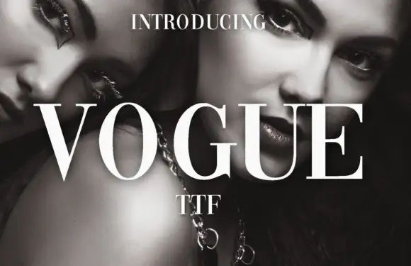
High-contrast didone with hairline serifs
Vogue is a high-contrast didone serif in white over a black-and-white beauty photograph: hairline serifs, a very thin crossbar on the A, a round O and a G with a fine spur, set in capitals as a magazine masthead.
Ideas for this font
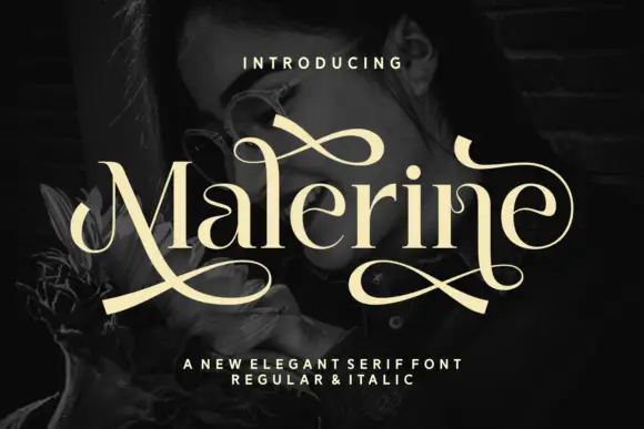
Serif with long swashes
Malerine is an elegant serif in cream over a dark portrait: high contrast, ball terminals and long drawn swashes that leave the first and last letters and loop across the whole word, with a small line beneath noting the regular and italic cuts.
Ideas for this font
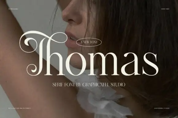
Elegant serif with elongated swash cap
Thomas is an elegant serif in cream over a portrait photograph, with a capital T whose swash runs back over the whole word and settles into a curl, ball terminals on the lower case and a fine hairline contrast through the rest of the letters.
Ideas for this font
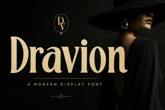
Tall high-contrast serif letters with tapered strokes and rounded counters
Dravion sets a large cream word against a dark photograph, where narrow hairlines meet thick upright strokes, the capital D stands tall and bowed, the a keeps a rounded bowl and the r ends in a soft curved terminal.
Same independent foundry
Allow optional Google Analytics to measure visits and catalogue actions. Your search words and notes are not included. Privacy & storage