Neutral Sans Workhorse

Adorn Doodle + Cenura
Lets Adorn Doodle own the focal silhouette while handling secondary copy, sizing and subheads cleanly.
Inspect Cenura specimenDisclosure: MakerFileHub may earn a commission from qualifying purchases via paid links on this page. How our links work.
Fine horizontal divider dingbats with hearts, arrows and curled floral ends
Adorn Doodle is a dingbat set of horizontal rules: arrowed lines, dotted leaders, small vines, scrolls and hearts, each drawn in a fine even line and each built to run edge to edge.
Paid link
Get this fontProject & layout blueprintsAt-a-glance maker compatibility
Sturdy stroke walls and open counters weed cleanly on adhesive vinyl, HTV apparel film, and cut cardstock.
Visual anatomy & craft review
The cover lays dozens of dividers in a grid on marble, all in gold, and each one solves the same problem differently: some are straight rules with arrowheads at both ends, some carry a heart at the centre, some curl into a scroll, and a few trail small leaves. Weights stay fine and consistent so any two can sit on the same page without one shouting. The label in the middle names the set, and nothing about the drawings is illustrative in the pictorial sense. As glyphs they are set like type, which means the line length is controlled by the number of repeats rather than by stretching.
Fine horizontal divider dingbats with hearts, arrows and curled floral ends
Two-font hierarchy recipes
Tested contrast partners — pairing Adorn Doodle with grounded secondary typography.
Adorn Doodle + Cenura
Lets Adorn Doodle own the focal silhouette while handling secondary copy, sizing and subheads cleanly.
Inspect Cenura specimen
Adorn Doodle + The Lumina Awesome
Grounds bold display lettering with classic typographic authority on posters, badges and apparel.
Inspect The Lumina Awesome specimenPractical applications
Concrete hierarchy, scale and production guidance tailored to Adorn Doodle’s stroke geometry.
A single fine rule separates the names from the details without adding an ornament that competes, and the set lets the same suite vary three times.
Hierarchy & layout recipe
Print a 130 by 180 mm invitation: place one divider 14 mm wide at 40 mm across the card, keep 8 mm of clear ground above and below it, and keep 16 mm of margin from the card edge on each side.
Pre-production check
Fine lines print faint on textured card; check the proof on the chosen stock. Ask the printer for a sample at the finished size.
Running a discrete rule between sections keeps the page structured without a heavy heading, and the fine weight holds on uncoated paper.
Hierarchy & layout recipe
Print a 170 by 240 mm page: set the divider 30 mm wide between sections, keep 10 mm of clear ground above and below before the next paragraph at 9 pt, and keep 14 mm of margin from the text block.
Pre-production check
Repeated glyphs must align; check the spacing before the issue goes to press. Confirm it on a printed sample, not on screen.
A short rule under the menu title gives a printed card a period feel without a decorative border, and the heart marks the festive options.
Hierarchy & layout recipe
Print an A5 menu: place the rule 45 mm wide under the title, keep 6 mm of clear ground above and below before the first dish at 10 pt, and keep 12 mm of margin from the sheet edge.
Pre-production check
Gold ink on cream reads weak; check a sample before the card run. Have the printer send a physical sample first.
Technical & licence verification
Confirm included OTF/TTF/WOFF formats, full glyph tables and licence coverage on the live store page before batch production.
Closest visual alternatives
Matched across letterform anatomy, stroke behaviour and craft applications.
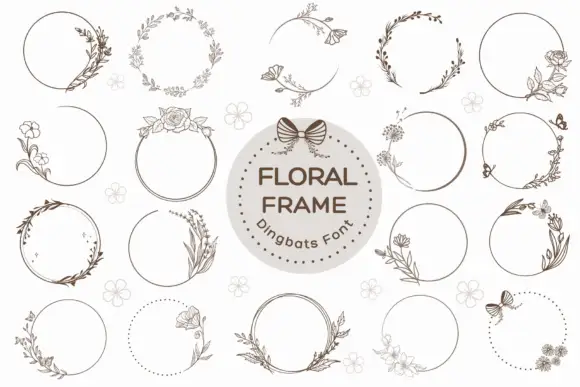
Fine circular frames with off-centre flowers, foliage and butterflies
Floral Frame is a dingbat set of wreath frames: open circles with line-drawn flowers, leaves and grasses growing around the edge, some closed with a bow and some left as a dotted ring.
Ideas for this font
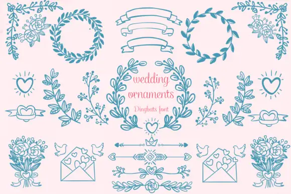
Wedding ornament dingbat set
Wedding Ornaments is an ornament and dingbat set in dusty blue and pink on a soft blush ground: hand-drawn wreaths of leaves and berries, ribbon banners, bouquets, doves, love hearts, arrows and floral sprays arranged as a specimen sheet.
Ideas for this font
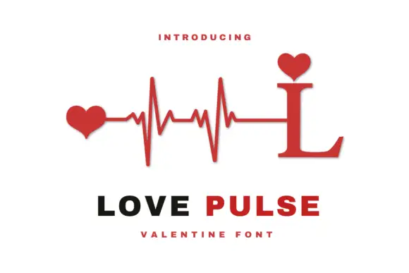
Heartbeat monogram design
Love Pulse Monogram is a monogram design in red and black on white: a serif capital L whose stem rises into a heartbeat line ending in two hearts, with a small heart seated on the ascender, and two plain lines beneath that name the design and the occasion.
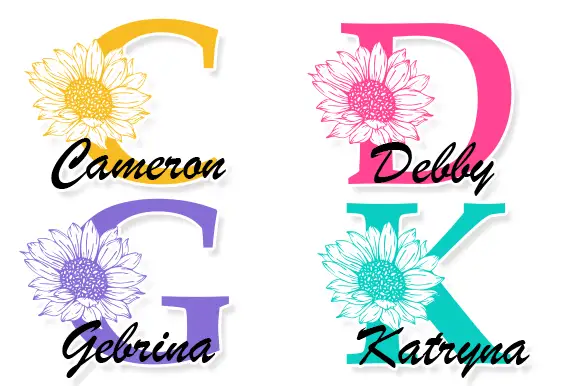
Large contrast serif initials crossed by finely drawn sunflower heads with separate script names
Cameron Monogram draws a heavy split capital with a sunflower blooming in its counter, runs a script name across the cut, and repeats the construction in four colourways.
Ideas for this font
Same independent foundry
Allow optional Google Analytics to measure visits and catalogue actions. Your search words and notes are not included. Privacy & storage