Editorial Serif Anchor

Handwriting + Brenco
Anchors Handwriting's fluid strokes with crisp Roman proportions on wedding suites, headers and packaging.
Inspect Brenco specimenDisclosure: MakerFileHub may earn a commission from qualifying purchases via paid links on this page. How our links work.
Thin monoline script with tall ascenders and wide spacing
Handwriting is a thin monoline script that keeps its ascenders long and its joins slack, so the word spreads across the line with air between letters rather than running as a tight ribbon.
Paid link
Get this fontProject & layout blueprintsAt-a-glance maker compatibility
Weld or Unite overlapping script joins into one continuous vector path before sending to the blade.
Visual anatomy & craft review
The capital H lifts a long first stroke that starts well below the baseline and rises above every other letter, and the d, t and g that follow repeat that scale, which gives the word a tall, uneven outline instead of a level top edge. The joins between letters are drawn loose and low, so each letter keeps its own shape and the spacing looks like a pen moving quickly rather than a nib held at a steady speed. Weight is a single thin line with no swelling at all, which is why the sample sets it large in black on white where the thinness itself is the message. The blurred pen at the top of the card, the tracked label above and the small credit line beneath are presentation; the script is only the one word.
Thin · Spacious · Loose
Two-font hierarchy recipes
Tested contrast partners — pairing Handwriting with grounded secondary typography.
Handwriting + Brenco
Anchors Handwriting's fluid strokes with crisp Roman proportions on wedding suites, headers and packaging.
Inspect Brenco specimen
Handwriting + Olline
Keeps small-scale dates, URLs, nutrition facts and care instructions crisp and legible below script titles.
Inspect Olline specimenPractical applications
Concrete hierarchy, scale and production guidance tailored to Handwriting’s stroke geometry.
A thin monoline signature reads as written rather than drawn, which is exactly the claim a letterpress studio makes about its own work, and the wide spacing keeps a long name from crowding a narrow door plate.
Hierarchy & layout recipe
Set the wordmark at 34 pt on a 90 mm plate, keep the studio's address in a small serif at 6 pt beneath it, and hold 10 mm clear at the right so the final g descender never reaches the plate edge.
Pre-production check
At 34 pt a hairline stroke is close to the limit of the printing method; ask for a proof on the plate material, because the thin joins are where it fails first.
A thin signature closes a first-person essay without competing with the body text, which a heavier script would do simply by carrying more ink than the column beside it.
Hierarchy & layout recipe
Set the signature at 16 pt on its own line after the final paragraph, leave 10 mm above and 12 mm before the footer rule, and keep the printed byline at the head of the piece in the standard text face.
Pre-production check
If the essay runs on uncoated stock, the fine line greys out; check the printed sign-off beside the body text and darken the weight if the two read as equals.
A specimen-quality script on a worksheet gives pupils the model they are meant to copy, and the wide joins show where the pen is supposed to lift between letters.
Hierarchy & layout recipe
Set the heading at 28 pt with the practice line in a ruled 12 mm band beneath it, keep the guide words in the same face at 18 pt, and leave the top third of the sheet for instructions in a plain sans.
Pre-production check
Photocopied worksheets lose thin strokes; print one copy on the classroom machine before the run, and go heavier if the joins disappear.
Technical & licence verification
Confirm included OTF/TTF/WOFF formats, full glyph tables and licence coverage on the live store page before batch production.
Closest visual alternatives
Matched across letterform anatomy, stroke behaviour and craft applications.
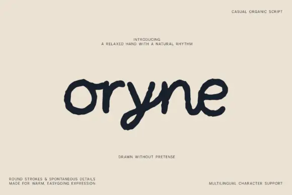
Uneven low rounded handwriting
Oryne is a relaxed rounded script in near-black on cream: fat even strokes, uneven outlines, a low x-height and letterforms that lean and wobble as if written on textured paper.
Ideas for this font
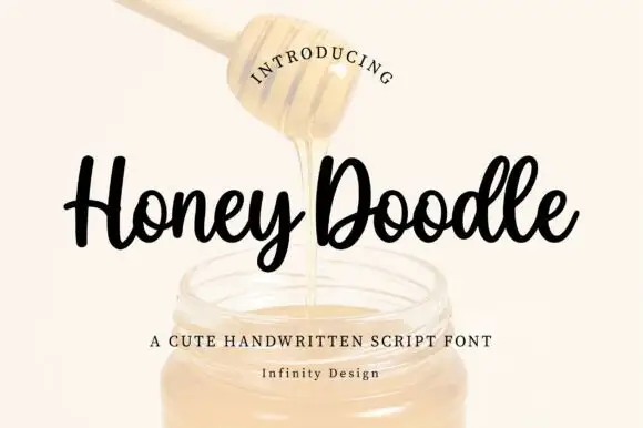
Rounded compact looping script with heavy strokes and short ascenders
Honey Doodle is a rounded compact script with heavy even strokes, short ascenders and tight letterfit, so a word reads as a friendly written badge rather than a flowing line.
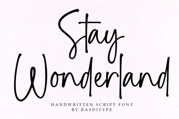
Thin monoline signature script
Stay Wonderland is a thin monoline signature script in black on white: tall narrow loops, a stem on the S that rises above the cap line, a straight-tailed y, and a spacing wide enough that the word reads as a signature written quickly.
Ideas for this font
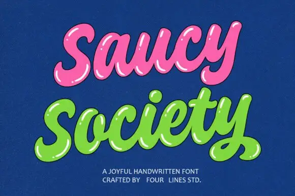
Glossy bubble script with highlights
Saucy Society is a glossy bubble script in pink and green on deep blue: fat inflated letters, drawn white highlights along the top of every stroke, and a soft shadow that makes the words look like blown sweets.
Ideas for this font
Same independent foundry
Allow optional Google Analytics to measure visits and catalogue actions. Your search words and notes are not included. Privacy & storage