Editorial Serif Anchor

Oryne + The Bilstein Editorial
Anchors Oryne's fluid strokes with crisp Roman proportions on wedding suites, headers and packaging.
Inspect The Bilstein Editorial specimenDisclosure: MakerFileHub may earn a commission from qualifying purchases via paid links on this page. How our links work.
Uneven low rounded handwriting
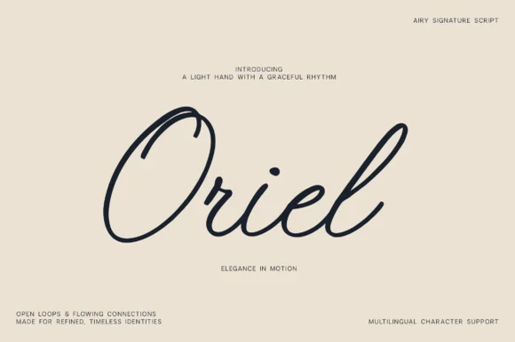
Oryne is a relaxed rounded script in near-black on cream: fat even strokes, uneven outlines, a low x-height and letterforms that lean and wobble as if written on textured paper.
Paid link
Get this fontProject & layout blueprintsAt-a-glance maker compatibility
Weld or Unite overlapping script joins into one continuous vector path before sending to the blade.
Visual anatomy & craft review
oryne is set lowercase across the middle of the card, and the lettering is casual rather than calligraphic: the o is a fat circle with a slightly squashed top, the r is reduced to a stem and a short shoulder, the y drops into a loop that swings left, and the n and e are wide and low. The outline of every stroke is uneven, as if drawn on rough paper with a marker, and the joins between letters are slack rather than tight, so the word reads as one continuous gesture. The ground is plain cream with four small captions in a plain sans distributed around the edges. The face is a casual script for warm, informal brands, packaging and short headings: it needs a decent size for the wobble to read as texture rather than as noise, and it should not be used for a line longer than three or four words.
A relaxed rounded hand with a rough edge
Two-font hierarchy recipes
Tested contrast partners — pairing Oryne with grounded secondary typography.
Oryne + The Bilstein Editorial
Anchors Oryne's fluid strokes with crisp Roman proportions on wedding suites, headers and packaging.
Inspect The Bilstein Editorial specimen
Oryne + Memoir Slang
Keeps small-scale dates, URLs, nutrition facts and care instructions crisp and legible below script titles.
Inspect Memoir Slang specimenPractical applications
Concrete hierarchy, scale and production guidance tailored to Oryne’s stroke geometry.
A loose hand suits an informal ceremony better than calligraphy, and one word on a board is the whole of what a small wedding sign needs.
Hierarchy & layout recipe
Print a 450 by 300 mm board: set the word at 110 pt on one row, keep 22 mm of clear ground beneath before the date at 20 pt, and hold 20 mm of border on all sides.
Pre-production check
The uneven outline looks like a printing fault when scaled up; print one board at the final size and check a stroke before the set.
A rough, low hand reads as a small producer rather than a factory, and the fat strokes hold at a small label size where a fine script fails.
Hierarchy & layout recipe
Print a 60 by 45 mm label: set the product at 13 pt on one row, keep 5 mm of clear ground beneath before the scent at 5 pt, and hold 4 mm from the lowest loop to the die line.
Pre-production check
A rough edge on a small label can look like poor print quality; print one on the real stock and judge it at arm's length before the order.
One casual word separates a quote from a page of serif, and the low silhouette keeps the heading from dominating the column beneath it.
Hierarchy & layout recipe
Print a 230 by 300 mm spread: set the quote word at 46 pt on one row, keep 16 mm of clear ground beneath before the body at 10.5 pt, and hold 18 mm of margin at the outer edge.
Pre-production check
Irregular outlines beside sharp text can read as a mistake; print one spread and check the two edges look intentional before the issue.
Technical & licence verification
Confirm included OTF/TTF/WOFF formats, full glyph tables and licence coverage on the live store page before batch production.
Closest visual alternatives
Matched across letterform anatomy, stroke behaviour and craft applications.
Thin monoline script with tall ascenders and wide spacing
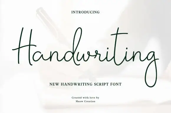
Handwriting is a thin monoline script that keeps its ascenders long and its joins slack, so the word spreads across the line with air between letters rather than running as a tight ribbon.
Ideas for this font
Glossy bubble script with highlights
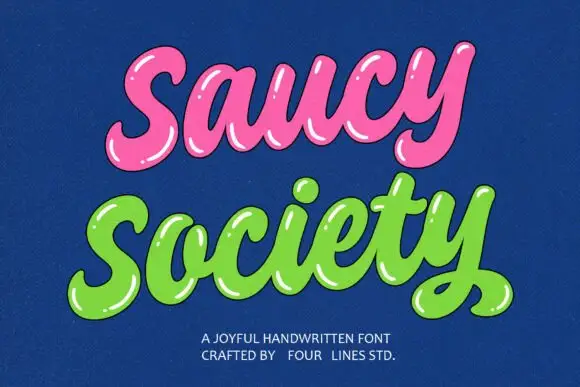
Saucy Society is a glossy bubble script in pink and green on deep blue: fat inflated letters, drawn white highlights along the top of every stroke, and a soft shadow that makes the words look like blown sweets.
Ideas for this font
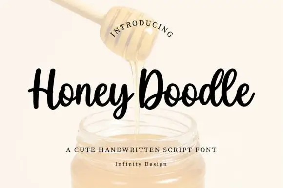
Rounded compact looping script with heavy strokes and short ascenders
Honey Doodle is a rounded compact script with heavy even strokes, short ascenders and tight letterfit, so a word reads as a friendly written badge rather than a flowing line.
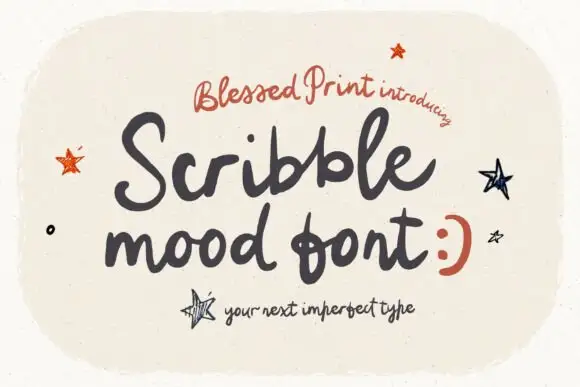
Loose rough handwritten script
Scribblemood is a loose rough handwritten script in charcoal on speckled cream: fat uneven strokes, letters of different heights and a deliberately unpolished line, presented as an imperfect type with drawn stars around it.
Ideas for this font
Same independent foundry
Allow optional Google Analytics to measure visits and catalogue actions. Your search words and notes are not included. Privacy & storage