Editorial Serif Anchor

Saucy Society + Medvilea Editorial
Anchors Saucy Society's fluid strokes with crisp Roman proportions on wedding suites, headers and packaging.
Inspect Medvilea Editorial specimenDisclosure: MakerFileHub may earn a commission from qualifying purchases via paid links on this page. How our links work.
Glossy bubble script with highlights
Saucy Society is a glossy bubble script in pink and green on deep blue: fat inflated letters, drawn white highlights along the top of every stroke, and a soft shadow that makes the words look like blown sweets.
Paid link
Get this fontProject & layout blueprintsAt-a-glance maker compatibility
Weld or Unite overlapping script joins into one continuous vector path before sending to the blade.
Visual anatomy & craft review
Saucy sits above Society, and both words are built from the same inflated stroke: the bowls are wide, the stems swell in the middle, the terminals are rounded and every letter carries a thin white highlight that runs along its upper edge as if the surface were wet. The colour changes between the two words — pink above, lime green below — and a soft shadow under each letter separates them from the deep blue ground. The letters are unjoined in places and loosely connected in others, which keeps the pair reading as a script rather than as a logo, and two captions at the foot in a plain sans name the style and the studio. The face is a playful display for sweets, party goods and children's brands: the highlights are part of the glyphs, so it needs a size where they read, and it prints best in colour.
A bubble script with painted highlights
Two-font hierarchy recipes
Tested contrast partners — pairing Saucy Society with grounded secondary typography.
Saucy Society + Medvilea Editorial
Anchors Saucy Society's fluid strokes with crisp Roman proportions on wedding suites, headers and packaging.
Inspect Medvilea Editorial specimen
Saucy Society + Saltriver Grotesk
Keeps small-scale dates, URLs, nutrition facts and care instructions crisp and legible below script titles.
Inspect Saltriver Grotesk specimenPractical applications
Concrete hierarchy, scale and production guidance tailored to Saucy Society’s stroke geometry.
Glossy bubble letters read as sweets before a word is read, and the highlight makes a one-word card look like a printed product rather than a note.
Hierarchy & layout recipe
Print a 120 by 120 mm square card: set the greeting at 36 pt across two rows, keep 15 mm of clear ground beneath before the details at 8.5 pt, and hold 13 mm of margin on all sides.
Pre-production check
The white highlights disappear on a home printer at small sizes; print one card on the actual machine and check a stroke before the batch.
A glossy bubble script sets a period tone for a feature about sweets or packaging, and the two colours separate the heading from the page without a tint panel.
Hierarchy & layout recipe
Print a 230 by 300 mm opener: set the heading at 60 pt across two rows, keep 22 mm of clear ground beneath before the standfirst at 10.5 pt, and hold 18 mm of margin on both sides.
Pre-production check
Two saturated inks on newsprint can bleed into each other; print one opener on the actual stock and check the edge before the issue.
A bubble script names a sweet table without an illustration, and the two colours let the sign match a wedding palette without a redesign.
Hierarchy & layout recipe
Print a 400 by 250 mm board: set the word at 80 pt on one row, keep 20 mm of clear ground beneath before the list at 14 pt, and hold 18 mm of border on all four sides.
Pre-production check
Glossy highlights read as glare under indoor lighting; print one board and check it in the venue before the set.
Technical & licence verification
Confirm included OTF/TTF/WOFF formats, full glyph tables and licence coverage on the live store page before batch production.
Closest visual alternatives
Matched across letterform anatomy, stroke behaviour and craft applications.
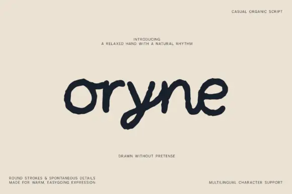
Uneven low rounded handwriting
Oryne is a relaxed rounded script in near-black on cream: fat even strokes, uneven outlines, a low x-height and letterforms that lean and wobble as if written on textured paper.
Ideas for this font
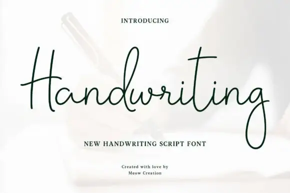
Thin monoline script with tall ascenders and wide spacing
Handwriting is a thin monoline script that keeps its ascenders long and its joins slack, so the word spreads across the line with air between letters rather than running as a tight ribbon.
Ideas for this font
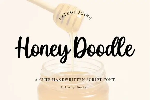
Rounded compact looping script with heavy strokes and short ascenders
Honey Doodle is a rounded compact script with heavy even strokes, short ascenders and tight letterfit, so a word reads as a friendly written badge rather than a flowing line.
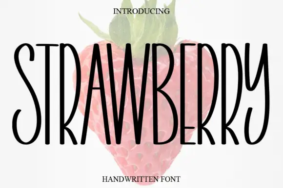
Tall narrow handwritten caps
Strawberry is a tall narrow handwritten face in black over a faded illustration of a strawberry: very condensed capitals with uneven strokes, high ascenders and a light bounce, set as one word with a small serif line above and beneath.
Ideas for this font
Same independent foundry
Allow optional Google Analytics to measure visits and catalogue actions. Your search words and notes are not included. Privacy & storage