Modern Grotesque Body

The Great Nineties + Saltriver Grotesk
Creates crisp high-hierarchy contrast beneath The Great Nineties headlines across menus, websites and labels.
Inspect Saltriver Grotesk specimenDisclosure: MakerFileHub may earn a commission from qualifying purchases via paid links on this page. How our links work.
High-contrast serif with an italic companion
The Great Nineties is a serif family in cream over a city at dusk: a high-contrast roman with fine bracketed serifs for the first line and a matching italic for the second, sold together as a pair.
Paid link
Get this fontProject & layout blueprintsAt-a-glance maker compatibility
Sturdy stroke walls and open counters weed cleanly on adhesive vinyl, HTV apparel film, and cut cardstock.
Visual anatomy & craft review
Two lines are set in the same family and deliberately different styles: the first is a roman with a pronounced contrast, fine bracketed serifs, a wide M and a tall x-height, and the second is the italic, which carries the same weight and colour but leans and rounds its forms, with a single-storey a and a soft tail on the y. Because the two share a skeleton, the pair reads as one voice with two tones, which is what makes a roman and its italic useful on a cover or a spread. The letters are set fairly tight, so each line reads as a band rather than a word, and the sample gives the face plenty of air above and below. The ground is a warm photograph of a city skyline at sunset, blurred enough that the cream type stays legible. The Great Nineties is a serif for editorial covers, packaging, invitations and branding with a warm, nineties-revival feel, and it needs a large size and a quiet background.
Contrasted, editorial, warm
Two-font hierarchy recipes
Tested contrast partners — pairing The Great Nineties with grounded secondary typography.
The Great Nineties + Saltriver Grotesk
Creates crisp high-hierarchy contrast beneath The Great Nineties headlines across menus, websites and labels.
Inspect Saltriver Grotesk specimen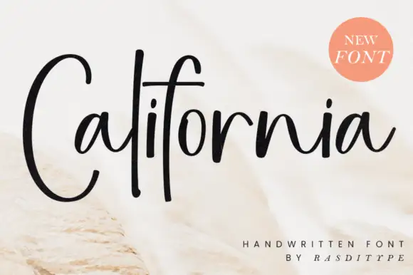
The Great Nineties + California
Adds a warm human signature touch for 1-to-3-word callouts without competing against structured serif capitals.
Inspect California specimenPractical applications
Concrete hierarchy, scale and production guidance tailored to The Great Nineties’s stroke geometry.
A roman and its italic cover a title and a standfirst in one family, and the contrast keeps the longer line from reading as a caption.
Hierarchy & layout recipe
Print a 230 by 300 mm cover: set the title at 80 pt in the roman, set the standfirst at 30 pt in the italic with 24 mm of clear ground, and hold 18 mm of margin on all four sides.
Pre-production check
An italic over a photographed background can lose its fine joins; place it on a calm area and proof the cover.
The pair gives a bag a name and a tasting note in two related voices, which is what a small roaster needs on a narrow label.
Hierarchy & layout recipe
Print a 60 by 90 mm bag label: set the name at 17 pt in the roman, set the note at 7.5 pt in the italic with 6 mm of clear ground, and hold 5 mm of margin on all four sides.
Pre-production check
A fine italic at seven and a half points can grey out; print one label on the real kraft paper and check the note.
A roman with an italic gives a card a formal line and a softer line without a second family, which suits a relaxed but formal wedding.
Hierarchy & layout recipe
Print a 130 by 190 mm card: set the names at 26 pt in the italic, set the details at 8 pt in the roman with 18 mm of clear ground, and hold 14 mm of margin on all four sides.
Pre-production check
Mixing the two styles can look accidental if the sizes are close; keep a clear size gap and proof one card.
Technical & licence verification
Confirm included OTF/TTF/WOFF formats, full glyph tables and licence coverage on the live store page before batch production.
Closest visual alternatives
Matched across letterform anatomy, stroke behaviour and craft applications.
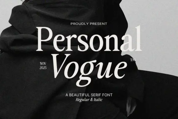
Elegant editorial serif with italic
Personal Vogue is a serif in cream on a monochrome fashion photograph: a moderate-contrast roman with fine serifs and a true italic with a strong slant, set on two lines with small tracked notes at the sides and an attribution beneath.
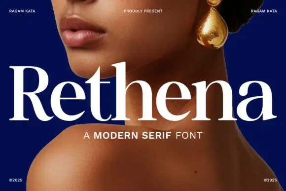
Modern serif with softened joins
Rethena is a modern serif in white over a deep blue portrait: moderate contrast, softened joins, round bowls and short bracketed serifs, set as one large word with a capital line beneath and small credits in the corners.
Ideas for this font

High-contrast italic editorial serif
The Simple Editorial is a high-contrast italic serif in near-black on white: very fine hairlines, sharp serifs, a strong forward slant and a tall waist, shown in a full specimen with weight and width labels in a small caps grid around the display line.
Ideas for this font
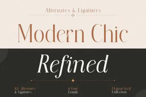
Fine upright serif title paired with an open italic sample
Modern Chic Refined pairs a pale brown upright cap line with a white slanted word: both keep long fine stems and contrasting rounded bowls, and the italic f drops below the baseline as the one descending letter.
Ideas for this font
Same independent foundry
Allow optional Google Analytics to measure visits and catalogue actions. Your search words and notes are not included. Privacy & storage