Editorial Serif Anchor

Glamira Script + The Avenue Editorial
Anchors Glamira Script's fluid strokes with crisp Roman proportions on wedding suites, headers and packaging.
Inspect The Avenue Editorial specimenDisclosure: MakerFileHub may earn a commission from qualifying purchases via paid links on this page. How our links work.
Soft upright script with heart accent and round bowls
Glamira is an upright script with smooth medium strokes and round open bowls, a capital that hooks back over the word and a heart set above the final letter in place of a dot.
Paid link
Get this fontProject & layout blueprintsAt-a-glance maker compatibility
Weld or Unite overlapping script joins into one continuous vector path before sending to the blade.
Visual anatomy & craft review
The capital G begins with a small hook above the cap line, then falls into a wide diagonal stem that ends in a curl touching the baseline before it joins forward, so the word opens with one continuous movement. The lowercase letters keep upright shapes rather than leaning, their bowls are nearly circular, and the joins ride at mid x-height, which gives the row the even rhythm of a printed line rather than the slope of a signature. Weight is consistent and only slightly lighter at the turns, so the face keeps its colour on the page. Ascenders on the l and the h are only a third above the x-height, which keeps the word compact, and the r ends in a soft flick instead of a hard taper. The heart sits above the last letter as a solid shape, not a dot. The ghosted word behind, the curved tracked line above and the quoted paragraph below are presentation; the script is the word.
Soft · Upright · Friendly
Two-font hierarchy recipes
Tested contrast partners — pairing Glamira Script with grounded secondary typography.
Glamira Script + The Avenue Editorial
Anchors Glamira Script's fluid strokes with crisp Roman proportions on wedding suites, headers and packaging.
Inspect The Avenue Editorial specimen
Glamira Script + Hermano
Keeps small-scale dates, URLs, nutrition facts and care instructions crisp and legible below script titles.
Inspect Hermano specimenPractical applications
Concrete hierarchy, scale and production guidance tailored to Glamira Script’s stroke geometry.
An upright script stays readable when a menu is held at arm's length in evening light, where a slanted calligraphic face would lose its joins, and the heart accent gives a small menu a single decorative detail instead of printed florals.
Hierarchy & layout recipe
Set the heading at 20 pt on an A5 menu, keep the dishes and descriptions in a light serif at 9 pt with 12 pt leading, and leave 10 mm below the heading so the heart sits clear of the first course line.
Pre-production check
Outdoor evening light drops the contrast between ink and cream stock; print one menu on the actual paper and darken the heading rather than enlarging it.
Soft round bowls print cleanly at the size of a jar label and keep a small maker's mark from looking corporate, and the heart gives the shop a recognisable detail that survives being stamped in one colour.
Hierarchy & layout recipe
Set the studio name at 13 pt on a 40 by 60 mm label, keep the scent in a condensed uppercase sans at 6 pt, and leave 6 mm clear at the right so the final heart does not crowd the label edge.
Pre-production check
A stamped label with a heart this small needs a clean die; check the stamp on wax paper and move the heart above the x-height if it fills in.
A compact upright script closes a short note in the same voice as a handwritten card, and the tight ascenders keep two words from spreading across the whole width of a small sheet.
Hierarchy & layout recipe
Set the closing at 16 pt on a 105 by 148 mm note, leave 8 mm above for the message and 14 mm below for the signature, and keep the printed rule off the sheet so the script is the only line work.
Pre-production check
A note card that is written on and then posted creases at the fold; check the closing's position against the fold before printing the run.
Technical & licence verification
Confirm included OTF/TTF/WOFF formats, full glyph tables and licence coverage on the live store page before batch production.
Closest visual alternatives
Matched across letterform anatomy, stroke behaviour and craft applications.
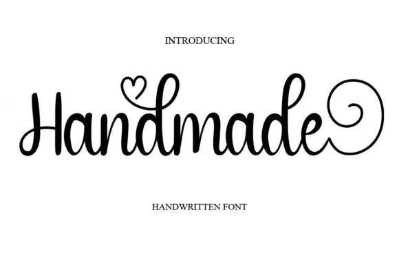
Upright rounded script with a heart swash and a spiral exit
Handmade is an upright rounded script in which the downstrokes stay heavy, the d loops rise narrow, a heart sprouts from one upper loop and the closing letter finishes in a large circular spiral, so a phrase reads as written with love.
Ideas for this font
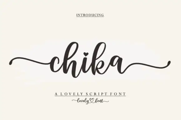
Round connected script with a heart dot and long tapering outer tails
Chika is a round connected script with a heavy even stroke, a heart instead of a dot on the i and long tapering tails that leave the word flat on both sides.
Ideas for this font
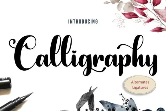
Heavy high-contrast looped calligraphy with swashed capitals and tight fit
Calligraphy is heavy high-contrast looped lettering in which the capitals carry wide swashes, the stems are thick and the joins are hairline, so a single word reads as a drawn flourish rather than a written line.
Ideas for this font
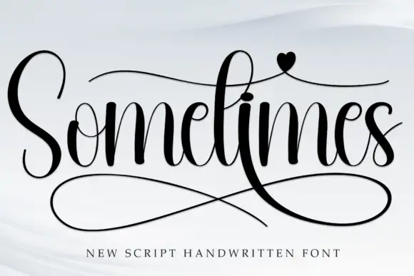
High-contrast handwritten script with long swashes
Sometimes is a high-contrast handwritten script in black on white: thick downstrokes against hairlines, a very tall S, crossbar strokes that run the length of the word, a heart on the i and a huge double loop sweeping under the letters.
Ideas for this font
Same independent foundry
Allow optional Google Analytics to measure visits and catalogue actions. Your search words and notes are not included. Privacy & storage