Modern Grotesque Body

Game Day + Montreal
Creates crisp high-hierarchy contrast beneath Game Day headlines across menus, websites and labels.
Inspect Montreal specimenDisclosure: MakerFileHub may earn a commission from qualifying purchases via paid links on this page. How our links work.
Rough tilted slabs with dense chips and uneven baselines
Game Day uses black chipped capitals with broad slab ends on a pale brush patch, where the upper row rises and falls slightly instead of sitting on a level baseline and the heavy lower row keeps compact triangular counters with rough edges throughout.
Paid link
Get this fontProject & layout blueprintsAt-a-glance maker compatibility
Open counter bridges hold interior islands intact on laser-cut wood, acrylic, and mylar stencils.
Visual anatomy & craft review
The slabs stay broad, the edges chip, the counters narrow to triangles and the rows drift off the baseline. That irregular placement is the character: the sample reads as a stamped sporty print rather than a typed headline, which is why the dots, hashes, plus marks and brush patch sit around it. Those marks are not confirmed glyphs, so keep them as artwork. Keep 44 pt so the chips stay visible, check the triangular counters on fabric and set the baseline drift deliberately rather than by eye.
Rough tilted slabs with dense chips and uneven baselines
Two-font hierarchy recipes
Tested contrast partners — pairing Game Day with grounded secondary typography.
Game Day + Montreal
Creates crisp high-hierarchy contrast beneath Game Day headlines across menus, websites and labels.
Inspect Montreal specimen
Game Day + Aureline
Adds a warm human signature touch for 1-to-3-word callouts without competing against structured serif capitals.
Inspect Aureline specimenPractical applications
Concrete hierarchy, scale and production guidance tailored to Game Day’s stroke geometry.
The chipped slabs give a team name its worn look, and the triangular counters stay open enough to read across a gym floor.
Hierarchy & layout recipe
Print a 300 mm back panel: set the team name at 66 mm across two rows, keep 12 mm between letters so the chips stay separate, and keep 20 mm of margin from each side seam.
Pre-production check
Chips under 2 mm disappear on jersey mesh; check the transfer proof and keep the name at 56 mm.
The jaunty rows suit a game-day party board, and the heavy slabs hold short words at a distance where a thin face would vanish.
Hierarchy & layout recipe
Print a 600 by 300 mm board: set the greeting at 56 mm across two rows with the second row offset 8 mm right, keep 22 mm of clear ground beneath before the kick-off time at 14 pt, and keep 26 mm of border.
Pre-production check
The baseline drift needs intent; check the artwork and record the offset before it goes to print.
The worn blocks give a sports bar a matchday mark, and the compact counters keep a short team name dense on a small label.
Hierarchy & layout recipe
Print a 60 by 90 mm label: set the bar name at 24 pt on one row, keep 10 mm of clear ground beneath before the street at 7 pt, and keep 6 mm to the die edge so the chips are not clipped.
Pre-production check
The triangular counters fill at 18 pt; check the plate proof and hold the name at 22 pt or above.
Technical & licence verification
Confirm included OTF/TTF/WOFF formats, full glyph tables and licence coverage on the live store page before batch production.
Closest visual alternatives
Matched across letterform anatomy, stroke behaviour and craft applications.
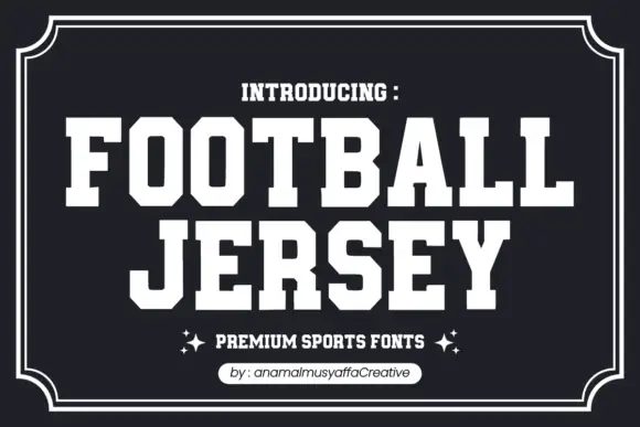
Solid athletic capitals with clipped corners and square slab ends
Football Jersey presents solid white athletic capitals on charcoal inside a double frame, where the O bowls have cut-off corners, the T and J carry broad rectangular terminals and the two rows keep an even dense rhythm with almost no space between the letters.

Collegiate slab with inline border
Varsity Legacy is a collegiate slab in black with a thin light inline border on a pale wood ground: wide caps with heavy slab serifs, a low waist and closed counters, edged by a light contour that follows every stroke, with tracked lines above and below.
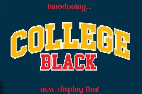
Double-outlined varsity jersey display
College Black pairs heavy collegiate slab capitals with a built-in athletic border framing, where wide stable letterforms and generous counter openings keep arched headlines crisp on jerseys, pennants and party backdrops.
Ideas for this font
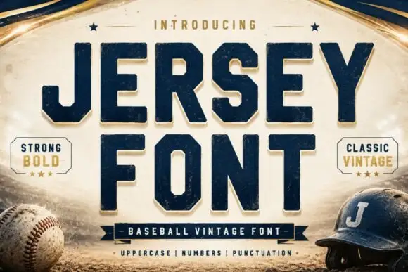
Square athletic capitals with chamfered bowls, hooked J and small slab feet
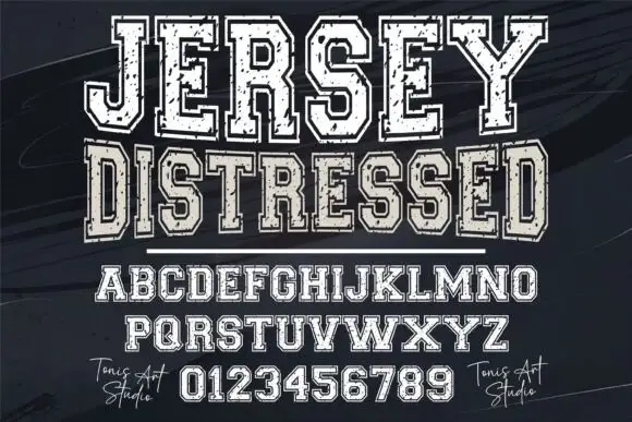
Jersey is a square athletic slab in which the capitals clip their corners, the O chamfers into an octagon, the J hooks under its stem and small slab feet sit flat, so a team name reads as a stadium board.
Ideas for this font
Same independent foundry
Allow optional Google Analytics to measure visits and catalogue actions. Your search words and notes are not included. Privacy & storage