Modern Grotesque Body

Funky Grunge + Homies
Creates crisp high-hierarchy contrast beneath Funky Grunge headlines across menus, websites and labels.
Inspect Homies specimenDisclosure: MakerFileHub may earn a commission from qualifying purchases via paid links on this page. How our links work.
Seventies funky display with stacked offset outlines
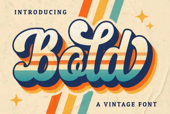
Funky Grunge is a seventies funky display alphabet in which the letters bulge, the counters close and two offset outlines stack behind each word, so a two-word title reads as a record sleeve from 1974.
Paid link
Get this fontProject & layout blueprintsAt-a-glance maker compatibility
Fine grain and micro-texture excel in 300 DPI print, sublimation, and screen print rather than small vinyl weeding.
Visual anatomy & craft review
The F curls a wide arm, the u fills its bowl, the n keeps two soft shoulders, the k turns two fat diagonals, the y drops a wide tail and the G closes a heavy eye, all at a funky weight with rounded contours and two offset copies of the same shape behind the fill. The stacked offsets are the character: they give the word depth without a shadow blur, which is why the sample sets two lines with the stripes running in opposite directions. Because the shapes are solid, the face holds from 30 pt and prints in three flat inks. The pale crumpled ground, the small sparkles and the caption below are presentation; the cream letters with striped relief are the face.
Funky · Retro · Layered
Two-font hierarchy recipes
Tested contrast partners — pairing Funky Grunge with grounded secondary typography.
Funky Grunge + Homies
Creates crisp high-hierarchy contrast beneath Funky Grunge headlines across menus, websites and labels.
Inspect Homies specimen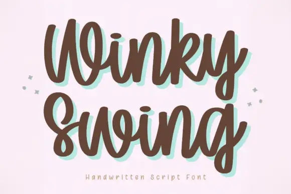
Funky Grunge + Winky Swing
Adds a warm human signature touch for 1-to-3-word callouts without competing against structured serif capitals.
Inspect Winky Swing specimenPractical applications
Concrete hierarchy, scale and production guidance tailored to Funky Grunge’s stroke geometry.
The stacked offsets give a seventies dance poster its period depth, and the bulging letters read at 90 mm in three flat inks.
Hierarchy & layout recipe
Print an A2 poster: set the title at 90 mm on two lines, offset each line in the opposite direction by 6 mm, and keep 30 mm of border so the relief stays on the sheet.
Pre-production check
Offsets that run the same way on both lines flatten the effect; check the poster and reverse the direction on the second line.
The funky weight reads from behind a freezer door, and the stacked relief gives a tub a period look at 30 mm in two inks.
Hierarchy & layout recipe
Print a 70 by 45 mm label: set the brand name at 30 mm, keep the offset layers at 2 mm, and keep 5 mm from the die so the relief is not trimmed by the cut.
Pre-production check
A relief printed to the die edge looks cut; check the imposed label and centre the word on the panel.
The bulging shapes suit a seventies birthday invitation, and the stacked offsets hold at 34 pt on a matte card in three inks.
Hierarchy & layout recipe
Print an A6 card: set the greeting at 34 pt, keep the offset at 1.5 mm throughout, and set the details in a 9 pt rounded sans beneath with 12 mm of clearance.
Pre-production check
Three inks on a small card multiply registration error; check a proof and drop the second offset if the drift shows.
Technical & licence verification
Confirm included OTF/TTF/WOFF formats, full glyph tables and licence coverage on the live store page before batch production.
Closest visual alternatives
Matched across letterform anatomy, stroke behaviour and craft applications.
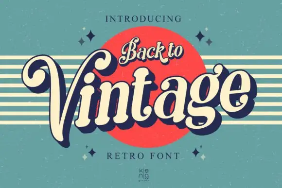
Slanted retro serif with curled V
Back to Vintage shows bold slanted high-contrast letters in cream with a deep navy shadow, where the large V curls inward at its upper left, the g carries a deep rounded lower loop and a small top hook, and a script badge reading Back to sits above on a red disc.
Ideas for this font
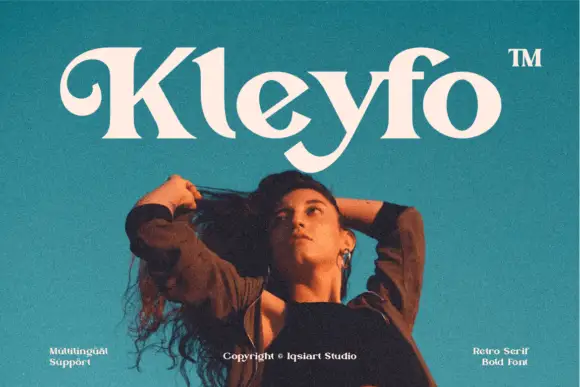
Heavy retro serif with a curled K entry and sweeping terminal swashes
Kleyfo is a heavy retro serif in which the stems carry groovy weight, the K opens a long curled entry, the diagonals stay thick and the terminals sweep into small pointed joins, so a short name reads as a seventies boutique label.
Ideas for this font
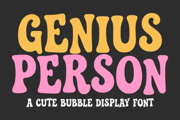
Soft retro capitals with flared rounded ends and a heavy rounded body
Genius Person is a soft retro capital alphabet whose stems flare slightly at the ends, whose corners are fully rounded, and whose weight is heavy enough to read as a bubble serif rather than a text face.
Ideas for this font
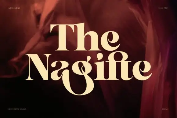
High-contrast serif display with ligature flourish
The Nagifte is a high-contrast serif display in cream on deep red fabric: hairline joins, a tall looped T entry and a g whose descender ties into the following letter, with the whole word set as one ligatured unit.
Ideas for this font
Same independent foundry
Allow optional Google Analytics to measure visits and catalogue actions. Your search words and notes are not included. Privacy & storage