Modern Grotesque Body

The Nagifte + Modern Heritage
Creates crisp high-hierarchy contrast beneath The Nagifte headlines across menus, websites and labels.
Inspect Modern Heritage specimenDisclosure: MakerFileHub may earn a commission from qualifying purchases via paid links on this page. How our links work.
High-contrast serif display with ligature flourish
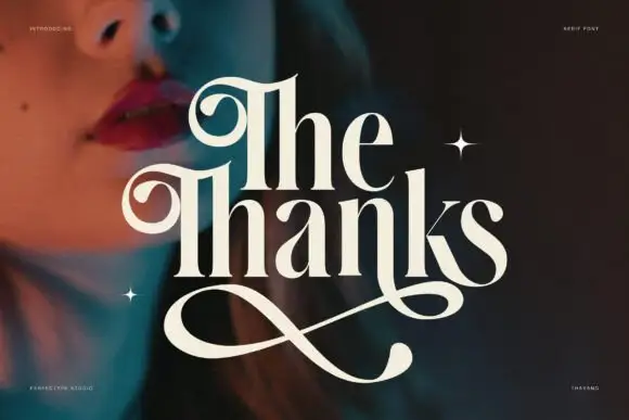
The Nagifte is a high-contrast serif display in cream on deep red fabric: hairline joins, a tall looped T entry and a g whose descender ties into the following letter, with the whole word set as one ligatured unit.
Paid link
Get this fontProject & layout blueprintsAt-a-glance maker compatibility
Sturdy stroke walls and open counters weed cleanly on adhesive vinyl, HTV apparel film, and cut cardstock.
Visual anatomy & craft review
The two words are stacked, and the lower one is where the drawing shows itself: the g drops a descender that loops under the f and the t and returns as a hairline, so three letters read as a single drawn shape. Elsewhere the face stays disciplined, with thick stems, thin joins and short flat serifs, and the N and the T carry tall entries that lift above the cap line, giving the pair of words a stepped silhouette. Contrast is extreme enough to need a mid-value ground, which the mockup provides with a dark red fabric photograph lit from the left, so the cream type stays legible where the cloth folds. The corner labels are tiny tracked capitals naming the studio and the designer, and their restraint is part of the presentation: everything except the two display words is deliberately quiet.
Dramatic, contrasted, ligatured, luxurious
Two-font hierarchy recipes
Tested contrast partners — pairing The Nagifte with grounded secondary typography.
The Nagifte + Modern Heritage
Creates crisp high-hierarchy contrast beneath The Nagifte headlines across menus, websites and labels.
Inspect Modern Heritage specimen
The Nagifte + Stylish
Adds a warm human signature touch for 1-to-3-word callouts without competing against structured serif capitals.
Inspect Stylish specimenPractical applications
Concrete hierarchy, scale and production guidance tailored to The Nagifte’s stroke geometry.
A ligatured serif gives a magazine cover a typographic signature that a stock didone cannot, and the cream on a dark image reads at newsstand distance.
Hierarchy & layout recipe
Set the title at 90 pt in two lines with the g ligature enabled, the issue details in 8 pt caps at the four corners, and the cover image darkened by 20 percent behind the type. Keep the ligature inside a 15 mm margin so it never reaches the trim.
Pre-production check
Check the ligature at 90 pt: the hairline return under the f and the t is the first thing to break on uncoated stock, so proof on the actual paper. Confirm the corner labels stay above 7 pt and that the looped descender clears the image's dark fold.
A high-contrast serif with a single ligatured pair reads as luxury without ornament, and the ligature gives the mark a detail that survives being printed small on a carton.
Hierarchy & layout recipe
Set the name at 28 pt with the ligature enabled for the g and the following letter, and pair it with a 0.5 pt rule 6 mm below. Use single-colour foil for the carton and a solid ink for the label.
Pre-production check
Check the foil at 28 pt, where a hairline under 0.3 mm will not hold a clean edge, and confirm the ligature does not read as a printing error at that size. Verify the mark still works at 24 mm wide on the bottle label.
A contrasted serif with a tied descender gives an album cover the weight of a book jacket while staying romantic, which is a narrower register than either a script or a plain roman.
Hierarchy & layout recipe
Set the couple's names at 40 pt in two lines on a 300 mm square cover, the date in a 10 pt roman caps beneath, and the image full bleed with a 30 percent scrim in the upper half. Keep the ligature clear of the scrim's edge by 12 mm.
Pre-production check
Check the descender loop against the scrim boundary, where a light grey edge can cut the hairline visually; move the scrim rather than the type. Confirm the 10 pt caps hold on the album's coated paper and that the names read from a metre away.
Technical & licence verification
Confirm included OTF/TTF/WOFF formats, full glyph tables and licence coverage on the live store page before batch production.
Closest visual alternatives
Matched across letterform anatomy, stroke behaviour and craft applications.
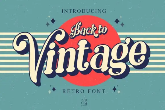
Slanted retro serif with curled V
Back to Vintage shows bold slanted high-contrast letters in cream with a deep navy shadow, where the large V curls inward at its upper left, the g carries a deep rounded lower loop and a small top hook, and a script badge reading Back to sits above on a red disc.
Ideas for this font
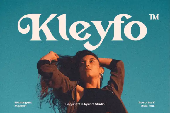
Heavy retro serif with a curled K entry and sweeping terminal swashes
Kleyfo is a heavy retro serif in which the stems carry groovy weight, the K opens a long curled entry, the diagonals stay thick and the terminals sweep into small pointed joins, so a short name reads as a seventies boutique label.
Ideas for this font
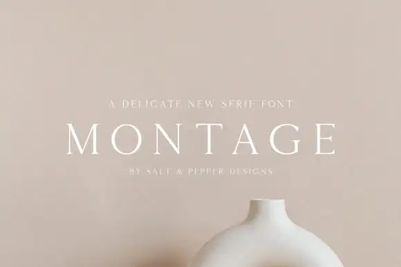
Delicate high-contrast serif
Montage is a delicate serif in white on a soft beige field: very fine hairlines, wide letterspacing, thin bracketed serifs and a high waist, set in caps on one line with a tracked line above and an attribution beneath, on a still life of a ceramic vessel.
Ideas for this font

Fine serif title with large upper and lower loops
Amilea shows pale yellow high-contrast letters with fine tapered serifs and broad rounded lowercase over a dark portrait, where a thin loop curves below the capital A and a tall upper flourish crosses the central ascender before sweeping right.
Same independent foundry
Allow optional Google Analytics to measure visits and catalogue actions. Your search words and notes are not included. Privacy & storage