Neutral Sans Workhorse

Fox Daisy + Helina
Lets Fox Daisy own the focal silhouette while handling secondary copy, sizing and subheads cleanly.
Inspect Helina specimenDisclosure: MakerFileHub may earn a commission from qualifying purchases via paid links on this page. How our links work.
Plump daisy-filled capitals with jagged stitch-like border marks
Fox Daisy fills fat rounded capitals with a printed daisy pattern in four colourways and then edges every letter with a hand-stitched line, so a word looks like sewn fabric cut into letters.
Paid link
Get this fontProject & layout blueprintsAt-a-glance maker compatibility
Sturdy stroke walls and open counters weed cleanly on adhesive vinyl, HTV apparel film, and cut cardstock.
Visual anatomy & craft review
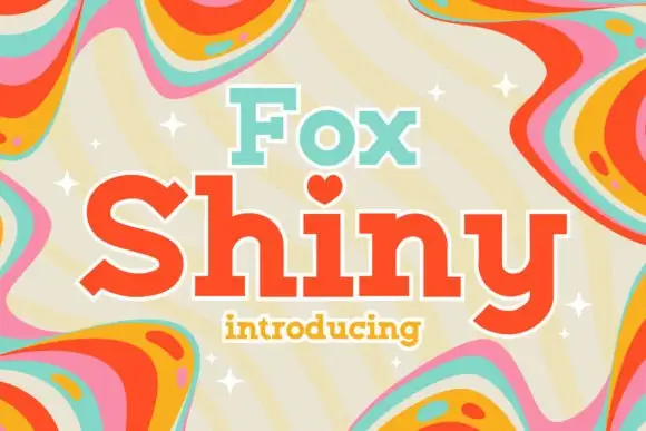
FOX over DAISY stands on a pink ground inside a white arch, the letters inflated into soft bubbles with one thick black outline and a broken stitch running inside it. Each letter takes a different daisy field, pink, lilac, mint and tan, so the word alternates colour while the flower motif repeats, and a couple of letters tilt as if the pieces were pinned by hand. A stitched badge counts four styles, and the cover keeps decorative clutter out of the way of the two rows. The pattern is dense, so a letter reads as colour at a distance and as daisies only close up, and the stitching needs a print size where the dashes stay separate.
Plump daisy-filled capitals with jagged stitch-like border marks
Two-font hierarchy recipes
Tested contrast partners — pairing Fox Daisy with grounded secondary typography.
Fox Daisy + Helina
Lets Fox Daisy own the focal silhouette while handling secondary copy, sizing and subheads cleanly.
Inspect Helina specimen
Fox Daisy + Papillon Serif – Elegant Modern Luxury
Grounds bold display lettering with classic typographic authority on posters, badges and apparel.
Inspect Papillon Serif – Elegant Modern Luxury specimenPractical applications
Concrete hierarchy, scale and production guidance tailored to Fox Daisy’s stroke geometry.
The sewn daisy pattern suits a stall that sells handmade cloth goods, and the plump letters stay warm and readable on a small sign.
Hierarchy & layout recipe
Print a 100 by 150 mm card: set the stall name at 30 pt across two rows, keep 14 mm of clear ground beneath before the opening times at 9 pt, and keep 10 mm of margin so the stitched edges are not trimmed.
Pre-production check
Stitch dashes blur below 18 pt; check the print proof and keep the name at 24 pt or above.
The daisy fill carries a spring garden theme without extra decorations, and the fat letters stay legible from across a lawn.
Hierarchy & layout recipe
Print a 1200 by 350 mm banner: set the greeting at 130 pt on one row, keep 28 mm of clear ground beneath before the age at 22 pt, and keep 34 mm of border so the tilted letters keep their space.
Pre-production check
Four colourways in one line; check the file layout before ordering a two-colour banner print.
The floral fill makes a plain exercise book feel like a keepsake, and the rounded letters survive a small printed label on a cover.
Hierarchy & layout recipe
Print a 70 by 100 mm cover label: set the subject at 20 pt on one row, keep 8 mm of clear ground beneath before the child's name at 7 pt, and keep 6 mm from the lettering to the label edge.
Pre-production check
Daisy detail vanishes at small sizes; check the label proof before printing a class set of books.
Technical & licence verification
Confirm included OTF/TTF/WOFF formats, full glyph tables and licence coverage on the live store page before batch production.
Closest visual alternatives
Matched across letterform anatomy, stroke behaviour and craft applications.
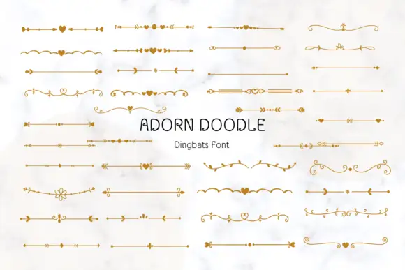
Fine horizontal divider dingbats with hearts, arrows and curled floral ends
Adorn Doodle is a dingbat set of horizontal rules: arrowed lines, dotted leaders, small vines, scrolls and hearts, each drawn in a fine even line and each built to run edge to edge.
Ideas for this font
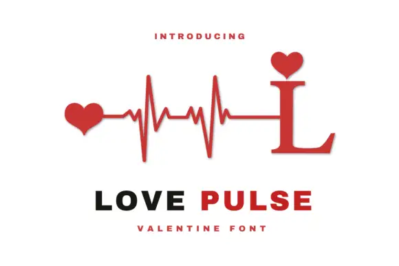
Heartbeat monogram design
Love Pulse Monogram is a monogram design in red and black on white: a serif capital L whose stem rises into a heartbeat line ending in two hearts, with a small heart seated on the ascender, and two plain lines beneath that name the design and the occasion.
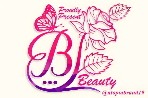
A looping contrast B initial with a large outlined flower, leaves and butterfly
Beauty Flower Monogram is a single ornate script initial with a long descending swash that turns into a line-drawn rose, two leaves and a butterfly, set in a warm pink-to-magenta gradient.
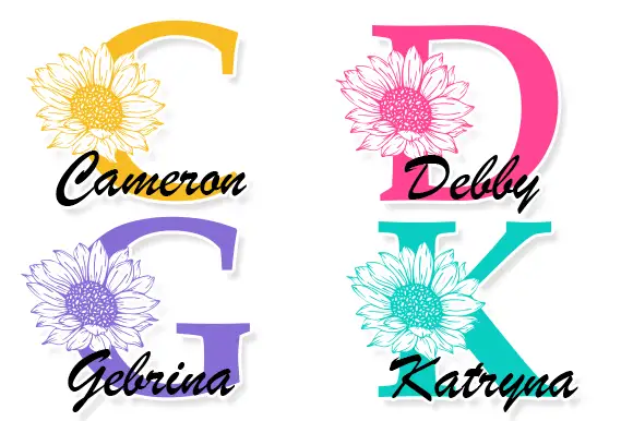
Large contrast serif initials crossed by finely drawn sunflower heads with separate script names
Cameron Monogram draws a heavy split capital with a sunflower blooming in its counter, runs a script name across the cut, and repeats the construction in four colourways.
Ideas for this font
Same independent foundry
Allow optional Google Analytics to measure visits and catalogue actions. Your search words and notes are not included. Privacy & storage