Editorial Serif Anchor

Farmhouse + Evoire
Anchors Farmhouse's fluid strokes with crisp Roman proportions on wedding suites, headers and packaging.
Inspect Evoire specimenDisclosure: MakerFileHub may earn a commission from qualifying purchases via paid links on this page. How our links work.
Bouncing looped farmhouse script with curled outer strokes
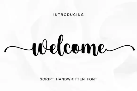
Farmhouse is a bouncing looped script in which the first and last strokes curl into wide spirals, the baseline lifts and settles and the letters keep an easy rounded weight.
Paid link
Get this fontProject & layout blueprintsAt-a-glance maker compatibility
Weld or Unite overlapping script joins into one continuous vector path before sending to the blade.
Visual anatomy & craft review
The entry begins with a spiral curl that loops back on itself before the f rises into a tall stem, and the letters after it keep that looseness: the a closes a wide bowl, the r holds a long arm, the m keeps three soft arches and the h rises without closing its loop. The exit repeats the entry as a mirrored spiral, and those two curls are what give the word its rustic, hand-lettered silhouette on a sign. Weight is medium and even, joins carry the same weight as the letters and the ends are rounded rather than tapered, which keeps the phrase legible at 16 pt. The baseline bounces by a few points letter by letter without losing its direction. The botanical sprig, the cream ground and the small sans caption are presentation; the script is the word.
Bouncy · Looped · Rustic
Two-font hierarchy recipes
Tested contrast partners — pairing Farmhouse with grounded secondary typography.
Farmhouse + Evoire
Anchors Farmhouse's fluid strokes with crisp Roman proportions on wedding suites, headers and packaging.
Inspect Evoire specimen
Farmhouse + Lemon Milk Pro FTR
Keeps small-scale dates, URLs, nutrition facts and care instructions crisp and legible below script titles.
Inspect Lemon Milk Pro FTR specimenPractical applications
Concrete hierarchy, scale and production guidance tailored to Farmhouse’s stroke geometry.
The spiral entry and exit let a single word act as a sign, and the bouncing baseline keeps a rustic tone without any drawn ornament.
Hierarchy & layout recipe
Set the shop name at 22 cm on a 2 m board, keep the opening hours in a clean sans at 5 cm, and hold 15 cm of clearance at each end so both spirals are on the board.
Pre-production check
Painting a spiral curl neatly takes a steady brush; mask the outer curl with tape and check the ends lift cleanly before sealing.
The rustic curls match a venue built from timber, and the bouncing baseline keeps a welcome sign informal without losing legibility.
Hierarchy & layout recipe
Set the greeting at 12 cm on a 600 by 500 mm board, set both names in the same face at 7 cm beneath, and leave 10 cm of margin so the spirals stay inside the frame.
Pre-production check
Outdoor boards are read from a distance on the day; check the sign in place and confirm the curls still read as lettering, not as marks.
The curled hand suits a small tag and the even weight keeps a short thanks readable at 13 pt without crowding the punch hole.
Hierarchy & layout recipe
Set the greeting at 13 pt on a 40 by 80 mm tag, keep the shop name in a 6 pt sans, and leave a 12 mm clear band at the top so no curl crosses the hole.
Pre-production check
A spiral curl near the hole tears when the tag is tied; check the artwork against the punch position and shorten the entry if needed.
Technical & licence verification
Confirm included OTF/TTF/WOFF formats, full glyph tables and licence coverage on the live store page before batch production.
Closest visual alternatives
Matched across letterform anatomy, stroke behaviour and craft applications.

Tall connected script with a long y descender and open round bowls
Hello Honey is a tall connected script in which the ascenders rise high, the bowls stay round and the y drops a descender that runs far below the line before curling away.
Tall script with an oversized narrow M
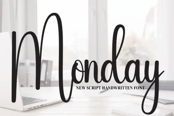
Monday is a tall script in black over a photograph of a desk: a very tall narrow capital M drawn as two long strokes with a shallow valley between, a compact connected body and a y whose descender curls below the word.
Ideas for this font
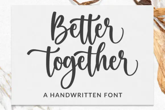
Broad bouncing script with paired cross strokes and a deep descender loop
Better Together is a broad bouncing script in which the words rise and fall, the paired t cross strokes reach across neighbours and the g drops a deep loop, so a stacked phrase reads as a warm handwritten statement.
Ideas for this font
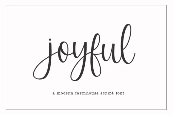
Modern farmhouse script with open descenders and long exit tails
Joyful Script is a modern farmhouse script with light even strokes, wide open descenders and long exit tails, drawn so a single word sits evenly across a wide card.
Ideas for this font
Same independent foundry
Allow optional Google Analytics to measure visits and catalogue actions. Your search words and notes are not included. Privacy & storage