Neutral Sans Workhorse

Fairies + Bielchon
Lets Fairies own the focal silhouette while handling secondary copy, sizing and subheads cleanly.
Inspect Bielchon specimenDisclosure: MakerFileHub may earn a commission from qualifying purchases via paid links on this page. How our links work.
Fantasy display with pointed ascenders and a gilded bevel
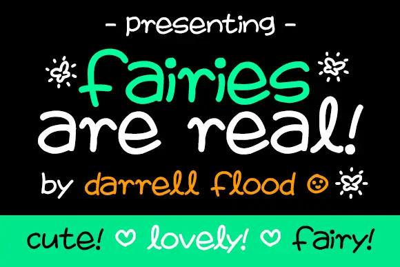
Fairies is a fantasy display alphabet in which the ascenders stretch into points, the bowls open wide and the terminals curl, so a single word reads as a title from an illustrated storybook.
Paid link
Get this fontProject & layout blueprintsAt-a-glance maker compatibility
Sturdy stroke walls and open counters weed cleanly on adhesive vinyl, HTV apparel film, and cut cardstock.
Visual anatomy & craft review
The F rises into a long pointed ascender, the a closes a wide bowl, the i carries a floating dot, the r finishes a curled arm, the e turns a round eye and the s holds a broad spine, all at a moderate weight with pointed ascenders, curled terminals and a drawn bevel that catches light. The points are the character: they lift the word above the cap line, which is why the sample sets one name with a line of smaller script beneath. Because the terminals are thin, the face needs 32 pt before they read, and it prints best in two tones. The black field, the gilded finish and the smaller attribution line are presentation; the gold display word is the face.
Fantasy · Pointed · Gilded
Two-font hierarchy recipes
Tested contrast partners — pairing Fairies with grounded secondary typography.
Fairies + Bielchon
Lets Fairies own the focal silhouette while handling secondary copy, sizing and subheads cleanly.
Inspect Bielchon specimen
Fairies + Augler
Grounds bold display lettering with classic typographic authority on posters, badges and apparel.
Inspect Augler specimenPractical applications
Concrete hierarchy, scale and production guidance tailored to Fairies’s stroke geometry.
The pointed ascenders give a child's card a storybook feel, and the wide bowls keep a name readable at 32 pt on a folded card in one ink.
Hierarchy & layout recipe
Print an A6 card: set the name at 32 pt, set the age in a 10 pt script beneath, and keep 14 mm of margin so the pointed ascender sits inside the trim.
Pre-production check
A pointed ascender printed to the trim looks cut; check the imposed card and lower the word by 4 mm.
The fantasy register gives a candle a mark with a story, and the moderate weight holds a brand name at 22 pt on a coated label in two tones.
Hierarchy & layout recipe
Print a 60 by 45 mm label: set the brand name at 22 pt, set the scent in a 7 pt script beneath, and keep 5 mm from the die so the curled terminal stays whole.
Pre-production check
A curled terminal cut by a small die loses its shape; check the imposed label and raise the word 2 mm.
The fantasy face suits a folklore feature opener, and the drawn bevel holds at 64 pt on a printed page in one flat colour.
Hierarchy & layout recipe
Print an A4 opener: set the title at 64 pt across the upper third, set the standfirst in a 10 pt serif beneath, and keep 22 mm of clearance so the pointed ascenders have air.
Pre-production check
A bevel printed as a gradient looks like a rendering error; check the proof and keep the bevel as a flat second tone.
Technical & licence verification
Confirm included OTF/TTF/WOFF formats, full glyph tables and licence coverage on the live store page before batch production.
Closest visual alternatives
Matched across letterform anatomy, stroke behaviour and craft applications.
Squared narrow blackletter
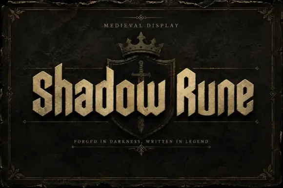
Shadow Rune is a squared narrow blackletter in bone on a dark stone ground: capitals with diagonal shoulders, a clipped S, blunt stems and a small scale texture, set as two words across a shield device with a small tracked line above and a plain line beneath.
Outlined ornamental blackletter
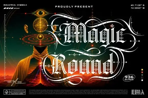
Magic Round is an outlined ornamental blackletter in white on a dark illustrated scene: letters traced with a double line and filled with a diamond lattice, with huge swashes that sweep beneath and between the words, set in two lines above a landscape of a hooded figure, an eye and a volcano, with small technical marks at the corners.
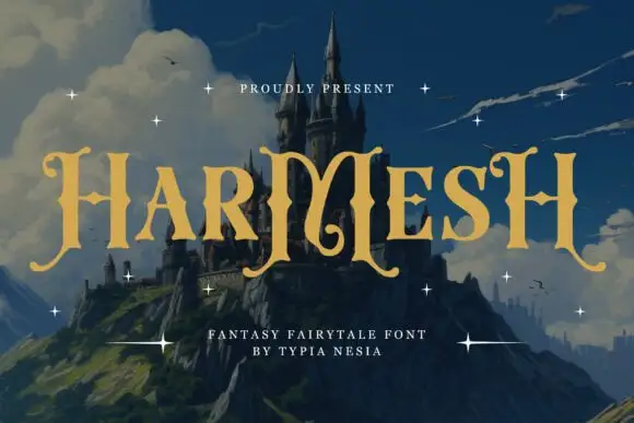
Angular fantasy capitals with hooked tops and curling feet
Harmesh shows gold-coloured capitals over a castle landscape, where tall stems end in pointed hooks and large curling feet, and the heavy H and M shapes use angular inner joins with broad triangular endings while small stars sit around the title.
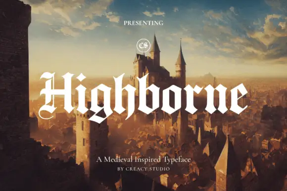
Solid blackletter with divided H and pointed angular shoulders
Highborne sets a solid blackletter across a painted castle town, its strokes rising into sharp peaks, the shoulders angled into points and the first capital divided down the middle.
Same independent foundry
Allow optional Google Analytics to measure visits and catalogue actions. Your search words and notes are not included. Privacy & storage