Editorial Serif Anchor

Happy Trails + Raffined
Anchors Happy Trails's fluid strokes with crisp Roman proportions on wedding suites, headers and packaging.
Inspect Raffined specimenDisclosure: MakerFileHub may earn a commission from qualifying purchases via paid links on this page. How our links work.
Compact heavy capitals with rounded ends and slightly irregular stems
Happy Trails is compact heavy capital lettering in which the stems wobble slightly, the ends are fully rounded and the letters sit close together, so a two-word phrase reads as a hand-drawn badge.
Paid link
Get this fontProject & layout blueprintsAt-a-glance maker compatibility
Weld or Unite overlapping script joins into one continuous vector path before sending to the blade.
Visual anatomy & craft review
The letters are short and wide: the H keeps two thick stems joined by a heavy bar, the A closes to a soft apex, the P holds a deep bowl and the T carries a wide arm, and the vertical stems drift by a hair rather than standing perfectly true. That wobble is what keeps the phrase from reading as a plain bold sans, and the fully rounded terminals add to the handmade feel. Weight is heavy and even, counters are small but open and the fit is tight enough that the two words lock together inside a frame. The crushed paper ground, the blue ink, the mountain rule and the small strapline are presentation; the lettering is the two words.
Compact · Heavy · Rounded
Two-font hierarchy recipes
Tested contrast partners — pairing Happy Trails with grounded secondary typography.
Happy Trails + Raffined
Anchors Happy Trails's fluid strokes with crisp Roman proportions on wedding suites, headers and packaging.
Inspect Raffined specimen
Happy Trails + Noar
Keeps small-scale dates, URLs, nutrition facts and care instructions crisp and legible below script titles.
Inspect Noar specimenPractical applications
Concrete hierarchy, scale and production guidance tailored to Happy Trails’s stroke geometry.
The compact heavy capitals sit inside a badge frame without crowding, and the slight wobble keeps a printed mark from looking like a stock sans at 14 pt.
Hierarchy & layout recipe
Set the brand at 14 pt inside a 60 mm round badge, keep the strapline in a 6 pt sans, and leave 6 mm from the frame so the letters do not touch the ring.
Pre-production check
A tight badge layout crowds a heavy face; check the print at final size and reduce the strapline rather than the brand.
The hand-drawn weight suits a venue in the open air, and the compact caps stay readable at a distance on a wooden board at 12 cm.
Hierarchy & layout recipe
Set the greeting at 12 cm on a 700 by 400 mm board, set both names in the same face at 6 cm beneath, and leave 10 cm of margin so the wide letters stay on the board.
Pre-production check
Painting rounded terminals cleanly takes a steady brush; mask the ends with tape and check the wobble is consistent before the second coat.
The badge weight holds on a small woven or paper label, and the tight fit keeps a two-word brand inside a narrow panel at 12 pt.
Hierarchy & layout recipe
Set the brand at 12 pt on a 50 by 30 mm label, keep the model name in a 5 pt sans beneath, and leave 4 mm of margin so the rounded ends stay inside the cut.
Pre-production check
Woven labels round off a slight wobble into a dotted edge; check a woven sample and simplify the steadiest letters before the run.
Technical & licence verification
Confirm included OTF/TTF/WOFF formats, full glyph tables and licence coverage on the live store page before batch production.
Closest visual alternatives
Matched across letterform anatomy, stroke behaviour and craft applications.
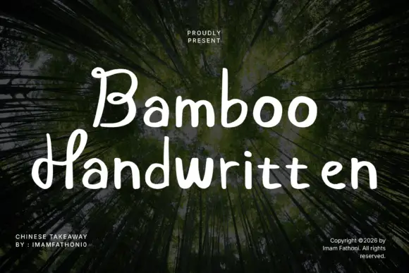
Rounded separate letters with curled capitals and a level baseline
Bamboo is rounded handwritten lettering in which the letters stand separately, the capitals curl at their ends and the baseline holds level across a phrase.
Ideas for this font
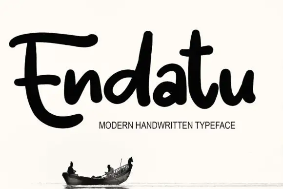
Heavy rounded connected lettering with tall stems and a wide E
Endatu is heavy rounded connected lettering whose capital E opens into a wide three-bar form while the lowercase stays tall, tight and joined, so a word reads as a dense soft block.
Ideas for this font
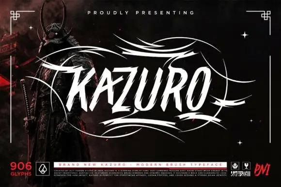
Sharp slanted brush capitals with cut terminals and a wide flourish frame
Kazuro is a sharp slanted brush alphabet in capitals, with strokes that end in hard cut angles and a flourish frame of thin sweeping lines drawn around the word.
Ideas for this font
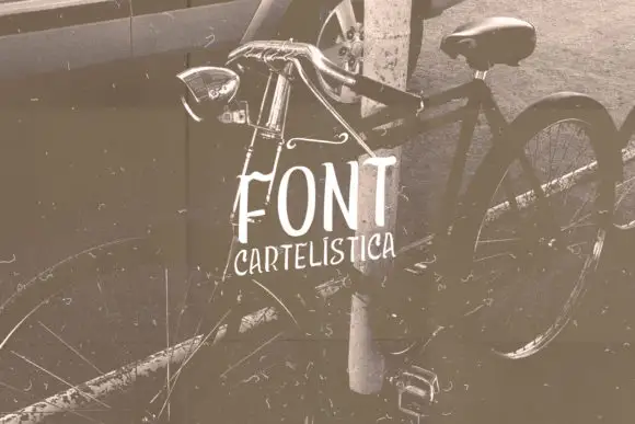
Narrow uneven vintage print
Cartelística puts narrow, unevenly weighted block capitals over a sepia bicycle photograph, with the second word set smaller and tucked beneath.
Ideas for this font
Allow optional Google Analytics to measure visits and catalogue actions. Your search words and notes are not included. Privacy & storage