Editorial Serif Anchor

Elegant Calligraphy + Svara
Anchors Elegant Calligraphy's fluid strokes with crisp Roman proportions on wedding suites, headers and packaging.
Inspect Svara specimenDisclosure: MakerFileHub may earn a commission from qualifying purchases via paid links on this page. How our links work.
Tall narrow calligraphy with heavy shading and fine joins
Elegant Calligraphy is tall narrow calligraphy in which the stems are compressed and heavily shaded while the joins stay hairline, so two words stack into a dense vertical block with strong internal contrast.
Paid link
Get this fontProject & layout blueprintsAt-a-glance maker compatibility
Weld or Unite overlapping script joins into one continuous vector path before sending to the blade.
Visual anatomy & craft review
The capital E begins with a small loop at the top of the stem and then descends in a narrow shaded stroke that ends in a curled foot, and its width is barely more than the lowercase letters that follow. Every stem in the word is compressed and shaded on the downstroke, while the connectors between letters are drawn as thin arcs that rise and fall in a shallow rhythm. The g and the y drop long narrow descenders that curve left at the end, and the second word repeats the same structure beneath, offset slightly so the two lines interlock rather than stack mechanically. Terminals taper to fine points, and the entry strokes are drawn as short horizontal leads. The soft grey background and the plain titles are presentation; the calligraphy is the two words.
Tall · Narrow · Contrasted
Two-font hierarchy recipes
Tested contrast partners — pairing Elegant Calligraphy with grounded secondary typography.
Elegant Calligraphy + Svara
Anchors Elegant Calligraphy's fluid strokes with crisp Roman proportions on wedding suites, headers and packaging.
Inspect Svara specimen
Elegant Calligraphy + Swaraga
Keeps small-scale dates, URLs, nutrition facts and care instructions crisp and legible below script titles.
Inspect Swaraga specimenPractical applications
Concrete hierarchy, scale and production guidance tailored to Elegant Calligraphy’s stroke geometry.
Narrow shaded stems hold up at small sizes on a title page, and the compressed letterforms let a long two-word title sit in one column without being broken across lines.
Hierarchy & layout recipe
Set the title at 40 pt in a 90 mm column, set the imprint in a small caps serif at 8 pt at the foot, and keep 20 mm of space above the title so the thin entry leads are not crowded by the header.
Pre-production check
Uncoated book paper with a raised grain closes hairlines; print the title page on the actual text stock and check that the joins still read before the run.
The compressed shaded stems give a formal invitation weight without width, which lets a long couple's name fit a narrow card at a readable size, and the fine joins keep the piece from looking heavy.
Hierarchy & layout recipe
Set both names at 24 pt on a 105 by 180 mm card, keep the ceremony details in a 8 pt serif, and leave 12 mm between the second name and the details so the descenders do not touch the text.
Pre-production check
A narrow shaded script printed at 24 pt on a smooth card can look blurred at the joins; check a proof at final size and hold the size rather than tightening the tracking.
Narrow calligraphy fits a tall label where a wide script would have to shrink, and the heavy shading gives the mark presence on a shelf where most labels are set in small caps.
Hierarchy & layout recipe
Set the importer's name at 14 pt vertically on a 50 by 100 mm label, keep the appellation and vintage in a 6 pt caps serif, and leave the lower third clear for the mandatory alcohol text.
Pre-production check
Vertical setting rotates the shading and can make the stems look uneven; check the printed label upright and at 90 degrees before the run is approved.
Technical & licence verification
Confirm included OTF/TTF/WOFF formats, full glyph tables and licence coverage on the live store page before batch production.
Closest visual alternatives
Matched across letterform anatomy, stroke behaviour and craft applications.

Very slanted calligraphy with broad lower sweeps and fine hairlines
Silken Luxe is a formal calligraphy script with a steep slant, broad lower sweeps and hairlines that thin almost to nothing, drawn so two words build an ornamental diagonal across the plate.
Ideas for this font
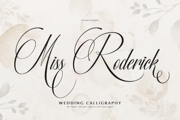
Formal calligraphy with large flourished loops
Miss Roderick is wedding calligraphy in black on cream: high-contrast copperplate-style strokes, hairlines between heavy shades, and enormous loops that leave the capitals and travel across the line, with a caption in tracked capitals beneath.
Ideas for this font
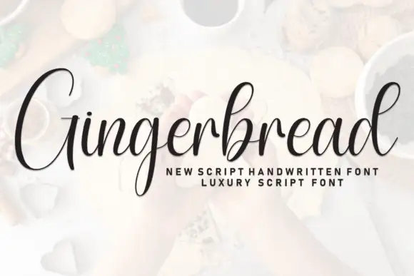
Tall contrast calligraphy with an oversized capital and a fine exit tail
Gingerbread is tall formal calligraphy whose capital stands nearly twice the height of the lowercase, with shaded stems, hairline joins and a long tail that carries the final r away from the word.
Ideas for this font

Fine slanted calligraphy with a wide open S and long low descenders
Stylish is a fine slanted calligraphy in which the S opens very wide, the l and h lift tall loops, the connectors run thin and the y drops a long low stroke, so a short phrase reads as modern pointed-pen writing.
Ideas for this font
Same independent foundry
Allow optional Google Analytics to measure visits and catalogue actions. Your search words and notes are not included. Privacy & storage