Neutral Sans Workhorse

Super Cute Font + Olline
Lets Super Cute Font own the focal silhouette while handling secondary copy, sizing and subheads cleanly.
Inspect Olline specimenDisclosure: MakerFileHub may earn a commission from qualifying purchases via paid links on this page. How our links work.
Glossy pink rounded display
Super Cute Font is a colour display on a black ground: glossy pink rounded capitals with soft highlights, dark shaded undersides and a slight taper, set in two lines inside small corner brackets, with a small note above and two plain lines beneath naming the style and the formats.
Paid link
Get this fontProject & layout blueprintsAt-a-glance maker compatibility
Sturdy stroke walls and open counters weed cleanly on adhesive vinyl, HTV apparel film, and cut cardstock.
Visual anatomy & craft review
The plate is a dark specimen, and the pink on black is the whole idea: the letters are inflated rounded forms with a highlight and a shaded underside, so the word reads as a rendered object rather than as type, and the taper gives it a gentle bounce. That construction sets a large size floor, because the highlights and the shading close first, and the note and the two lines beneath are product copy that name the style and the formats honestly. It suits a card, a shirt and a social graphic for a young, a beauty or a party subject, and it is a device for a short word rather than a face for a sentence.
Decorative, glossy, bubble, playful
Two-font hierarchy recipes
Tested contrast partners — pairing Super Cute Font with grounded secondary typography.
Super Cute Font + Olline
Lets Super Cute Font own the focal silhouette while handling secondary copy, sizing and subheads cleanly.
Inspect Olline specimen
Super Cute Font + Kernova
Grounds bold display lettering with classic typographic authority on posters, badges and apparel.
Inspect Kernova specimenPractical applications
Concrete hierarchy, scale and production guidance tailored to Super Cute Font’s stroke geometry.
A glossy display names a party, and the pink on black reads as a printed invitation rather than a template. It suits a sweet party.
Hierarchy & layout recipe
A6 card: the greeting at 30 pt, the details in a 10 pt sans, and the date at 9 pt. Keep 15 mm margins, print four colours on a dark card and leave 12 mm at the foot for the address.
Pre-production check
Check the 30 pt greeting at home-print resolution, where a highlight merges; keep it above 1.2 mm. Confirm the details keep a 4.5:1 contrast and that the card folds flat.
A glossy display prints as party kit, and the pink holds on a dark shirt where a pale face would look washed out. It reads as party kit.
Hierarchy & layout recipe
Print a 240 mm chest graphic: the crew at 50 mm cap height, the year at 24 mm, and four inks on a dark shirt. Keep the smallest highlight at 4 mm and place the graphic 80 mm below the collar.
Pre-production check
Check the screen at actual mesh, where a 4 mm highlight can fill; enlarge it. Wash-test one shirt and confirm the shading stays clean after five cycles.
A glossy poster reads in a corridor, and the rounded forms suit a sweet-themed event better than a formal face. It suits a sweet event.
Hierarchy & layout recipe
A3 poster: the sale at 80 mm cap height, the times in an 18 mm sans, and the venue at 11 mm. Keep 26 mm margins, print four colours on a light stock and keep the highlights above 3 mm.
Pre-production check
Check the A3 at four metres, where a highlight vanishes; keep it above 3 mm. Confirm the 11 mm venue reads at two metres and that the title fits the measure.
Technical & licence verification
Confirm included OTF/TTF/WOFF formats, full glyph tables and licence coverage on the live store page before batch production.
Closest visual alternatives
Matched across letterform anatomy, stroke behaviour and craft applications.
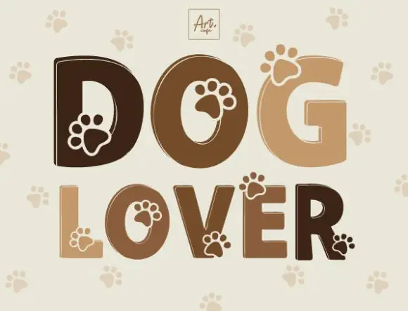
Heavy rounded capitals with paw-shaped details overlapping counters and outer edges
Dog Lover draws heavy rounded capitals in four shades of brown and cuts a paw print out of each letter, with a pale paw pattern repeating on the ground behind the words.
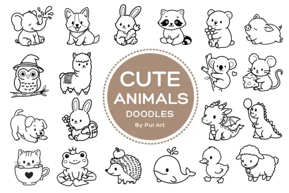
Rounded black outline animal dingbats with simple expressions and props
Cute Animals Doodles is a typable collection of about two dozen animals — elephant, corgi, bunny, raccoon, bear, owl, alpaca, koala, mouse, hedgehog, whale, duck, sheep, a small dragon — each drawn in one even black line.
Ideas for this font
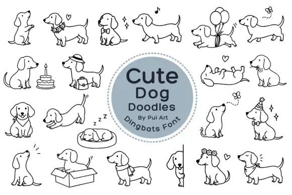
Long-bodied dog outlines with balloons, flowers and playful poses
Cute Dog Doodles is a dingbat set of about two dozen line-drawn dachshunds: sitting, sleeping in a bed, standing in a box, wearing a party hat, carrying a cake, holding a balloon, and one draped over a fence.
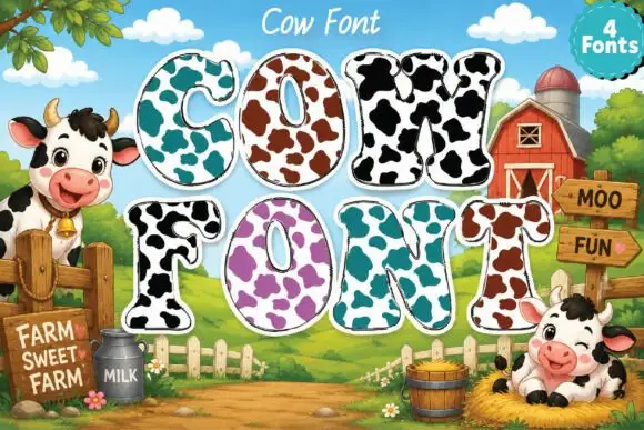
Broad rounded slab capitals carrying contrasting cow-like patches
Cow Font draws heavy rounded capitals and fills each with a cow print: a pale ground spotted with large irregular patches, available in four colourways from turquoise to purple.
Ideas for this font
Same independent foundry
Allow optional Google Analytics to measure visits and catalogue actions. Your search words and notes are not included. Privacy & storage