Neutral Sans Workhorse

Dino Park + Base Edge
Lets Dino Park own the focal silhouette while handling secondary copy, sizing and subheads cleanly.
Inspect Base Edge specimenDisclosure: MakerFileHub may earn a commission from qualifying purchases via paid links on this page. How our links work.
Tall coloured capitals with scalloped dinosaur ridges and spot clusters
Dino Park is a colour font that draws each capital as a hand-sketched dinosaur letter: a rough outline, a pastel fill, spikes along the top edge and clusters of spots scattered through the shape.
Paid link
Get this fontProject & layout blueprintsAt-a-glance maker compatibility
Sturdy stroke walls and open counters weed cleanly on adhesive vinyl, HTV apparel film, and cut cardstock.
Visual anatomy & craft review
DINO over PARK fills the card on an illustrated jungle background of trees, a river and a wooden bridge, and each letter is drawn with a wobbling black outline and filled in a soft pastel: grey, mint, orange, purple, green and blue. Rows of rounded spikes run along the tops of most letters, and clusters of small dots sit in the bowls and stems, which is what makes the set read as dinosaur skin rather than as plain colour type. A caption at the top introduces the face and one at the foot names it in the same pastel palette, and two small file labels sit in the lower right corner. The letters are wide and simple, so the drawing survives at poster size and the spots only appear up close. It is a children's and party face, and it wants a large size and a light background.
Tall coloured capitals with scalloped dinosaur ridges and spot clusters
Two-font hierarchy recipes
Tested contrast partners — pairing Dino Park with grounded secondary typography.
Dino Park + Base Edge
Lets Dino Park own the focal silhouette while handling secondary copy, sizing and subheads cleanly.
Inspect Base Edge specimen
Dino Park + Bulgary
Grounds bold display lettering with classic typographic authority on posters, badges and apparel.
Inspect Bulgary specimenPractical applications
Concrete hierarchy, scale and production guidance tailored to Dino Park’s stroke geometry.
The spikes and spots name the theme without a drawn dinosaur on the card, and the sketchy outline keeps the invitation from looking manufactured.
Hierarchy & layout recipe
Print a 105 by 148 mm invitation: set the name at 38 pt across two rows, keep 14 mm of clear ground beneath before the details at 8 pt, and hold 12 mm of margin so no spike is cut.
Pre-production check
The spots close up below 22 pt; print one card at the finished size and check the pattern before the batch.
The face gives a children's trail a subject, and the wide counters keep the heading clear for a reader walking with the sheet in hand.
Hierarchy & layout recipe
Print an A4 trail sheet: set the header at 36 pt on one row, keep 15 mm of clear ground beneath before the first stop at 11 pt, and hold 16 mm of margin at both sides of the sheet.
Pre-production check
Trail sheets are copied in bulk; copy one on the machine the museum uses and check the outlines survive.
The sketched letters suit an outdoor family event, and the pastel fills stay visible against a wooden board seen from a path.
Hierarchy & layout recipe
Print a 600 by 400 mm board: set the event name at 90 pt across two rows, keep 24 mm of clear ground beneath before the times at 14 pt, and hold 26 mm of border so the spikes stay whole.
Pre-production check
Pastels look washed out in daylight; print one board and check it outdoors before the set is mounted.
Technical & licence verification
Confirm included OTF/TTF/WOFF formats, full glyph tables and licence coverage on the live store page before batch production.
Closest visual alternatives
Matched across letterform anatomy, stroke behaviour and craft applications.
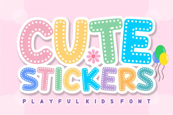
Dashed-inset sticker capitals
Cute Stickers shows thick rounded capitals with short white dash marks following the inner contours. The C curves broadly, the T carries a soft wide top, the strokes stay even and heavy, and the smaller line beneath repeats the same dashed decoration.
Ideas for this font
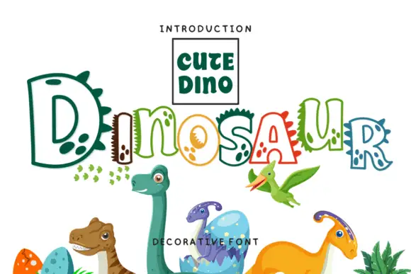
Hollow irregular mixed case with dinosaur-like spikes and rounded footprint-like spots
Dinosaur draws hollow letters with an unsteady hand, gives several of them spikes along the top and fills the neighbours with round footprint spots, so a word looks assembled by a child who likes big reptiles.
Ideas for this font
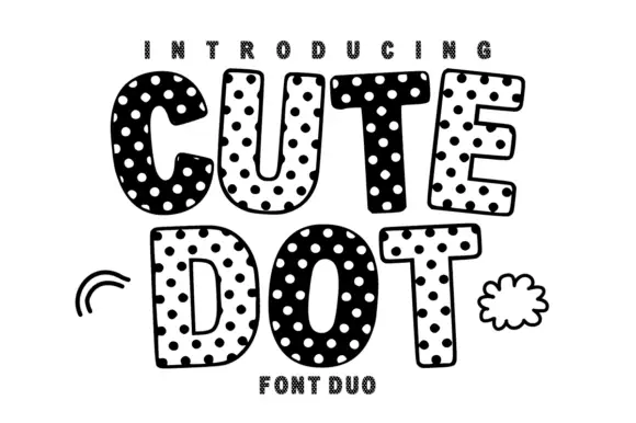
Soft uneven block capitals alternating filled white-dot and hollow dark-dot bodies
Cute Dot is a two-face set in black and white: fat rounded caps packed with dots on a white ground, and a matching face where the dots invert to white on black, both with a hatched shadow.
Ideas for this font
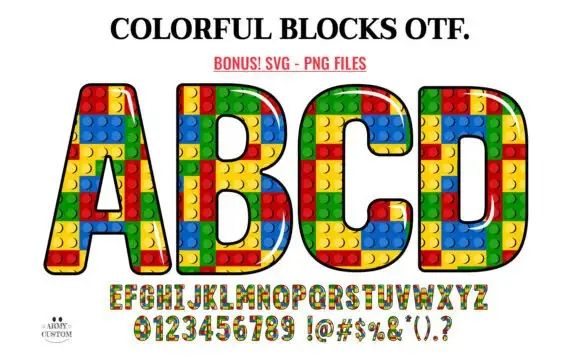
Outlined block capitals filled with colourful studded rectangles
Colorful Blocks builds every letter from a grid of plastic bricks, fills them in primary red, yellow, green and blue, and adds a glossy highlight and a heavy black contour around the whole shape.
Ideas for this font
Same independent foundry
Allow optional Google Analytics to measure visits and catalogue actions. Your search words and notes are not included. Privacy & storage