High-Contrast Display Serif

Bastion + Papillon Serif – Elegant Modern Luxury
Pairs sculptural editorial warmth with Bastion's clean modern geometry.
Inspect Papillon Serif – Elegant Modern Luxury specimenDisclosure: MakerFileHub may earn a commission from qualifying purchases via paid links on this page. How our links work.
Light uneven capitals with an arched A and a curved high N diagonal
Bastion shows pale capitals on muted green, where the B carries two broad irregular bowls, the A rises into a rounded narrow arch and the O closes as a wide near-circle while the N replaces a rigid diagonal with a high bowed connector.
Paid link
Get this fontProject & layout blueprintsAt-a-glance maker compatibility
Sturdy stroke walls and open counters weed cleanly on adhesive vinyl, HTV apparel film, and cut cardstock.
Visual anatomy & craft review
The strokes stay light and uneven, the bowls vary in width, the arch on the A narrows and the N turns its diagonal into a curve. That bowed connector is the character: a plain light cap row gains one memorable letter, which is why the sample keeps a short title with small captions beside it. Those captions are too small and too different to prove a reading system, so test the unusual A and N in your own wording and keep 30 pt before the light strokes thin away on uncoated stock.
Light caps · Arched A · Bowed N
Two-font hierarchy recipes
Tested contrast partners — pairing Bastion with grounded secondary typography.
Bastion + Papillon Serif – Elegant Modern Luxury
Pairs sculptural editorial warmth with Bastion's clean modern geometry.
Inspect Papillon Serif – Elegant Modern Luxury specimen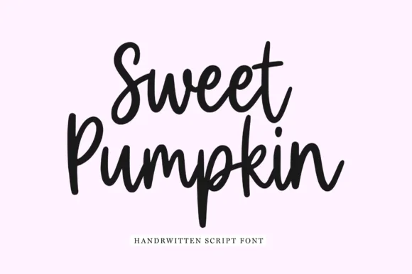
Bastion + Sweet Pumpkin
Introduces organic movement on pull-quotes, signatures and gift tags.
Inspect Sweet Pumpkin specimenPractical applications
Concrete hierarchy, scale and production guidance tailored to Bastion’s stroke geometry.
The light uneven caps give a studio a quiet mark, and the arched A holds a one-word name at 28 pt on a card, where the bowed N supplies the one unusual note.
Hierarchy & layout recipe
Print an 85 by 55 mm card: set the wordmark at 28 pt in capitals on one line, keep 16 mm of clear ground beneath before the address at 7 pt, and centre the block optically.
Pre-production check
The bowed N reads as a printing fault under 20 pt; check the proof and hold the wordmark at 24 pt or above.
The pale capitals set a restrained cover, and the wide O holds a two-word title at 56 pt on a coated page, with the uneven bowls kept from looking accidental.
Hierarchy & layout recipe
Print an A4 cover: set the title at 56 pt in capitals on one row, keep 22 mm of clear ground beneath before the cover lines at 9 pt, and keep the block on the palest band of the image.
Pre-production check
Thin pale strokes over a photograph disappear; check the cover and print the title on flat colour.
The geometric caps suit an institutional sign, and the near-circular O stays clear at 42 pt on a printed sheet, light enough to feel modern without thinning out.
Hierarchy & layout recipe
Print an A4 sign: set the department name at 42 pt in capitals on one row, keep 20 mm of clear ground beneath before the room number at 13 pt, and keep 20 mm of margin all round.
Pre-production check
Light caps seen down a corridor grey out; check the mounted sheet and hold the sign at 38 pt or above.
Technical & licence verification
Confirm included OTF/TTF/WOFF formats, full glyph tables and licence coverage on the live store page before batch production.
Closest visual alternatives
Matched across letterform anatomy, stroke behaviour and craft applications.
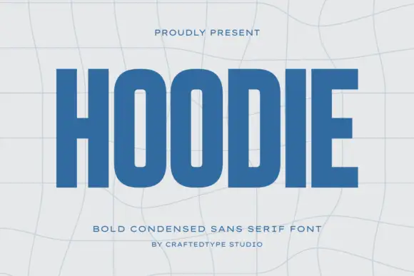
Condensed block capitals with rounded rectangular O counters
Hoodie shows a large blue uppercase word on a pale warped-grid field, where heavy straight uprights and flat horizontal endings form a dense block, the O and D hold rounded rectangular counters, the H crossbar sits near the middle and the E keeps three squared arms.
Ideas for this font
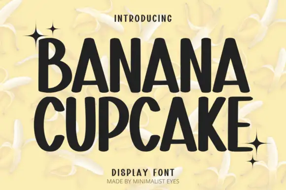
Tall playful display sans
Banana Cupcake stacks two large words in dark letters on a pale banana photograph, where tall narrow capitals fill the width, the counters squeeze into thin slots, the corners soften slightly and the letter widths shift row by row so the second word runs wider than the first.
Ideas for this font

Open rounded mixed case with a tall t and broad circular bowls
Cultivo shows a large black title-case name across the lower part of a pale beige cover, where light to moderate nearly even strokes form an open C, a broad u and near-circular bowls, the t finishes with a rounded lower turn and the v opens a clean diagonal.
Ideas for this font
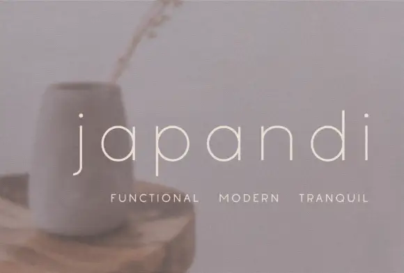
Widely spaced thin lowercase with circular bowls and a hooked j descender
Japandi draws its lowercase in a hairline geometric line, keeps the bowls almost circular and sets the words far apart on a soft photographic ground so the type feels like a room rather than a label.
Ideas for this font
Same independent foundry
Allow optional Google Analytics to measure visits and catalogue actions. Your search words and notes are not included. Privacy & storage