Modern Grotesque Body

Demolish + Mansory
Creates crisp high-hierarchy contrast beneath Demolish headlines across menus, websites and labels.
Inspect Mansory specimenDisclosure: MakerFileHub may earn a commission from qualifying purchases via paid links on this page. How our links work.
Thin Gothic-influenced lettering with pointed oval counters
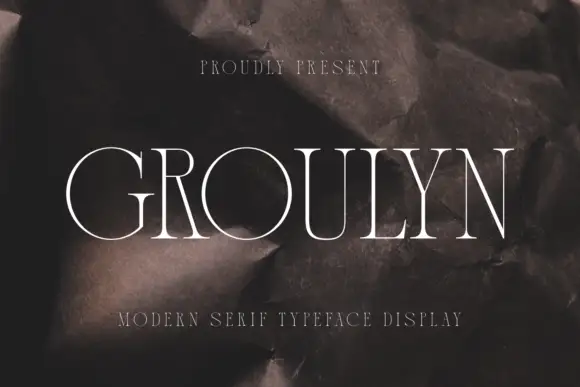
Demolish shows clean white mixed case over a dark red-black ground, where the D stands tall and softly rectangular, the e and o enclose pointed leaf-like counters and fine stems widen into small flared tips with subtle waist notches.
Paid link
Get this fontProject & layout blueprintsAt-a-glance maker compatibility
Sturdy stroke walls and open counters weed cleanly on adhesive vinyl, HTV apparel film, and cut cardstock.
Visual anatomy & craft review
The strokes stay open and light, the counters pinch into points, the tips flare briefly and the waist shows a small notch. That thin Gothic structure is the character: it borrows blackletter shapes without the dense black mass, which is why the sample sets one mixed-case word on a dark field. Because the strokes are fine, keep 30 pt as the floor, keep the word off busy imagery and check the punctuation before setting a full phrase. The pointed counters are the fragile part: they pinch shut at 26 pt and the flared tips vanish on a busy ground, so keep 30 pt and set the word on flat colour.
Thin · Gothic · Pointed counters
Two-font hierarchy recipes
Tested contrast partners — pairing Demolish with grounded secondary typography.
Demolish + Mansory
Creates crisp high-hierarchy contrast beneath Demolish headlines across menus, websites and labels.
Inspect Mansory specimen
Demolish + Hello Honey
Adds a warm human signature touch for 1-to-3-word callouts without competing against structured serif capitals.
Inspect Hello Honey specimenPractical applications
Concrete hierarchy, scale and production guidance tailored to Demolish’s stroke geometry.
The thin Gothic lettering sets a seasonal card, and the pointed counters stay clear at 30 pt on an A6 sheet, so the lettering keeps its edge without turning dense.
Hierarchy & layout recipe
Print an A6 card: set the supper line at 30 pt across the upper third, keep 16 mm of clear ground beneath before the date at 10 pt, and keep the lettering on a plain dark or plain pale field.
Pre-production check
Fine stems over a photographed texture break up; check the card and print the line on flat colour.
The flared Gothic tips set an anthology heading, and the open structure holds a two-word title at 52 pt on a page, where the light stems keep the mood dark without a dense black mass.
Hierarchy & layout recipe
Print a 210 mm page: set the heading at 52 pt on one row, keep 20 mm beneath before the standfirst at 10 pt, and keep the block inside the column so the pointed counters stay whole.
Pre-production check
Thin white strokes on a mid-grey ground grey out; check the spread and keep the heading on the darkest field.
The Gothic lean suits a brewery label, and the light counters hold a two-word name at 22 pt on a 55 mm panel, as long as the label stock is smooth enough for the fine stems.
Hierarchy & layout recipe
Print a 55 by 40 mm label: set the brewery name at 22 pt, keep 6 mm of clear ground beneath before the strength line at 6 pt, and keep 5 mm of border all round.
Pre-production check
A thin Gothic face at 14 pt turns into a grey line; check the plate proof and hold the name at 20 pt or above.
Technical & licence verification
Confirm included OTF/TTF/WOFF formats, full glyph tables and licence coverage on the live store page before batch production.
Closest visual alternatives
Matched across letterform anatomy, stroke behaviour and craft applications.
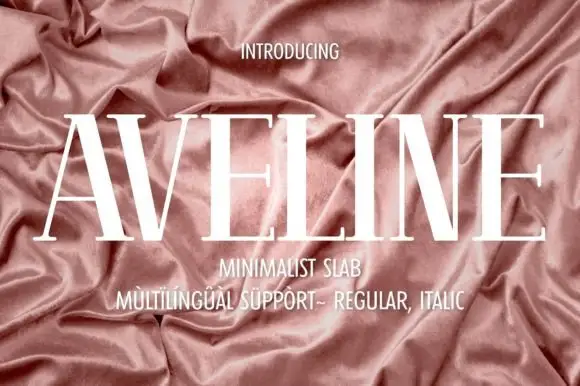
Very tall high-contrast capitals with fine crossbars and hairline feet
Aveline is a very tall high-contrast capital face in which the uprights narrow, the A and V spread wide diagonals and the crossbars and feet thin to hairlines, so a name reads as delicate couture lettering.
Ideas for this font
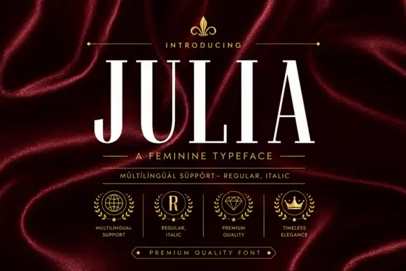
Tall fine-contrast capitals with hairline crossbars and narrow bowls
Julia sets a narrow didone in cream on burgundy silk, its stems heavy, its joins and serifs reduced to hairlines, and its caps tall enough to fill a masthead on their own.
Ideas for this font
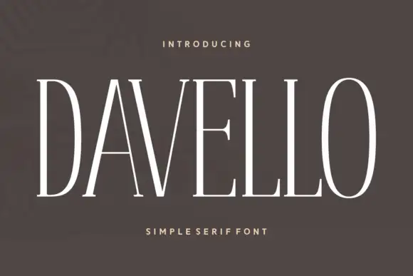
Very tall narrow capitals with fine flat serifs and a single weight
Davello is a very tall capital serif in which the stems run high, the serifs stay fine and flat and the counters close to narrow slits, so a single word reads as a modern museum caption.
Ideas for this font
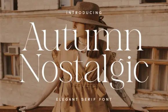
Elegant serif with flared stems and fine calligraphic details
Autumn Nostalgic is an elegant serif in which the stems flare at the ends, the contrast stays high and a few letters carry a calligraphic tail, so a two-word title reads as a printed editorial opener.
Ideas for this font
Same independent foundry
Allow optional Google Analytics to measure visits and catalogue actions. Your search words and notes are not included. Privacy & storage