Neutral Sans Workhorse

Groovy Crayon + Modern Heritage
Lets Groovy Crayon own the focal silhouette while handling secondary copy, sizing and subheads cleanly.
Inspect Modern Heritage specimenDisclosure: MakerFileHub may earn a commission from qualifying purchases via paid links on this page. How our links work.
Tall rainbow capitals with black wavy bands and rounded ends
Groovy Crayon draws fat rounded letters in candy colours with a crayon-scribble fill, a heavy contour and a bow or a sticker on nearly every letter, then scatters crayons, rainbows and school objects around them.
Paid link
Get this fontProject & layout blueprintsAt-a-glance maker compatibility
Sturdy stroke walls and open counters weed cleanly on adhesive vinyl, HTV apparel film, and cut cardstock.
Visual anatomy & craft review
GROOVY over CRAYON fills the card on a yellow ground, and each letter is a fat soft shape with a black contour and a fill of wavy crayon lines in a single bright colour — coral, teal, lime, pink, lilac. Some letters wear extras: the G has a big bow, the O has a face, the Y carries a pair of glasses, the N has a pencil clip. Around the words sit crayons, rainbows at the corners, scissors, a lunch box and small flowers, and two banners name the set and list the formats with twenty-one decoration files. The palette is deliberately cheerful and slightly retro, closer to a 1970s classroom poster than to a modern flat illustration, and the heavy contour is what keeps a very busy word readable.
Tall rainbow capitals with black wavy bands and rounded ends
Two-font hierarchy recipes
Tested contrast partners — pairing Groovy Crayon with grounded secondary typography.
Groovy Crayon + Modern Heritage
Lets Groovy Crayon own the focal silhouette while handling secondary copy, sizing and subheads cleanly.
Inspect Modern Heritage specimen
Groovy Crayon + Marquis - Elegant Modern Serif
Grounds bold display lettering with classic typographic authority on posters, badges and apparel.
Inspect Marquis - Elegant Modern Serif specimenPractical applications
Concrete hierarchy, scale and production guidance tailored to Groovy Crayon’s stroke geometry.
The lettering looks hand-coloured, which suits a planner a teacher will keep on a desk, and the extra elements can be placed on the cover without further artwork.
Hierarchy & layout recipe
Print an A5 planner cover: set the title at 30 pt across two rows, keep 12 mm of clear ground between the rows, and hold 12 mm of margin so the rainbow corners stay whole.
Pre-production check
Scribble fills and small stickers compete; print one cover at the finished size and check the title first.
Crayon fills say what the party is about, and the bows, glasses and stickers on the letters mean the front of the card needs nothing else on it.
Hierarchy & layout recipe
Print a 105 by 148 mm card: set the greeting at 38 pt across two rows, keep 15 mm of clear ground beneath before the details at 8.5 pt, and hold 12 mm from the contour to the card edge.
Pre-production check
Busy letters lose their shape on textured card; print one card on the intended board and check the Y before the batch.
The face tells a parent the club is about making things, and the flat colours print cheaply on the labels a small club actually orders.
Hierarchy & layout recipe
Print a 60 by 45 mm label: set the club name at 15 pt on one row, keep 5 mm of clear ground beneath before the term at 4.5 pt, and hold 4 mm from the outline to the die line.
Pre-production check
Stickers and bows turn to specks on a small label; print one label on the real stock and check the letters before the order.
Technical & licence verification
Confirm included OTF/TTF/WOFF formats, full glyph tables and licence coverage on the live store page before batch production.
Closest visual alternatives
Matched across letterform anatomy, stroke behaviour and craft applications.
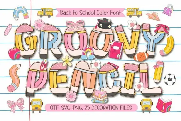
Rounded pencil-built capitals with pastel shafts and dark graphite ends
Groovy Pencil turns swelling capitals into coloured pencils, where pink eraser-like tops and narrow yellow collars sit above pastel blue, yellow, peach and pink shafts, and small bows, flowers and school objects overlap some letters over ruled notebook lines.
Ideas for this font
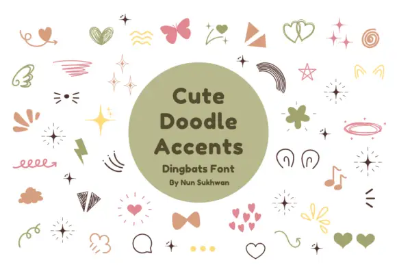
Pastel hearts, sparkles, bows and loose hand-drawn accent shapes
Cute Doodle Accents is a typable set of small decorative marks — four-point sparks, hearts in outline and solid, bows, ribbons, rainbows, teardrops, small flowers, notes and loops — in a muted pink, sage and mustard palette.
Ideas for this font
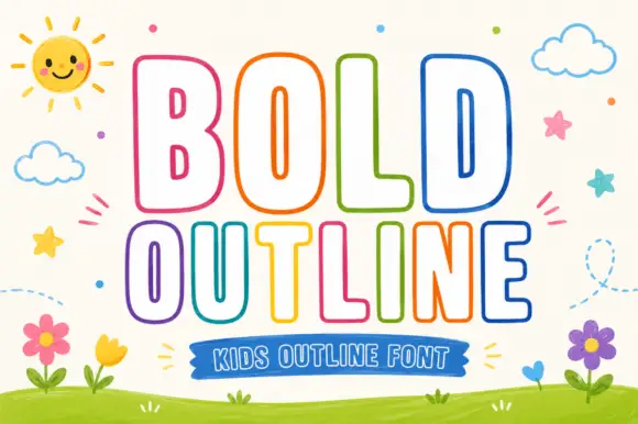
Rounded outline capitals
Bold Outline shows tall rounded capitals traced by a thin coloured contour on a pale field, where the B keeps small narrow counters while the L and D leave broad white interiors, and the letter widths change across the two rows so the second word runs wider than the first.
Ideas for this font
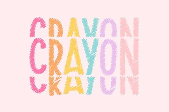
Tall crayon-textured capitals repeated in cropped upper and lower rows
Crayonfriends Stacked repeats the same tall word in three pastel rows on pale pink, where the middle row is complete while the rows above and below are cut by broad horizontal blank bands, and scratchy diagonal marks break both the coloured strokes and their edges.
Ideas for this font
Same independent foundry
Allow optional Google Analytics to measure visits and catalogue actions. Your search words and notes are not included. Privacy & storage