Neutral Sans Workhorse

Cute Bow + Kohilo
Lets Cute Bow own the focal silhouette while handling secondary copy, sizing and subheads cleanly.
Inspect Kohilo specimenDisclosure: MakerFileHub may earn a commission from qualifying purchases via paid links on this page. How our links work.
Loose rounded Bow letters crossed by large ribbon-bow shapes
Cute Bow draws fat candy-pink letters where each stem and bowl is a ribbon: two loops, a knot and two tails replace the straight stroke, so one word looks like a row of tied bows.
Paid link
Get this fontProject & layout blueprintsAt-a-glance maker compatibility
Sturdy stroke walls and open counters weed cleanly on adhesive vinyl, HTV apparel film, and cut cardstock.
Visual anatomy & craft review
BOW fills the card in a single pink, and each letter is a variation on the same drawing: the B has a bow inside its upper bowl, the O is a full bow with the loops standing in for the ring, and the W is three bows joined at the tails. The strokes are thick and glossy with a soft highlight and a darker edge, and the counters stay open enough that the letters can still be told apart. CUTE sits above in small black caps with wide tracking, and a small logo lockup at the top right repeats the word with an italic caption under it. Behind the letters the ground is white with a single red ribbon crossing the top left corner, which ties the whole card together. The face is a one-trick display set: a short word works, a long one turns into a garland of bows and becomes unreadable. Keep the words to three or four letters and set them large.
Loose rounded Bow letters crossed by large ribbon-bow shapes
Two-font hierarchy recipes
Tested contrast partners — pairing Cute Bow with grounded secondary typography.
Cute Bow + Kohilo
Lets Cute Bow own the focal silhouette while handling secondary copy, sizing and subheads cleanly.
Inspect Kohilo specimen
Cute Bow + Glofi
Grounds bold display lettering with classic typographic authority on posters, badges and apparel.
Inspect Glofi specimenPractical applications
Concrete hierarchy, scale and production guidance tailored to Cute Bow’s stroke geometry.
The bow shapes say what the party is about without balloons or printed characters, and the thick strokes survive being cut out of card and stood up.
Hierarchy & layout recipe
Print a 120 mm wide topper: set the name at 60 pt on one row, keep 12 mm of clear ground beneath before the age at 14 pt, and hold 10 mm from the lowest bow tail to the stick position.
Pre-production check
Bow loops tear on thin card; print one topper on 300 gsm and mount it before cutting the set.
One word made of ribbons covers the occasion, and the single pink keeps a small card from looking like a party invitation instead of a note.
Hierarchy & layout recipe
Print a 105 by 148 mm card: set the word at 64 pt at the optical centre, keep 20 mm of clear ground beneath before the written message at 9 pt, and hold 15 mm from the outer bows to the card edge.
Pre-production check
The gloss highlight prints as a band on matte stock; print one card on the real board and check the highlight first.
The lettering matches what the stall sells at a glance, and the thick ribbon forms read as a logo when the word is short.
Hierarchy & layout recipe
Print a 60 mm round sticker: set the word at 30 pt across the middle of the disc, keep 6 mm of clear ground beneath before the stall name at 5 pt, and hold 5 mm from the bows to the die edge.
Pre-production check
Pink ink on white vinyl goes flat without a white underlay; print one sticker and check the tone before the sheet.
Technical & licence verification
Confirm included OTF/TTF/WOFF formats, full glyph tables and licence coverage on the live store page before batch production.
Closest visual alternatives
Matched across letterform anatomy, stroke behaviour and craft applications.
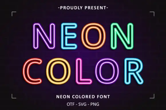
Neon double-line outline display
Neon Colored is a colour display on a dark brick ground: rounded outline capitals in bright double-line neon colours — violet, blue, orange, green, yellow, pink — with soft glow, set in two lines inside small corner brackets, with a small presenting line above and two plain lines below.
Ideas for this font
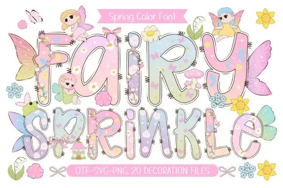
Pastel rounded letters with tiny flowers and overlapping fairy details
Fairy Sprinkle sets a spring scene in tall pastel colour-font letters, each interior printed with flowers, clouds and butterflies, each edge closed by a dashed stitch line, with small fairies perched on top.
Ideas for this font
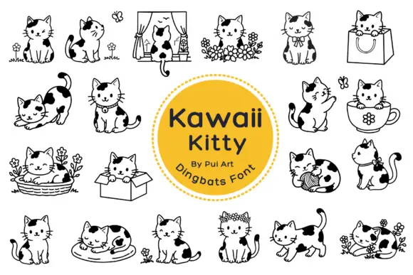
Black-patched kitten outlines in small domestic scenes
Kawaii Kitty Doodle shows black-and-white kittens with rounded heads, dark patches and small whiskers, where a window, a shopping bag, a cup, a basket, a cardboard box and a ball of yarn turn the poses into little scenes, flowers surround several cats and other figures sit alone with an upright or curled tail.
Ideas for this font
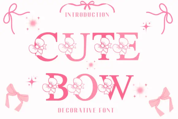
High-contrast serif capitals interrupted by outlined flower-like ribbon motifs
Cute Bow is a high-contrast serif display face in pink, with a drawn ribbon bow attached to each letter and small sparkles scattered around the word.
Ideas for this font
Same independent foundry
Allow optional Google Analytics to measure visits and catalogue actions. Your search words and notes are not included. Privacy & storage