High-Contrast Display Serif

Cotton Candy + The Lumina Awesome
Pairs sculptural editorial warmth with Cotton Candy's clean modern geometry.
Inspect The Lumina Awesome specimenDisclosure: MakerFileHub may earn a commission from qualifying purchases via paid links on this page. How our links work.
Tall heart-accent capitals behind a contrasting connected cotton candy script line
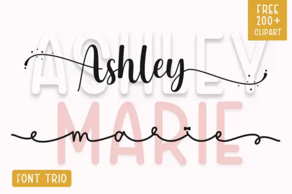
Cotton Candy places tall pale capitals behind a dark connected script line, where small pale hearts interrupt several upright strokes and a thin horizontal rule runs across the composition while the script overlaps the cap row in front.
Paid link
Get this fontProject & layout blueprintsAt-a-glance maker compatibility
Weld or Unite overlapping script joins into one continuous vector path before sending to the blade.
Visual anatomy & craft review
The caps rise tall and light, the script stays dark and connected, the hearts break the uprights and the rule ties the layers together. That overlap is the character: the two voices share one plane rather than stacking, which is why the sample needs careful spacing. A new phrase may need more separation, so test your own wording, keep 20 mm between the layers and confirm whether the hearts are extra glyphs or artwork. The hearts are the pieces that fail first: on a cutting mat they are small separate shapes that lift, so keep 20 mm between the layers and confirm whether the hearts are glyphs or artwork before a cut.
Tall heart-accent capitals behind a contrasting connected cotton candy script line
Two-font hierarchy recipes
Tested contrast partners — pairing Cotton Candy with grounded secondary typography.
Cotton Candy + The Lumina Awesome
Pairs sculptural editorial warmth with Cotton Candy's clean modern geometry.
Inspect The Lumina Awesome specimen
Cotton Candy + Esmeralda
Introduces organic movement on pull-quotes, signatures and gift tags.
Inspect Esmeralda specimenPractical applications
Concrete hierarchy, scale and production guidance tailored to Cotton Candy’s stroke geometry.
The layered pairing suits a bright card, and the tall caps hold a name at 36 pt with the script crossing at 24 pt, where the hearts stay visible between them.
Hierarchy & layout recipe
Print an A6 card: set the caps at 36 pt, set the script at 24 pt overlapping 12 mm beneath, and keep 16 mm of clear ground below before the details at 11 pt.
Pre-production check
The overlap has to be tuned per phrase; check one card before the full run, printed at final size with the real wording.
The pale caps read across a stall, and the script supplies a second line at 50 mm on a printed board, where the heart accents stay legible at distance.
Hierarchy & layout recipe
Print a 600 by 300 mm board: set the caps at 50 mm, set the script at 30 mm crossing 20 mm beneath, and keep 24 mm of border so no tail is cut by the trim.
Pre-production check
Hearts may be alternates; check the character map before the sign is drawn and keep a plain version of the row ready.
The heart details suit a favour tag, and the tall letters hold a name at 24 pt on a 45 by 70 mm tag, where the script sits beneath in one ink.
Hierarchy & layout recipe
Print a 45 by 70 mm tag: set the name at 24 pt in the caps, set the script at 18 pt beneath with 10 mm of clear ground, and keep 7 mm to the punch hole.
Pre-production check
Two connected lines on a small tag tangle; check the mock-up and keep the script to one word.
Technical & licence verification
Confirm included OTF/TTF/WOFF formats, full glyph tables and licence coverage on the live store page before batch production.
Closest visual alternatives
Matched across letterform anatomy, stroke behaviour and craft applications.
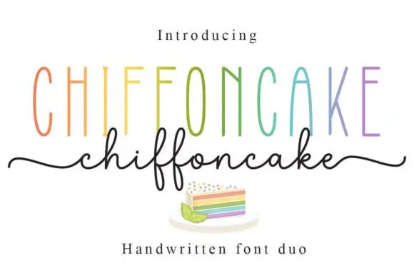
Tall narrow sans and fine looping script duo
Chiffoncake Duo pairs very tall narrow capitals, each in a different pastel tone, with a low connected script whose deep f loops drop below the baseline, and long tails extend from both sides of the lower word above a small cake illustration.
Ideas for this font
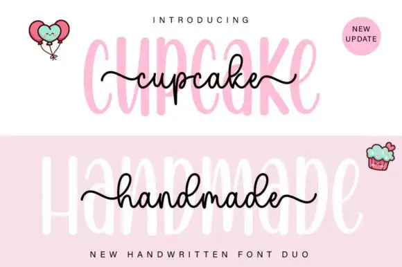
Tall rounded sans with fine extended script
Cupcake Handmade Duo places tall narrow rounded letters in pale pink behind a smaller connected script line in black, twice on one cover, where the script carries long outer tails and looped k and h forms while a balloon pair, a cupcake drawing and an update badge sit in the corners.
Ideas for this font
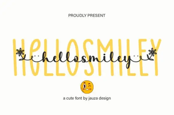
Tall narrow outlined sans paired with a small floral-linked script
Hello Smiley pairs a tall narrow outlined sans with a small script that runs across the middle of the letters, and the script's ends turn into small flowers, so a word reads as a drawn label with a hand-written band across it.
Ideas for this font
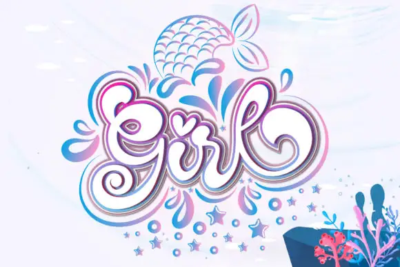
Ornamental script and decorative motifs
Girl builds a large curled capital G, a tall looped l and a heart-shaped accent over the central letters, with layered pink and blue outlines around the word and droplets, stars and a mermaid tail drawn beside it.
Ideas for this font
Same independent foundry
Allow optional Google Analytics to measure visits and catalogue actions. Your search words and notes are not included. Privacy & storage