Neutral Sans Workhorse

Minimal Wedding Monogram + Limited Coffee
Lets Minimal Wedding Monogram own the focal silhouette while handling secondary copy, sizing and subheads cleanly.
Inspect Limited Coffee specimenDisclosure: MakerFileHub may earn a commission from qualifying purchases via paid links on this page. How our links work.
Fine monoline script with a monogram frame
Minimal Wedding is a fine monoline script paired with thin monogram capitals inside two overlapping heart outlines: hairline strokes, a long flourish under the W, and a drawing of a bride and groom in single-weight line art beside it.
Paid link
Get this fontProject & layout blueprintsAt-a-glance maker compatibility
Weld or Unite overlapping script joins into one continuous vector path before sending to the blade.
Visual anatomy & craft review
The script line runs across the lower middle of the page and holds a single hairline weight: the M opens with a rounded entry, the W finishes in a flourish that sweeps under the word and lifts at the end, and the joins are visible as fine links rather than thick strokes, so the phrase reads as engraved rather than written with a pen. Above it, two capital letters sit inside two overlapping heart outlines drawn in the same weight, which is the monogram device the face is sold with, and the whole lockup is flanked by single-line drawings of a bride and a groom, each built from the same uniform stroke so the illustration and the type belong together. The line weight is the constraint: at large sizes it looks like engraving, and below about 18 pt it starts to break, which is why the sample uses it only for the name and keeps the small caps in a separate, sturdier serif underneath.
Delicate, romantic, thin, personal
Two-font hierarchy recipes
Tested contrast partners — pairing Minimal Wedding Monogram with grounded secondary typography.
Minimal Wedding Monogram + Limited Coffee
Lets Minimal Wedding Monogram own the focal silhouette while handling secondary copy, sizing and subheads cleanly.
Inspect Limited Coffee specimen
Minimal Wedding Monogram + Resquel
Grounds bold display lettering with classic typographic authority on posters, badges and apparel.
Inspect Resquel specimenPractical applications
Concrete hierarchy, scale and production guidance tailored to Minimal Wedding Monogram’s stroke geometry.
A thin monogram inside a drawn frame turns two initials into a crest that can be carried from the invitation to the place cards without a designer redrawing anything.
Hierarchy & layout recipe
Set the initials at 40 pt in the monogram caps, close the two hearts so they overlap by 6 mm, and lock the pair at the top centre of an A5 card, 25 mm below the trim. Repeat the same mark at 18 mm wide on the place card so the suite matches.
Pre-production check
Check the 18 mm version on the place card, where the hairline frame under 0.3 mm will break at print; increase the frame weight for that size. Confirm the overlap of the two hearts does not create a dark spot where the strokes cross and that the mark holds at 320 px wide.
A hairline script reads as engraving rather than decoration, which suits a shop that wants a romantic card without the pink-and-swash cliché of a heavy script.
Hierarchy & layout recipe
A6 card: the phrase at 30 pt across the middle, the campaign line in a 9 pt roman serif 12 mm below, and the monogram at 15 mm in the upper right. Print one ink on cream so the fine strokes stay crisp and the card reads as stationery.
Pre-production check
Check the 15 mm monogram at actual size, where the heart outlines need a minimum 0.25 pt stroke to survive the press. Confirm the script's long flourish does not run into the trim on the right and that the 9 pt line keeps a 4.5:1 contrast.
A fine script on a small insert makes an order feel like a gift, and a monoline face prints reliably in one ink where a contrasted script would lose its hairlines.
Hierarchy & layout recipe
Print a 70 by 100 mm insert: the phrase at 22 pt at the top, three lines of 9 pt serif beneath, and the monogram at 10 mm at the lower centre. Keep 10 mm margins and print on the same stock as the outer packaging insert so the two read as one set.
Pre-production check
Check the phrase at 22 pt on uncoated stock, where a hairline under 0.3 pt can break up; thicken it slightly for that stock. Confirm the 10 mm monogram does not fill in and that the insert still fits the envelope without folding the type.
Technical & licence verification
Confirm included OTF/TTF/WOFF formats, full glyph tables and licence coverage on the live store page before batch production.
Closest visual alternatives
Matched across letterform anatomy, stroke behaviour and craft applications.
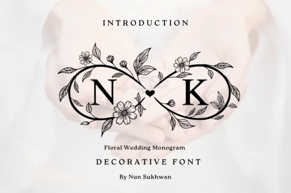
Crisp black botanical infinity-loop (∞) wedding monogram
Floral Wedding Monogram frames two serif initials inside a high-contrast black botanical infinity loop joined by a center heart.
Ideas for this font
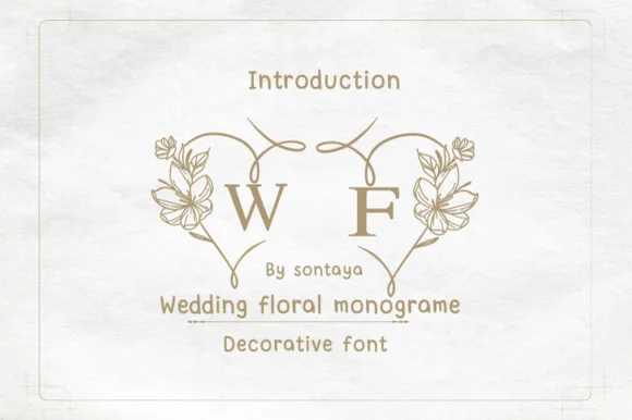
Split-heart botanical wedding monogram system
Wedding Floral Monogram is a paired decorative monogram alphabet where left and right floral half-arches join two initials into one heart wreath.
Ideas for this font
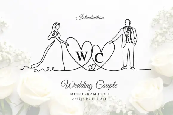
Bride-and-groom heart monogram
Wedding Couple Monogram is a mark on a white ground: two serif initials inside overlapping hearts, flanked by fine continuous line drawings of a bride in a long dress and a groom in a suit, each holding the outer edge of a heart, with a script title and two small credit lines beneath.
Ideas for this font
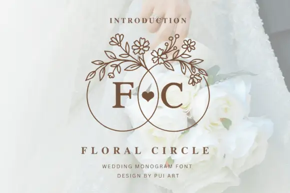
Overlapping fine circles with floral upper branches around F and C initials
Floral Circle Monogram frames F and C inside two overlapping open circles, where fine branches with small flowers and leaves crown both rings, a small solid heart sits in the central overlap and the serif initials stay visually separate from the narrow ring and stem outlines.
Ideas for this font
Same independent foundry
Allow optional Google Analytics to measure visits and catalogue actions. Your search words and notes are not included. Privacy & storage