Modern Grotesque Body

College Varsity + Borsen
Creates crisp high-hierarchy contrast beneath College Varsity headlines across menus, websites and labels.
Inspect Borsen specimenDisclosure: MakerFileHub may earn a commission from qualifying purchases via paid links on this page. How our links work.
Heavy collegiate block capitals on a single flat weight
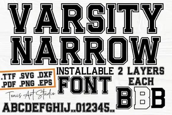
College Varsity is a heavy collegiate block alphabet in which the stems are wide, the serifs are flat slabs and the fit is tight, so a two-word title reads as an American athletic banner.
Paid link
Get this fontProject & layout blueprintsAt-a-glance maker compatibility
Sturdy stroke walls and open counters weed cleanly on adhesive vinyl, HTV apparel film, and cut cardstock.
Visual anatomy & craft review
The C cuts a rectangular crescent, the O is a near square with small counters, the L turns a right-angle slab, the E stacks three even arms and the Y splays two thick diagonals, all at a single weight with flat slabs and almost no contrast. The flatness is the character: there is no bold or light, only one dense cut that fills a banner edge to edge, which is how the sample sets a stacked title over an alphabet line. Because the slabs are square, the face survives a vinyl cut at 40 mm and fills a hoarding at 200 pt; it needs tracking rather than kerning. The white ground, the file-format box and the script signature are presentation; the block title and alphabet are the face.
Collegiate · Block · Heavy
Two-font hierarchy recipes
Tested contrast partners — pairing College Varsity with grounded secondary typography.
College Varsity + Borsen
Creates crisp high-hierarchy contrast beneath College Varsity headlines across menus, websites and labels.
Inspect Borsen specimen
College Varsity + Photography Font
Adds a warm human signature touch for 1-to-3-word callouts without competing against structured serif capitals.
Inspect Photography Font specimenPractical applications
Concrete hierarchy, scale and production guidance tailored to College Varsity’s stroke geometry.
The block slabs read from the far side of a field, and the single dense weight keeps a vinyl banner legible at 120 mm in one colour.
Hierarchy & layout recipe
Print a two-metre banner: set the headline at 120 mm, keep 40 mm of margin at each end, and set the event details in a 25 mm line of the same face under the headline.
Pre-production check
Two lines of a very heavy face at full width can close up; check the banner at full size and add 2 percent tracking rather than reducing the size.
The collegiate register suits team apparel, and the flat slabs hold up in a one-colour screen print at 70 mm across the chest.
Hierarchy & layout recipe
Print a 300 mm chest print: set the club name at 70 mm in one ink, keep every slab at 4 mm minimum stroke, and leave 35 mm of clear shirt below for the founding year.
Pre-production check
A tight fit closes the gap between a Y and a following letter; check the film and add 1 mm between the letters rather than cutting the diagonal.
The flat heavy slabs read from the far end of a car park, and the single weight prints cleanly on a plywood board at 150 mm.
Hierarchy & layout recipe
Print a 600 by 400 mm panel: set the headline at 150 mm, keep 30 mm of border, and set the opening times in a 20 mm line beneath with 25 mm of clearance.
Pre-production check
A dense slab word on textured plywood fills in at small sizes; check the panel and print the times in a lighter sans if the board is rough.
Technical & licence verification
Confirm included OTF/TTF/WOFF formats, full glyph tables and licence coverage on the live store page before batch production.
Closest visual alternatives
Matched across letterform anatomy, stroke behaviour and craft applications.
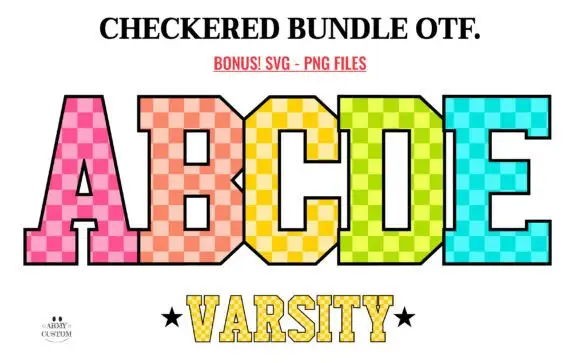
Tall varsity-style blocks filled with bright two-tone checks
Checkered Back to School shows tall angular slab capitals filled with pink, peach, yellow, lime and turquoise checks: the B and D keep small squared counters, the A opens a narrow rectangle, a thin black outline bounds the pattern and a smaller line below repeats the structure at reduced scale.
Ideas for this font
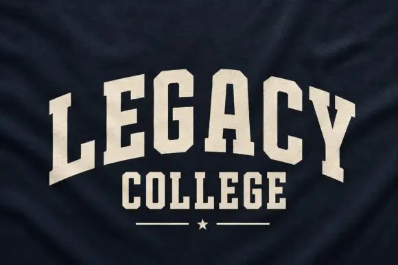
Narrow solid college capitals
Legacy College is a narrow solid college block in cream on navy heather fabric: the word is arched over a straight second line, with a rule and a star closing the composition.
Ideas for this font
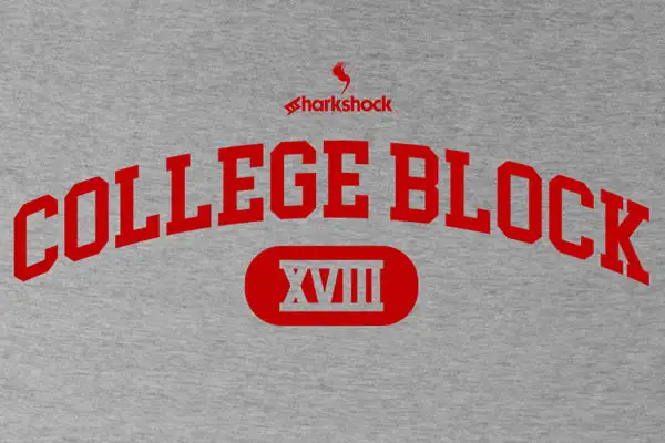
Clean narrow collegiate slab capitals with angled cuts and no lowercase
College Block is a condensed collegiate slab in capitals only, with heavy rectangular serifs, angled cuts and tight counters, built to be set on an arc across a garment.
Ideas for this font

Wide geometric variable sans
Mechacore is a wide geometric sans in black on yellow: square extended letters, a flat-topped C, a stencil variant, five weights from light to bold, and an ultra-expanded width, laid out as a technical sheet with rules, labels and a barcode, so the plate reads as a system rather than a single font.
Ideas for this font
Same independent foundry
Allow optional Google Analytics to measure visits and catalogue actions. Your search words and notes are not included. Privacy & storage