Neutral Sans Workhorse

Coffee Time + Homies
Lets Coffee Time own the focal silhouette while handling secondary copy, sizing and subheads cleanly.
Inspect Homies specimenDisclosure: MakerFileHub may earn a commission from qualifying purchases via paid links on this page. How our links work.
Dark brown cafe dingbats with cups, pastries and hand-drawn food contours
Coffee Time is a dingbat collection drawn in a single warm-brown line: cups, mugs and pots, croissants and layered cakes, beans, a grinder, a paper to-go cup and a latte with a heart in the foam.
Paid link
Get this fontProject & layout blueprintsAt-a-glance maker compatibility
Sturdy stroke walls and open counters weed cleanly on adhesive vinyl, HTV apparel film, and cut cardstock.
Visual anatomy & craft review
The card is a plain brown title bar and then a grid of about thirty drawings, each one a piece of café life: a bowl with beans, a burlap sack marked Coffee, a French press, three kinds of cup, a slice of layer cake, a croissant, a swirl of soft-serve in a striped cup, a cake with a piped top. The line weight is even throughout with no fills except the coffee itself, which is what lets the set sit alongside a script or a serif without a clash, and each drawing sits inside its own square with air around it. Because the glyphs are meant to be typed, they are spaced as a font would be, and the whole set is monochrome, so it prints on a menu or a kraft bag in one ink with no colour separation.
Dark brown cafe dingbats with cups, pastries and hand-drawn food contours
Two-font hierarchy recipes
Tested contrast partners — pairing Coffee Time with grounded secondary typography.
Coffee Time + Homies
Lets Coffee Time own the focal silhouette while handling secondary copy, sizing and subheads cleanly.
Inspect Homies specimen
Coffee Time + Raffined
Grounds bold display lettering with classic typographic authority on posters, badges and apparel.
Inspect Raffined specimenPractical applications
Concrete hierarchy, scale and production guidance tailored to Coffee Time’s stroke geometry.
The drawings are already the illustrations a menu needs, and one brown ink on a pale sheet is cheaper than a printed photograph and stays crisp at a small size.
Hierarchy & layout recipe
Print an A4 menu: set the drink list at 9.5 pt with a cup glyph at 12 pt beside each section head, keep 6 mm of clear ground between the glyph and the price column, and hold 14 mm of margin at both sides.
Pre-production check
Thin line work fades on a laser printer; print one sheet on the intended stock and check a croissant before the full set.
One glyph on a lid sticker identifies the drink without words, and the line drawing prints legibly on a small round label where a photo would turn to mud.
Hierarchy & layout recipe
Print a 40 mm round sticker: set a single cup glyph at 22 mm wide, keep 4 mm of clear ground around the drawing inside the circle, and hold the glyph centred so the lid seam does not cut it.
Pre-production check
Small stickers lose the finer hatching in the beans; print one at the real size and inspect it on the cup before ordering the roll.
The set gives a food page small ornaments that match the tone of a review, and the single weight keeps a column from looking decorated rather than written.
Hierarchy & layout recipe
Print a 210 by 297 mm page: set body text at 10 pt with spot glyphs at 16 pt at the head of each section, keep 8 mm of clear ground between a glyph and the first line, and hold 18 mm of margin at the outer edge.
Pre-production check
Glyphs used as bullets can crowd a narrow measure; print one page and check the spacing before the issue goes to press.
Technical & licence verification
Confirm included OTF/TTF/WOFF formats, full glyph tables and licence coverage on the live store page before batch production.
Closest visual alternatives
Matched across letterform anatomy, stroke behaviour and craft applications.
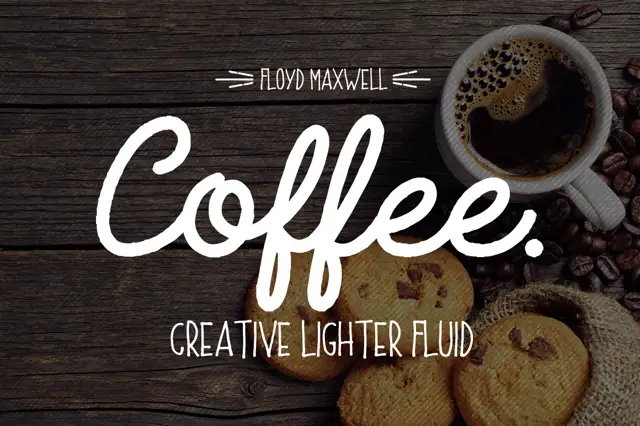
Heavy script lettering paired with a light rounded uppercase sans
Coffee Font + Extras pairs a heavy connected script with a light rounded uppercase sans, so a name can be carried loudly in script and supported quietly in caps beneath.
Ideas for this font
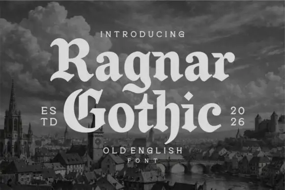
Rounded blackletter display
Ragnar Gothic is a rounded blackletter in cream over a monochrome medieval cityscape: mixed case with broad round bowls, a split capital G, curled spurs and softened corners, set in two lines between a small line above and a tracked caption beneath, with dated notes at the shoulders.
Ideas for this font
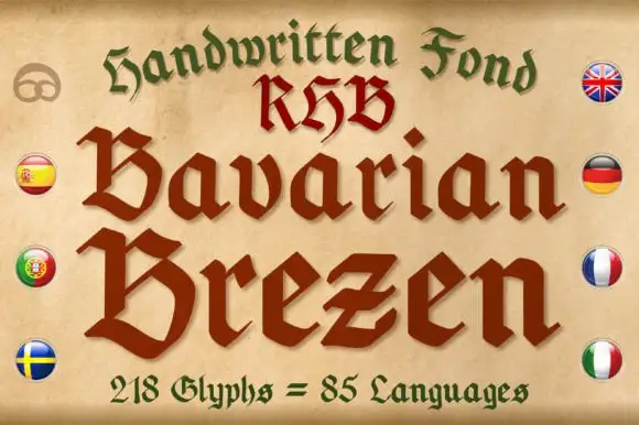
Broad broken letters with clipped bowls and wedge-like terminals
Bavarian Brezen is a handwritten fraktur: the strokes wobble slightly as a pen would, the capitals carry curled spurs, and the face covers a large character set for European languages.
Ideas for this font
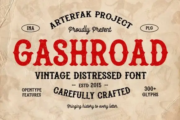
Western slabs with rounded bowls and pointed waist spurs
Gashroad presents a red uppercase title on crumpled cream paper, where rounded bowls and short curved terminals sit beside pointed waist spurs cutting into the stems, the G curls inward and arched captions run above and below.
Same independent foundry
Allow optional Google Analytics to measure visits and catalogue actions. Your search words and notes are not included. Privacy & storage