Editorial Serif Anchor

Coffee Blossom + Stanza
Anchors Coffee Blossom's fluid strokes with crisp Roman proportions on wedding suites, headers and packaging.
Inspect Stanza specimenDisclosure: MakerFileHub may earn a commission from qualifying purchases via paid links on this page. How our links work.
Fine loops with tall paired ascenders and a wide capital sweep
Coffee Blossom is fine looping script with tall paired ascenders and a wide capital that sweeps out of the word, drawn in an even light stroke that keeps the counters open.
Paid link
Get this fontProject & layout blueprintsAt-a-glance maker compatibility
Weld or Unite overlapping script joins into one continuous vector path before sending to the blade.
Visual anatomy & craft review
The capital C opens with a wide sweep that starts below the baseline, rises past the cap line and folds back into the stem, giving the word a broad start. The double f rises into two tall loops that do not close, the l repeats that height once more, and the double o in the second word keeps two round open counters side by side. Joins are thin and cross at the same mid-height throughout, so the rhythm is even, and there is no swelling anywhere in the line, which keeps the face light enough to print small. The final m exits in a short curved tail that ends in a fine point. The blurred cup and saucer behind and the two tracked captions are presentation; the script is the two words.
Fine · Looped · Paired
Two-font hierarchy recipes
Tested contrast partners — pairing Coffee Blossom with grounded secondary typography.
Coffee Blossom + Stanza
Anchors Coffee Blossom's fluid strokes with crisp Roman proportions on wedding suites, headers and packaging.
Inspect Stanza specimen
Coffee Blossom + Hermano
Keeps small-scale dates, URLs, nutrition facts and care instructions crisp and legible below script titles.
Inspect Hermano specimenPractical applications
Concrete hierarchy, scale and production guidance tailored to Coffee Blossom’s stroke geometry.
A fine looped script suits a cafe's printed cups and a window decal at the same time, and the tall paired ascenders give a short name enough height to read from the pavement.
Hierarchy & layout recipe
Set the cafe name at 18 cm on the window, keep the opening hours in a narrow sans at 3 cm, and hold 10 cm of clearance so the capital sweep does not run into the glass frame.
Pre-production check
Cup printing is small and curved; check one printed cup on the actual stock and hold the name at 14 mm on the sleeve if the hairlines fill in.
The light looping hand matches a casual venue, and because the joins are even the couple's names stay readable at the modest size a table sign allows.
Hierarchy & layout recipe
Set both names at 40 mm on a 300 by 400 mm board, keep the date in the same face at 15 mm beneath, and leave 30 mm at the base so the descender loops stay clear of the stand.
Pre-production check
A frame or stand covers part of a small board; check the artwork against the mounting and keep the descenders above the covered area.
A fine script on a small card reads as a personal note from the roaster, and the light weight keeps the printed thanks from competing with the handwritten message beside it.
Hierarchy & layout recipe
Set the greeting at 18 pt at the head of a 105 by 148 mm card, keep the roaster's details in a 6 pt sans, and leave the lower half clear for a handwritten line.
Pre-production check
Cards inserted into a delivery box get bent; print on a heavier stock and check that the fine loops survive the fold if the card is scored.
Technical & licence verification
Confirm included OTF/TTF/WOFF formats, full glyph tables and licence coverage on the live store page before batch production.
Closest visual alternatives
Matched across letterform anatomy, stroke behaviour and craft applications.
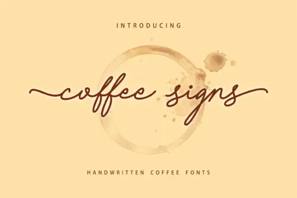
Fine low coffee-sign handwriting
Coffee Signs is a fine, low-slung handwriting script with a long flat baseline, small lowercase and a final s that lifts into a soft open curl above the line.
Ideas for this font
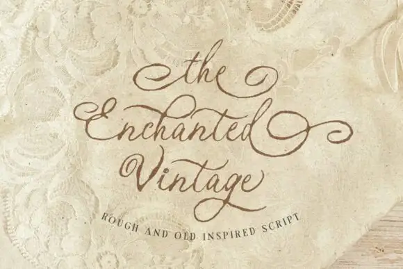
Rough old-style script
The Enchanted Vintage is a rough script in cocoa brown on aged lace: connected lower case, wide looping capitals on the E and the V, and edges that look eaten into the surface rather than printed on top.
Ideas for this font

Fine extended signature script
Lovely sets a fine signature script in a single dark weight over a pale city photograph, where a wide entry curve opens low at the left, the letters rise into tall slender loops through the middle and a large descending y plus an extended closing sweep make the lower right part of the footprint.
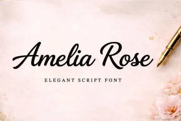
Slanted weighty script with a sweeping capital R and connected joins
Amelia Rose is a slanted script in which the strokes stay weighty through the joins, the capital R sweeps wide and the letters lean together, so a name reads as a confident handwritten signature.
Ideas for this font
Same independent foundry
Allow optional Google Analytics to measure visits and catalogue actions. Your search words and notes are not included. Privacy & storage