Editorial Serif Anchor

Coffee Signs + Stanza
Anchors Coffee Signs's fluid strokes with crisp Roman proportions on wedding suites, headers and packaging.
Inspect Stanza specimenDisclosure: MakerFileHub may earn a commission from qualifying purchases via paid links on this page. How our links work.
Fine low coffee-sign handwriting
Coffee Signs is a fine, low-slung handwriting script with a long flat baseline, small lowercase and a final s that lifts into a soft open curl above the line.
Paid link
Get this fontProject & layout blueprintsAt-a-glance maker compatibility
Weld or Unite overlapping script joins into one continuous vector path before sending to the blade.
Visual anatomy & craft review
The sample is written small on a cream menu card with a coffee-ring stain, which tells you the size the face is meant for: the letters sit close to the baseline, ascenders barely rise, and the whole line stays deliberately understated rather than reaching for display size. Weight is even and thin, joins are short, and the capitals are only slightly taller than the lowercase, so the word reads as a marker note rather than as calligraphy. The stain and the cup are photographic props, and the tracked line under the script is a separate label face rather than part of the alphabet.
Fine · Low · Handwritten
Two-font hierarchy recipes
Tested contrast partners — pairing Coffee Signs with grounded secondary typography.
Coffee Signs + Stanza
Anchors Coffee Signs's fluid strokes with crisp Roman proportions on wedding suites, headers and packaging.
Inspect Stanza specimen
Coffee Signs + Furion
Keeps small-scale dates, URLs, nutrition facts and care instructions crisp and legible below script titles.
Inspect Furion specimenPractical applications
Concrete hierarchy, scale and production guidance tailored to Coffee Signs’s stroke geometry.
A low fine script reads as a hand-written menu header, the kind a small café writes on a card rather than prints with a display face.
Hierarchy & layout recipe
Set the header at 22 pt on an A5 menu card, keep the items in a plain serif at 10 pt below it, and leave 8 mm between the script and the first price rule.
Pre-production check
At 22 pt the even thin stroke can disappear on textured card, so proof on the actual menu stock.
A small script signature gives a letterhead a personal line without turning the whole page into a designed promotional piece.
Hierarchy & layout recipe
Set the signature at 14 pt under the address block, keep it left-aligned with that block, and leave 10 mm before the first paragraph so the baseline stays clean.
Pre-production check
The low ascenders mean the line looks shorter than it is; check the visual weight against the address block.
A fine script adds a warm hand-written note to a chalkboard while the drink list itself stays in a plain, easily read face.
Hierarchy & layout recipe
Write the seasonal line at 2-inch height across the top of the board, keep the drinks and prices at half that size, and leave 6 cm between the two zones.
Pre-production check
Chalk swells every stroke; a fine script written small can close up entirely, so keep the height.
Technical & licence verification
Confirm included OTF/TTF/WOFF formats, full glyph tables and licence coverage on the live store page before batch production.
Closest visual alternatives
Matched across letterform anatomy, stroke behaviour and craft applications.
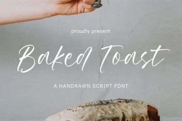
Fine loose handdrawn script with tall flicks and an uneven baseline
Baked Toast is a fine loose script drawn quickly by hand, its ascenders flicking upward, its baseline uneven and its joins breaking where the pen lifted, so a phrase reads as a note rather than a set line.
Ideas for this font
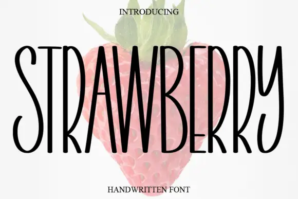
Tall narrow handwritten caps
Strawberry is a tall narrow handwritten face in black over a faded illustration of a strawberry: very condensed capitals with uneven strokes, high ascenders and a light bounce, set as one word with a small serif line above and beneath.
Ideas for this font
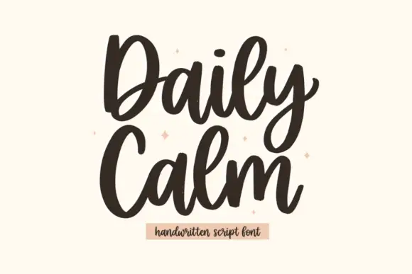
Tall rounded script with heavy entries and a stacked two-line rhythm
Daily Calm is a tall rounded script with heavy entries and light exits, drawn so two stacked words share the same width and read as a single column of movement.
Ideas for this font
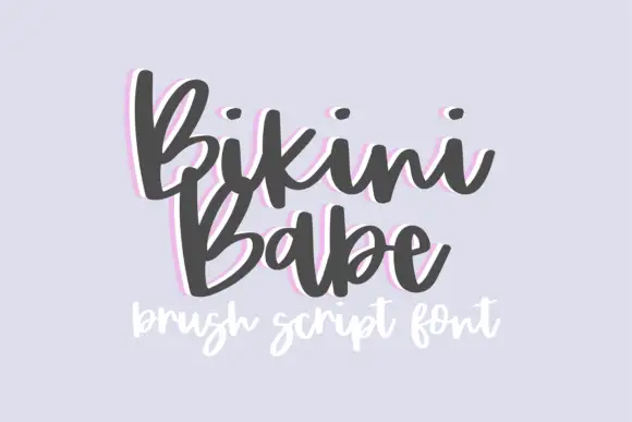
Bouncy brush script with a heavy soft stroke and tilted letter bodies
Bikini Babe is a bouncy brush script in which the letters tilt at slightly different angles, the stroke stays heavy and soft and the baseline rises and falls through the phrase.
Ideas for this font
Allow optional Google Analytics to measure visits and catalogue actions. Your search words and notes are not included. Privacy & storage