Editorial Serif Anchor

The Enchanted Vintage + Stanza
Anchors The Enchanted Vintage's fluid strokes with crisp Roman proportions on wedding suites, headers and packaging.
Inspect Stanza specimenDisclosure: MakerFileHub may earn a commission from qualifying purchases via paid links on this page. How our links work.
Rough old-style script
The Enchanted Vintage is a rough script in cocoa brown on aged lace: connected lower case, wide looping capitals on the E and the V, and edges that look eaten into the surface rather than printed on top.
Paid link
Get this fontProject & layout blueprintsAt-a-glance maker compatibility
Weld or Unite overlapping script joins into one continuous vector path before sending to the blade.
Visual anatomy & craft review
The phrase is set on three centred lines, the and Enchanted and Vintage, and the middle line is the widest so the block forms a soft diamond. The capitals are the reason to buy the face: the E opens with a full curling loop that swings out to the left and the V answers it with a loop on the right, while the lower case is a compact connected script with short ascenders and rounded bowls. The rough edge rides the whole letterform, so the strokes read as if they had been written on linen with a nib that skipped, which is why the specimen sits on a photograph of old lace rather than on a flat colour. The caption beneath is a tracked serif line. It is a formal-with-wear script for editorial openers, wedding suites and vintage packaging, and it holds best in a warm ink on an uncoated stock.
A warm brown script that looks worn into the paper
Two-font hierarchy recipes
Tested contrast partners — pairing The Enchanted Vintage with grounded secondary typography.
The Enchanted Vintage + Stanza
Anchors The Enchanted Vintage's fluid strokes with crisp Roman proportions on wedding suites, headers and packaging.
Inspect Stanza specimen
The Enchanted Vintage + Cultivo
Keeps small-scale dates, URLs, nutrition facts and care instructions crisp and legible below script titles.
Inspect Cultivo specimenPractical applications
Concrete hierarchy, scale and production guidance tailored to The Enchanted Vintage’s stroke geometry.
A worn script on textured card reads as a family paper found in a drawer, which is exactly the tone a vintage wedding is trying to borrow.
Hierarchy & layout recipe
Print a 130 by 180 mm invitation on uncoated card: set the names at 26 pt across two lines, keep 18 mm of clear ground beneath before the venue at 8.5 pt, and hold 16 mm of margin on all sides.
Pre-production check
The rough edge disappears if the stock is too smooth; print one invitation on the intended card and check the wear in the capitals before the suite.
A brown script on cream board fits a table dressed with linen and old silver, and the wide capital loops make a small card feel considered.
Hierarchy & layout recipe
Print a 70 by 40 mm place card: set the name at 15 pt on one line, keep 6 mm of clear ground beneath before the table number at 6 pt, and hold 5 mm of margin on all sides.
Pre-production check
Small capitals can lose their loops at fifteen points; print one card at the finished size and check the first letter before the set.
A script with worn edges sets a period mood on the first page, and the three-line block gives the opener a shape instead of a single headline.
Hierarchy & layout recipe
Print a 230 by 300 mm opener: set the title at 64 pt over three staggered lines, keep 24 mm of clear ground beneath before the standfirst at 10.5 pt, and hold 20 mm of margin on both sides.
Pre-production check
A rough face at display size shows every chip; print one opener at the final size and judge the wear on the page before the issue.
Technical & licence verification
Confirm included OTF/TTF/WOFF formats, full glyph tables and licence coverage on the live store page before batch production.
Closest visual alternatives
Matched across letterform anatomy, stroke behaviour and craft applications.
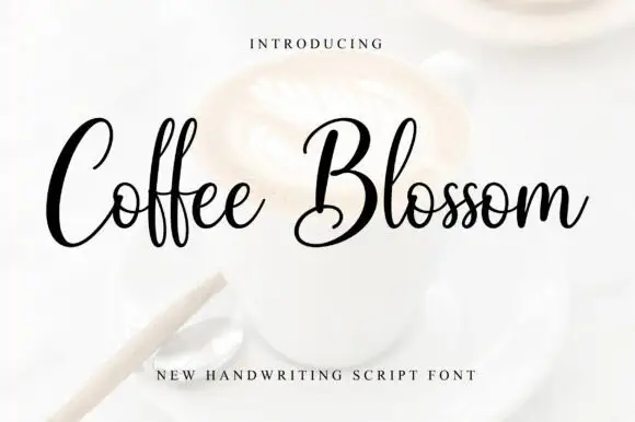
Fine loops with tall paired ascenders and a wide capital sweep
Coffee Blossom is fine looping script with tall paired ascenders and a wide capital that sweeps out of the word, drawn in an even light stroke that keeps the counters open.
Ideas for this font

Substantial handwriting script
Simple Handwriting is a substantial handwritten script in deep green on white: connected lowercase with open round bowls, a firm even stroke, tall ascenders and a long entry stroke on the H, set across two lines over a soft brush swipe, with a serif caption beneath and a studio credit at the foot.
Ideas for this font

Tall narrow letters left unjoined
Simple Alphabet is a tall narrow display face in black on a pale photograph of loose lettering blocks: monoline letters with rounded ends, open counters and wide spacing, set unjoined so each letter stands on its own.
Ideas for this font
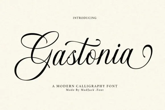
Contrasting calligraphy with a large looped G
Gastonia Script leads with a large double-looped G that extends far above and below the lowercase body, a long crossbar arcs across the central t and the final stroke climbs into a separate loop on the right.
Ideas for this font
Same independent foundry
Allow optional Google Analytics to measure visits and catalogue actions. Your search words and notes are not included. Privacy & storage



